STHLM Tigers
Info
STHLM Tigers is a Swedish women's football team based in Stockholm. We were commissioned to design a logotype and symbol that would express the team's identity, point of view and dynamic character.
During our research, we came across the word FORWARD and its multiple meanings:
-
In the direction one is facing or travelling; towards the front.
-
Onward, towards progress.
-
Towards the future; ahead in time.
-
An attacking player in football, hockey or other sports.
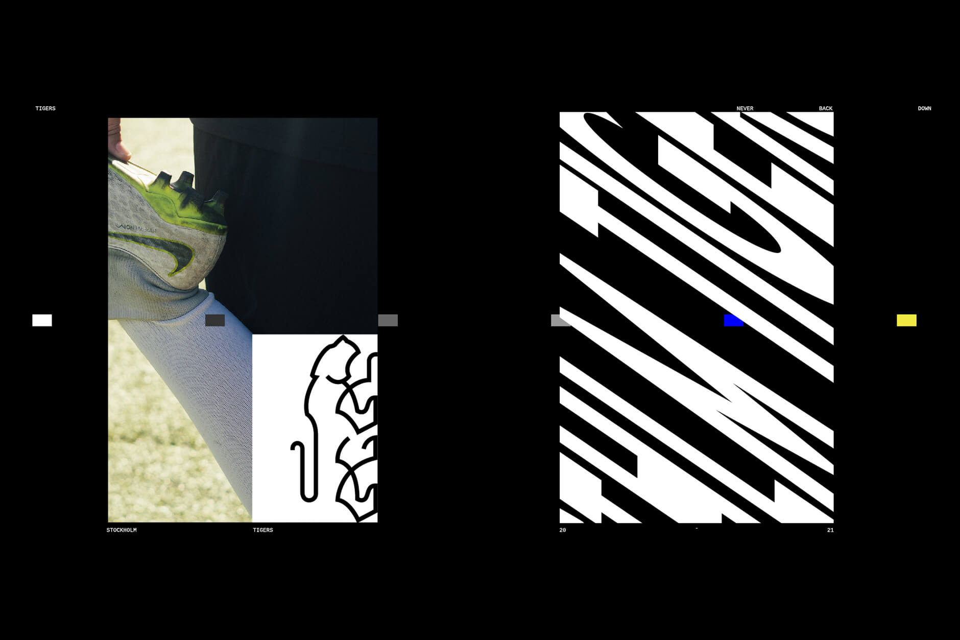
This concept became the starting point for the visual identity. We developed a linear, almost single-line tiger symbol, drawing inspiration from the markings of a football pitch. Bold and confident, the tiger reflects the character of the team. Its gaze is directed forward, while the subtle movement of its front paw suggests readiness to move, attack and stay focused on its target.
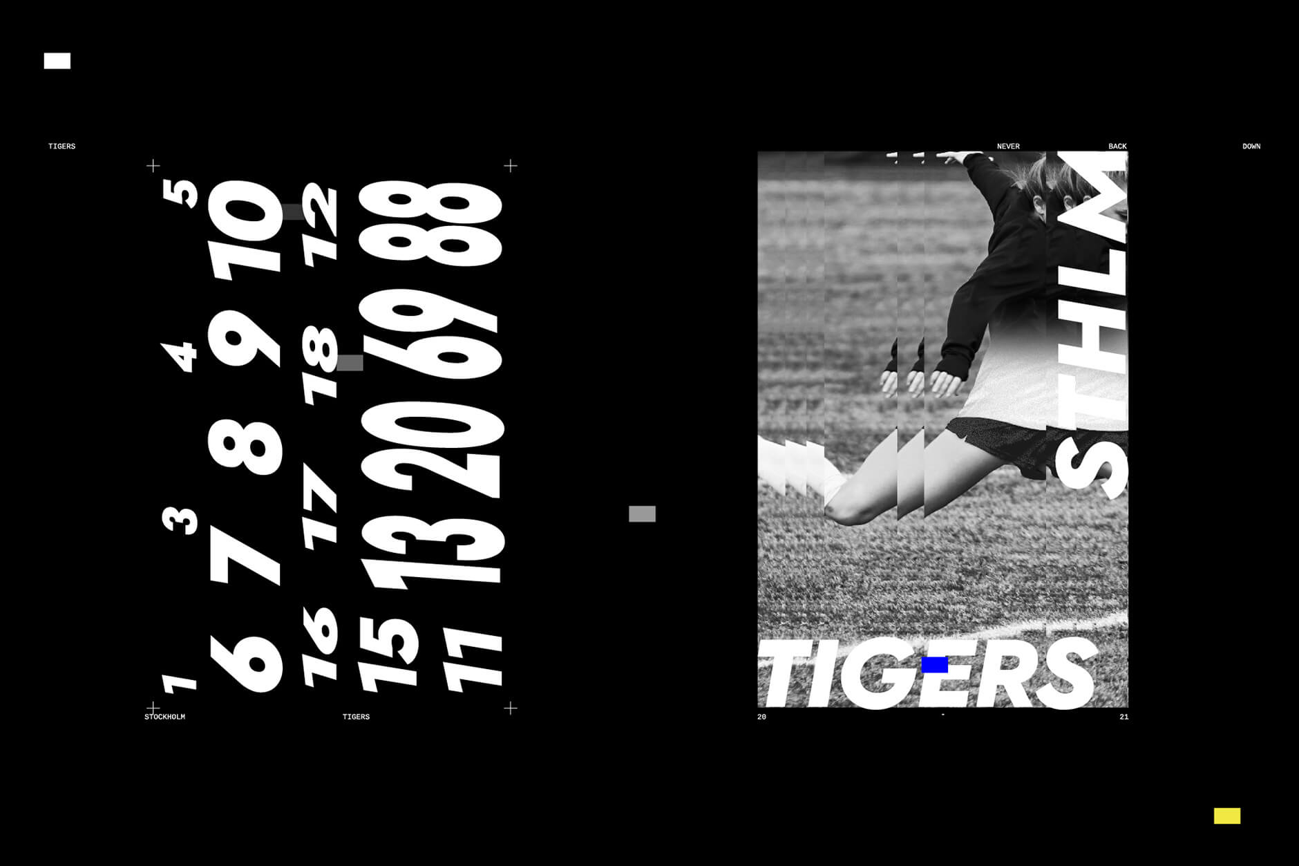
The symbol is paired with a bold sans-serif typeface, slightly skewed to reinforce the idea of forward movement and give the identity a sense of direction and momentum.
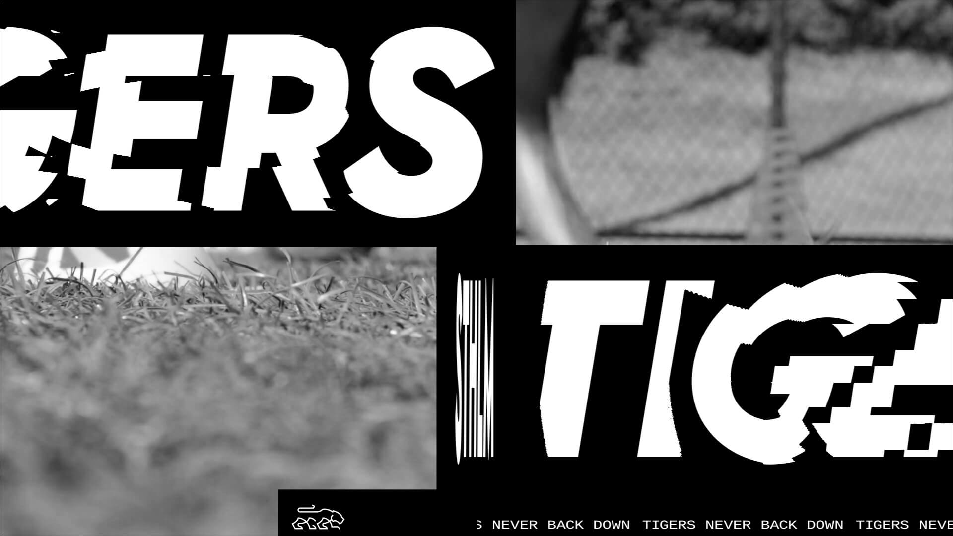
To introduce the team's new identity, we also created a promotional video combining photography and animated typographic elements drawn from the visual system. The result captures the energy of the team and marks the beginning of a new chapter for STHLM Tigers.