Info
Stockholm (STHLM) - Tigers is a Swedish female football team located in the city of Stockholm as it’s name suggests.
Our task was to design a logotype and symbol for this team that will express their point of view and dynamic character.
Through our research we found out that the word forward has a very interesting concept that could generate interesting visuals
Forward
1. in the direction that one is facing or travelling. Towards the front.
2. onward so as to make progress.
3. towards the future; ahead in time.
4. an attacking player in football, hockey, or other sports.
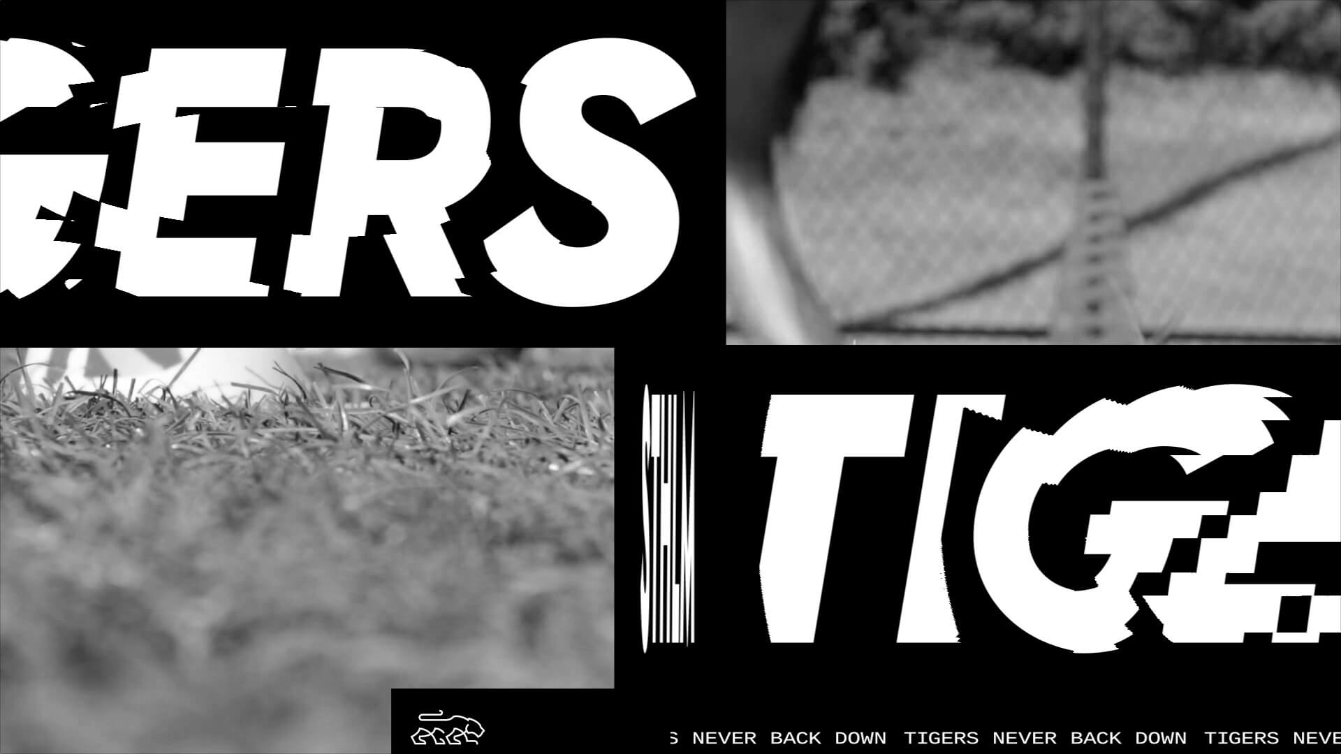
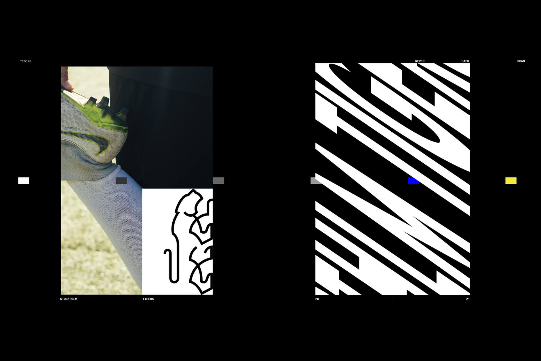
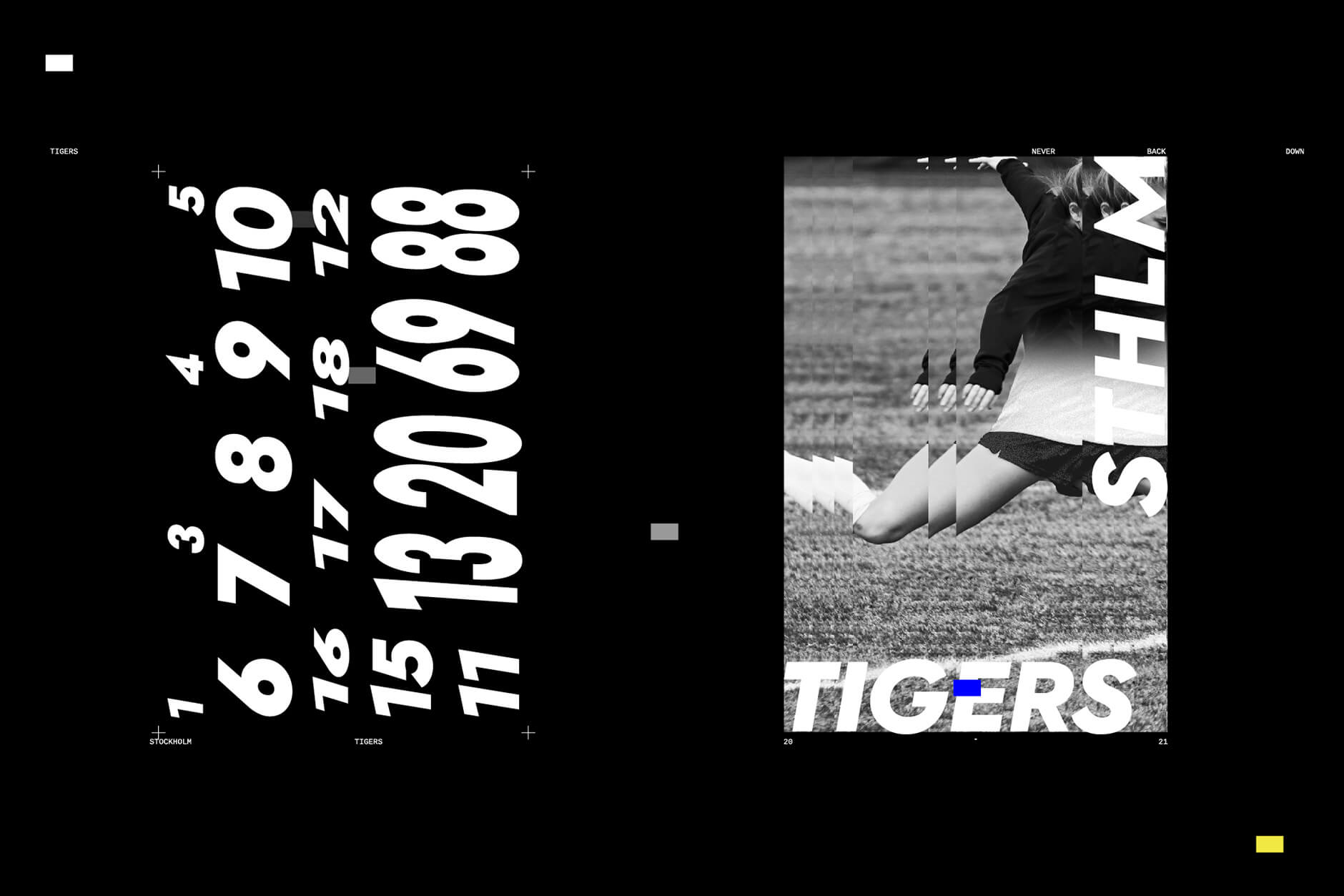
We proceeded with a linear almost single line tiger that refers to the football stadium lines, bold and confident just like a tiger or like the team members. The tiger looks forward and has a slight move on her front paw, ready to move, ready to attack, always on guard always looking at her target. To accompaign this icon, we used a bold sans font with a slight skew to complete the whole concept of forward moving.
Finally we created a video that reflects all the above by combining images and moving typographic elements from the brand identity of the team in order to be used as promotional material for their new beginning.


