Awards
EBGE AWARDS / 2024
Blogs & Portals
Award
Info
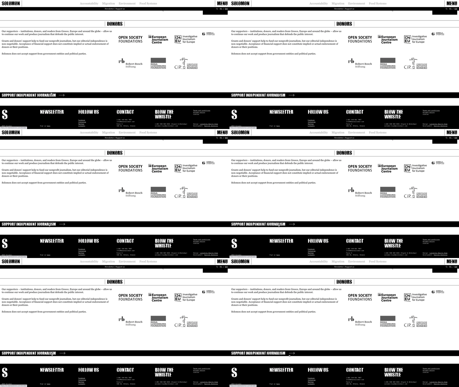
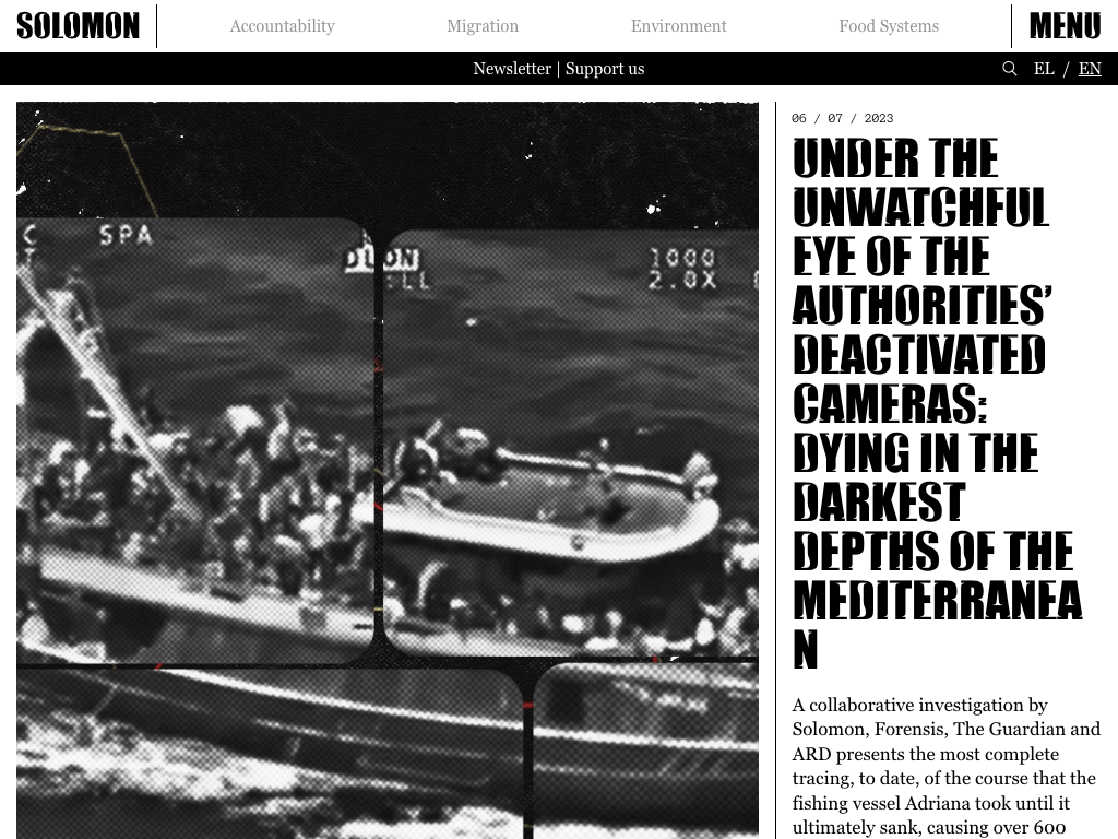
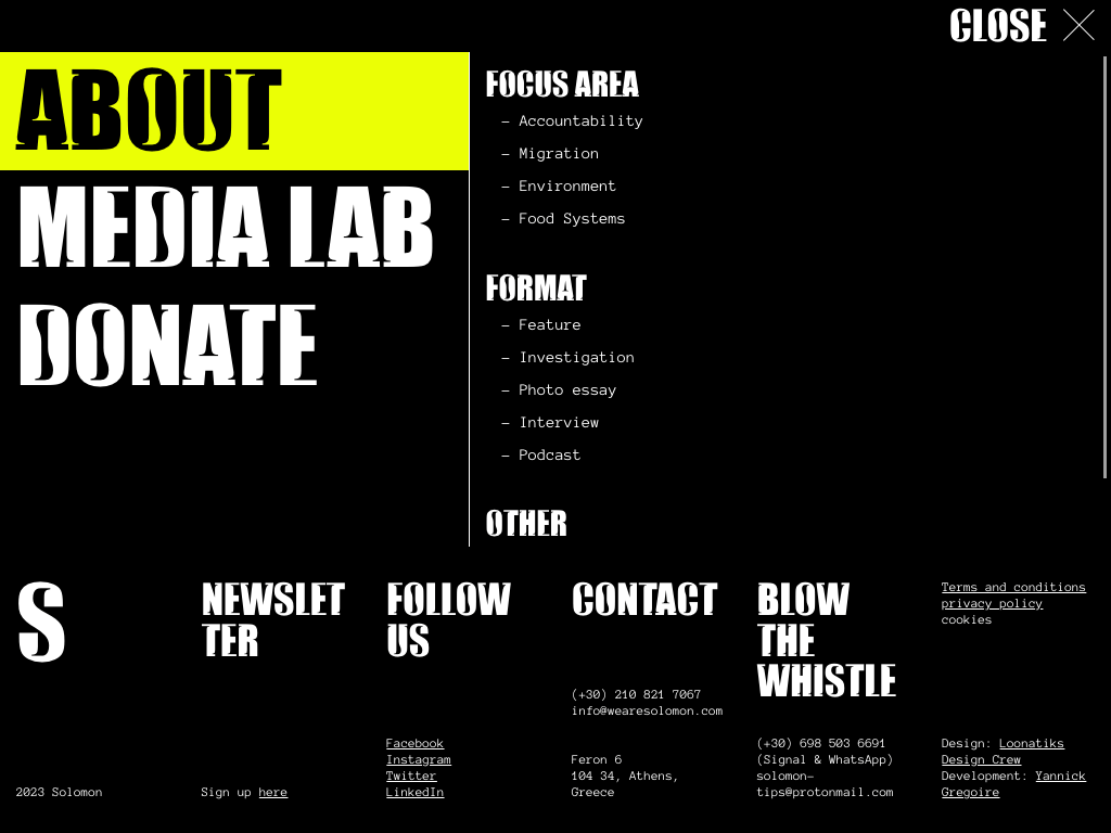
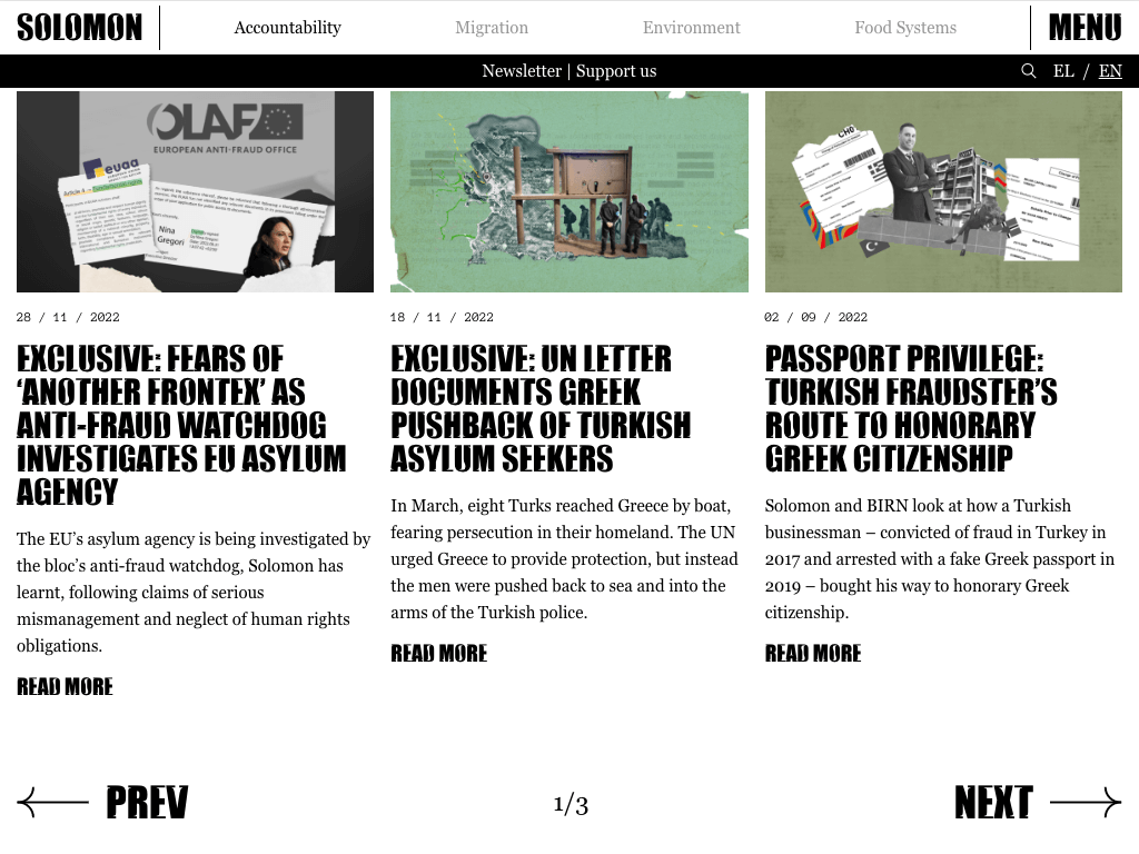
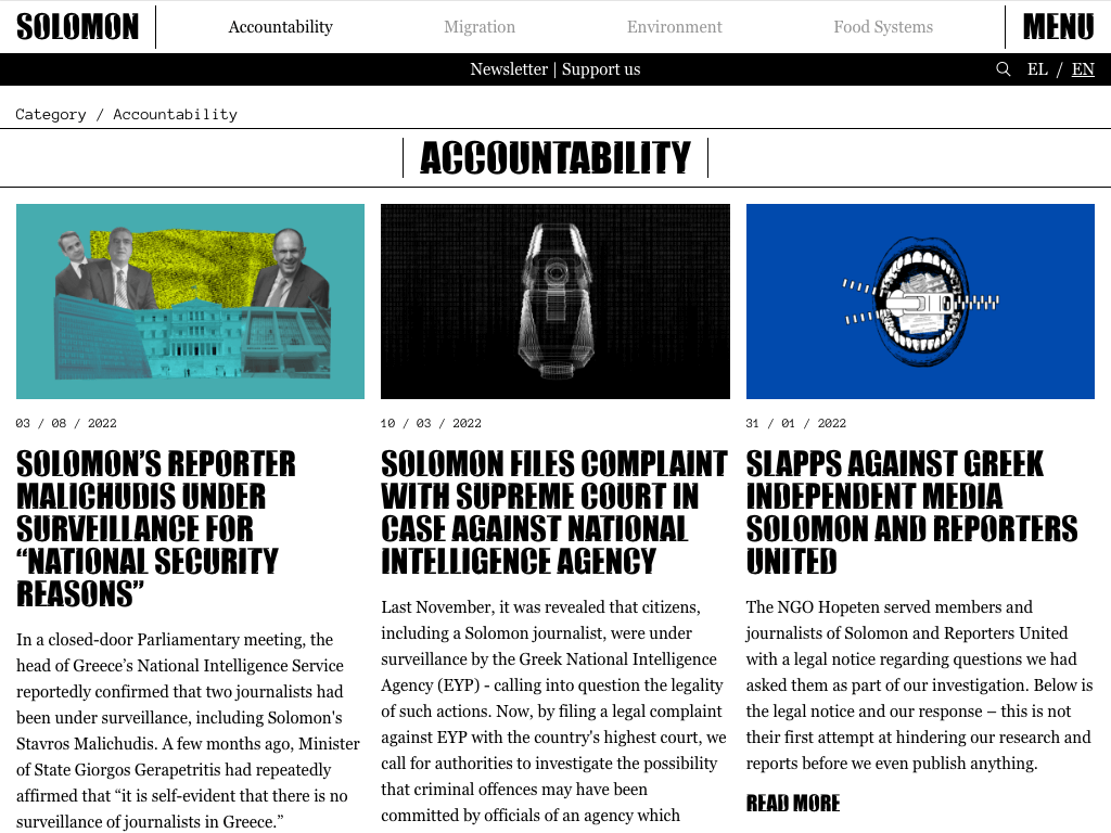
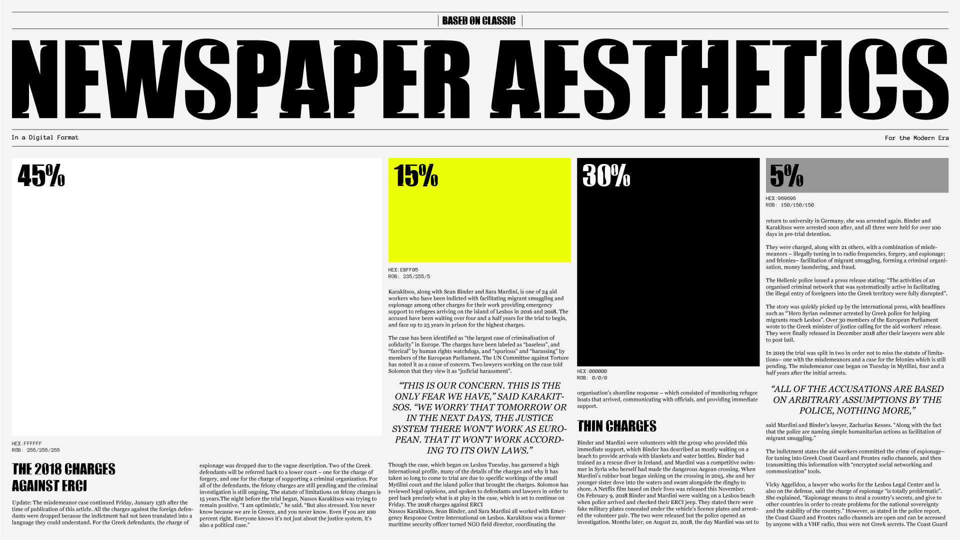
Solomon’s website redesign rested on two foundational principles: a custom typeface that we designed in both Greek and Latin scripts for Solomon and the revival of the classic newspaper layout, reimagined for the modern audience.
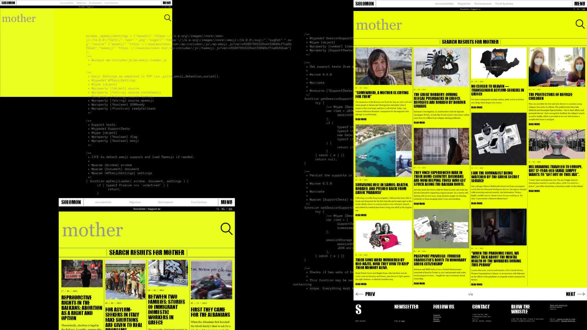
The uppercase characters of the custom typeface served as the title font, adding a touch of sophistication to the website’s visual identity. Paired with Georgia, a classic serif font, and Anonymous Pro, a monospaced font, used discreetly for descriptive purposes. The harmonious interplay of these fonts with a palette of basic colors—predominantly black and white, with a subtle pop of yellow—imbued the website with an aura of understated sophistication.
Resisting the temptation of flashy animations and overwhelming transitions, we aimed for a subtle and user friendly experience. Micro interactions, the delicate dance of elements responding to user actions, became the focal point of the website's interactivity. This strategic choice ensured that user engagement remained seamless and enjoyable, avoiding unnecessary visual fatigue from excessive animations.
At the heart of the website lays a robust mechanism governing its content. Empowering users with access to the website’s CMS (Content Management System), contributors could unleash their creativity within predefined boundaries. This approach allowed them to experiment with various image ratios, font sizes, and styles, crafting unique and captivating layouts for each post. This dynamic flexibility not only enriched the visual diversity of the website but also facilitated a user experience that was both engaging and immersive.
Furthermore, the website was designed to be fully responsive, adapting seamlessly to different devices and screen sizes.
The bilingual functionality, supporting both English and Greek languages, broadened its reach, ensuring inclusivity and accessibility for a diverse audience.
Web Development by: Yannick Gregoire


