Info
Mike Tserbis, a boxing pad specialist and elite level Mittology instructor, created MT Worx as a personal project. Mittology is all about technique-based flow drills that are performed in perpetual motion to enhance specific skills such as reflexes, agility, and action/reaction autonomy.
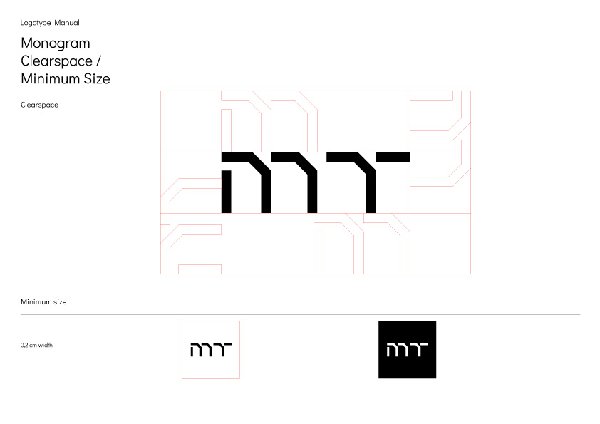
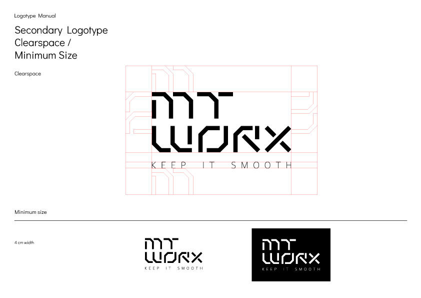
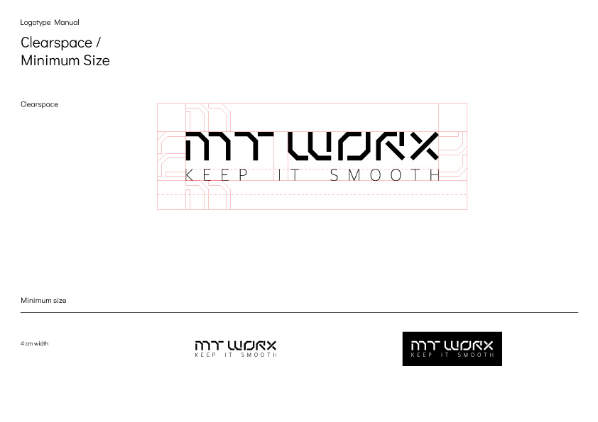
We wanted the logo to be clearly related to the nature of Mittology, thus we worked on a knuckles and mitts logotype direction. Sharp 45 and 90 degree angles, as well as repetitive motifs, were used based on Mittology training methods; after all, drills are all about repetition in order for someone to be sharp, accurate, and effective.
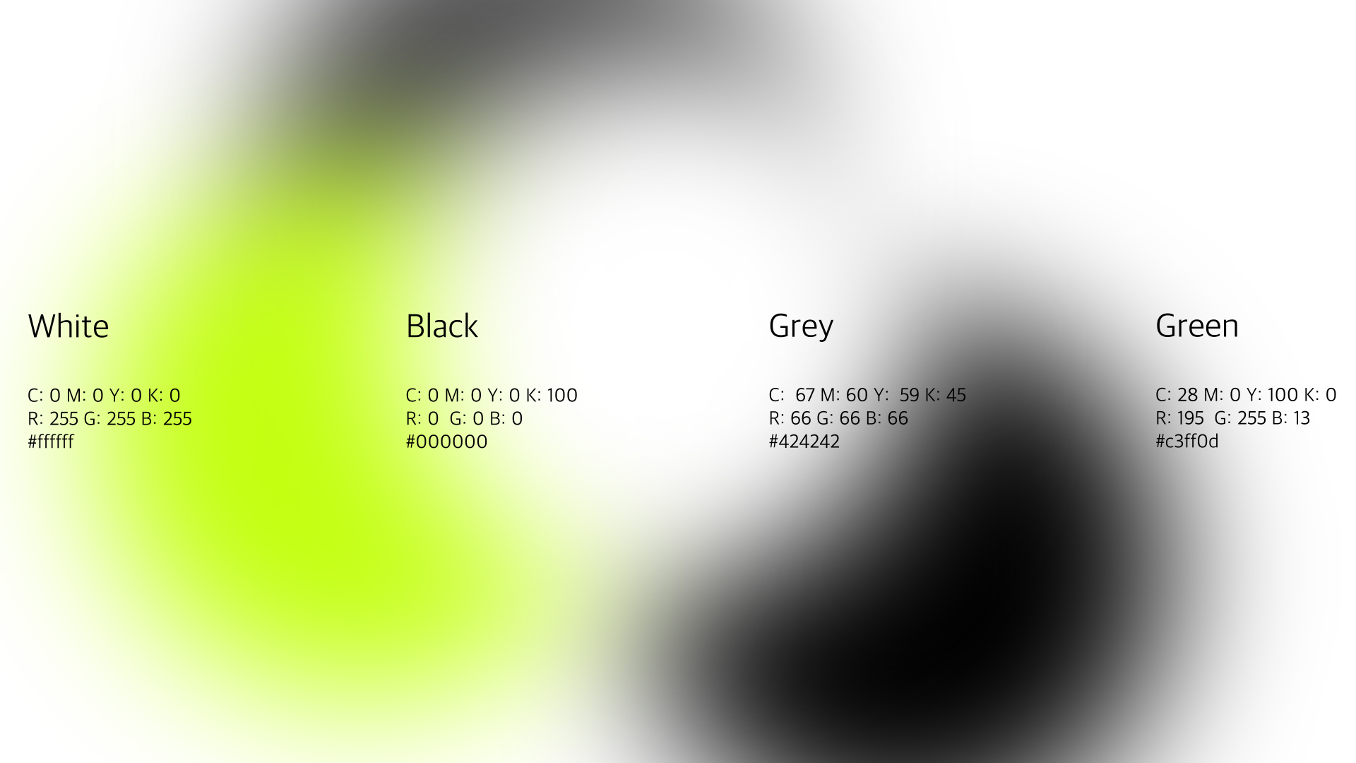
The colour scheme was a very straight forward Black-White-Grey with the addition of a bright green as an accent colour, as a homage to the all time classic Jab-Hook-Cross, which, if you master, allows you to add all kind of tricks and movements.
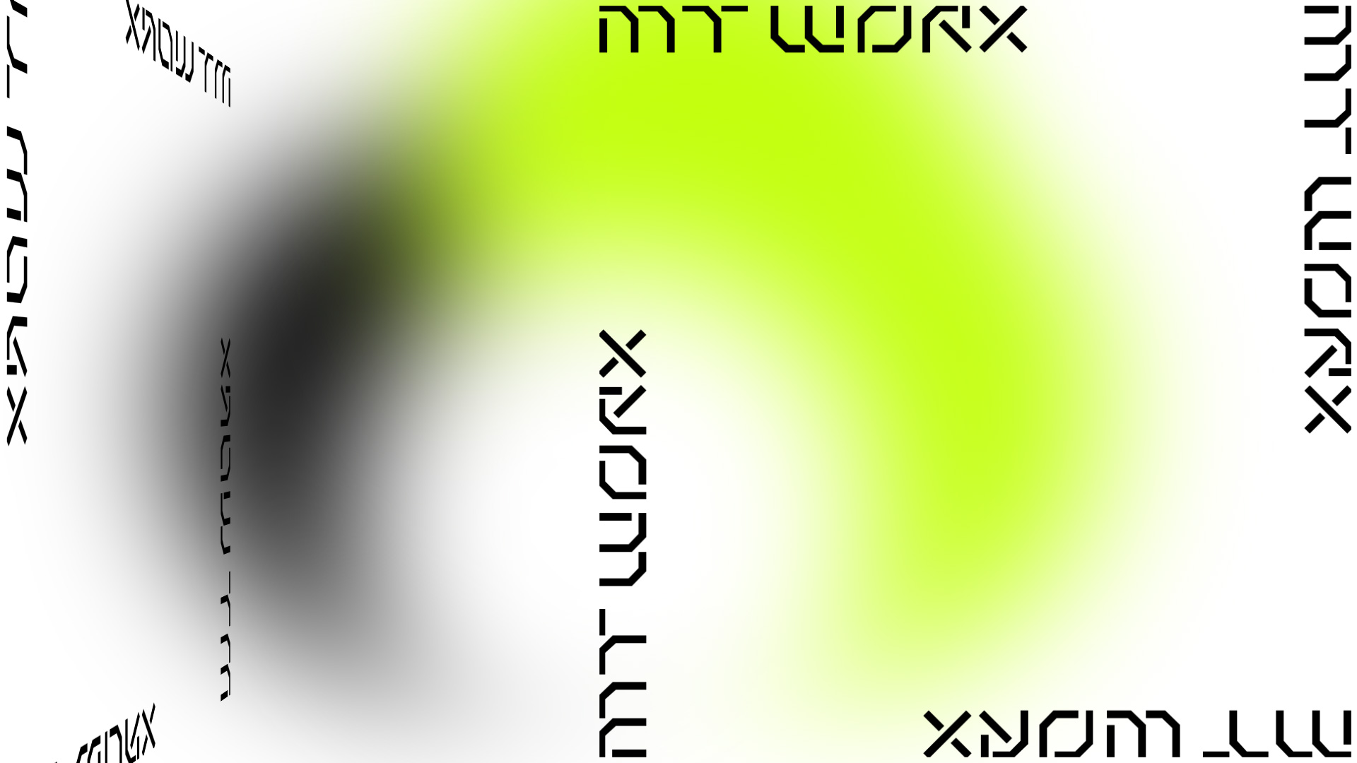
Kinetic Typography and colourful animated elements that change shape, position, and pace like a boxer in motion, complete the brand identity.
You can follow Mike Tserbis for more by clicking here


