LT Mono

Info
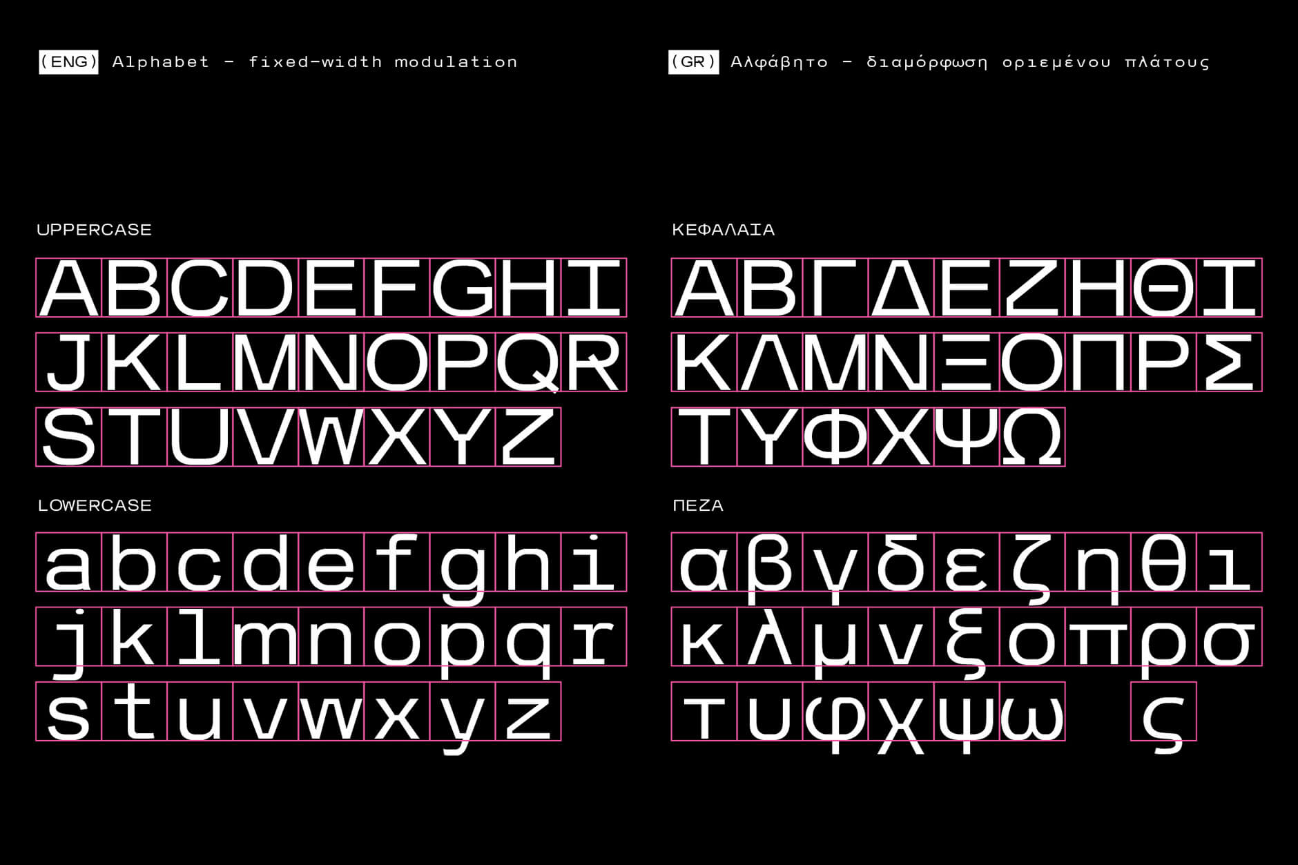
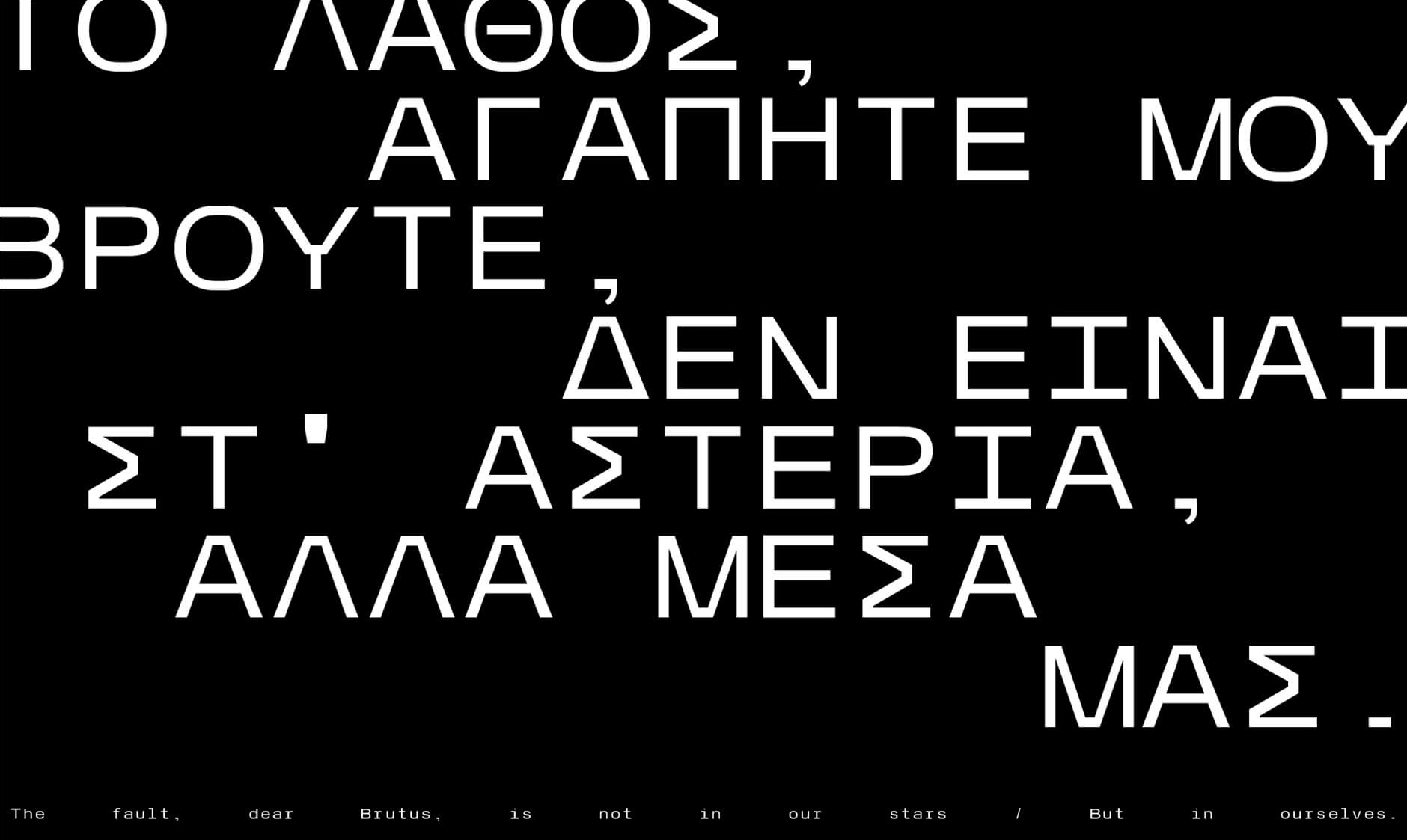
LT Mono is a monospace typeface designed to serve the needs of our studio’s visual identity. To introduce the typeface and communicate one of our services — custom typeface design — we produced a brochure exploring its anatomy and characteristics.
Taking Arial, perhaps one of the most familiar typefaces in digital environments, as our starting point, we reworked it into a monospace typeface to complement the typography of our website.
The cover introduces the fundamental principle of monospace fonts: every character occupies the same fixed width. Using a grid, we make this underlying structure visible, turning the defining characteristic of the typeface into the main graphic element.
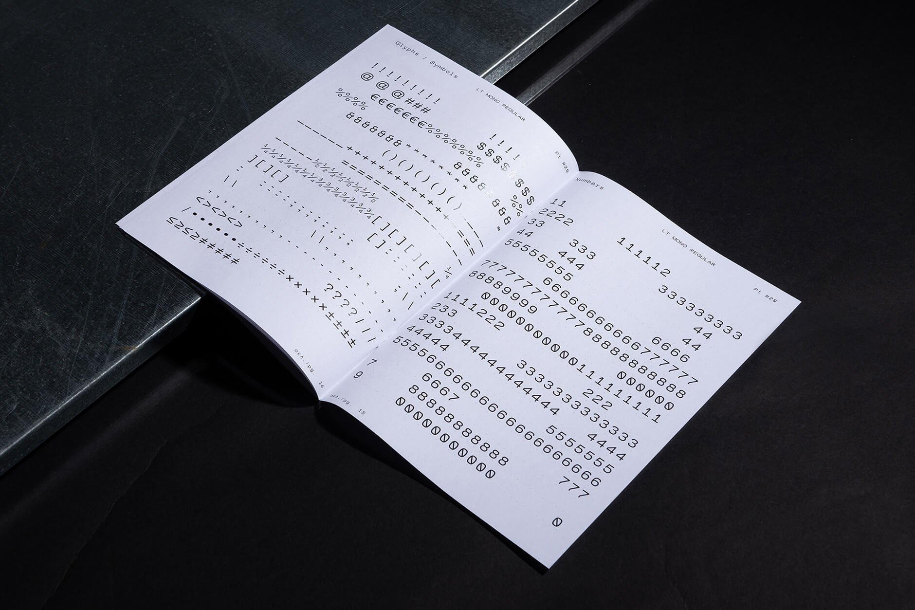
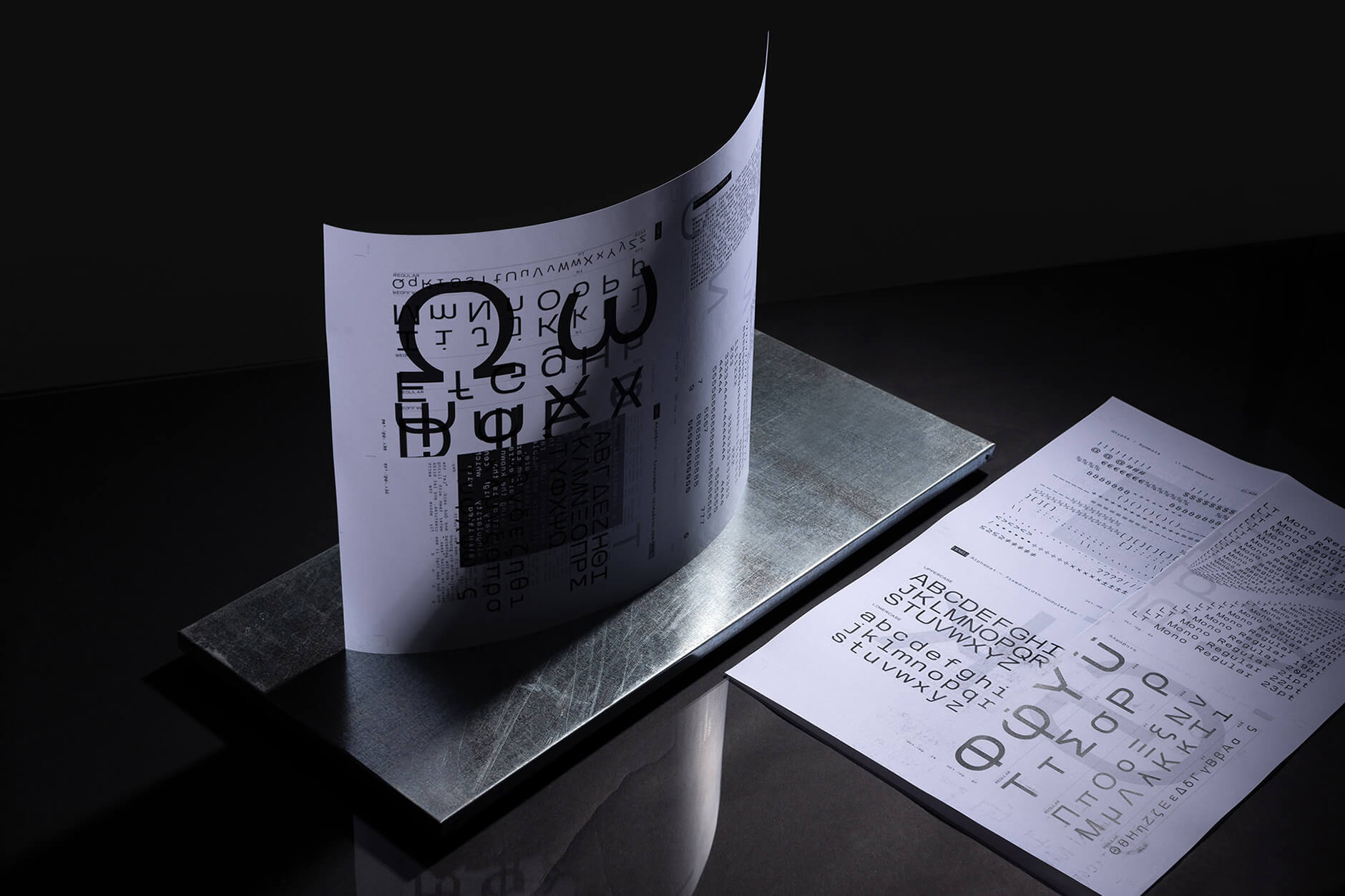
Inside, the brochure presents the typeface in different sizes and applications, with references to graphic design tools such as Letraset dry-transfer lettering sheets, once widely used in the industry.
The back cover brings everything together with an oversized grid — one of the most fundamental tools in our design process and a recurring element in the way we approach visual systems.