Lo:ft Productions
Awards
Lo:ft Productions
Adobe Behance
Graphic Design Gallery
Info
LO:FT PRODUCTIONS approached us to build their brand identity and web site. When the owners, Rafailia and Anna-Maria, were still students, they dreamt of starting their own production firm in a New York loft, thus they needed an “overseas" - water element in their logo.
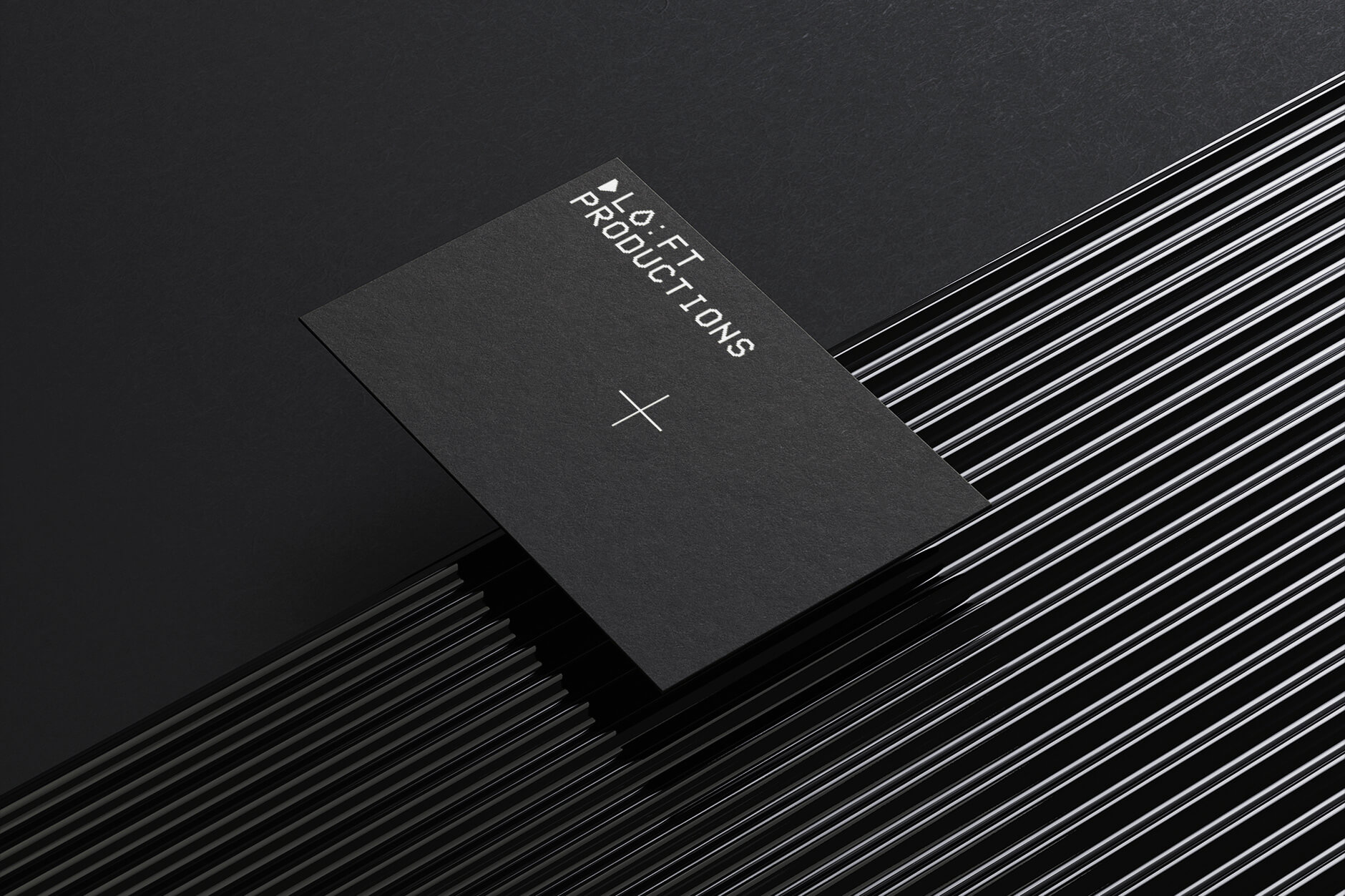
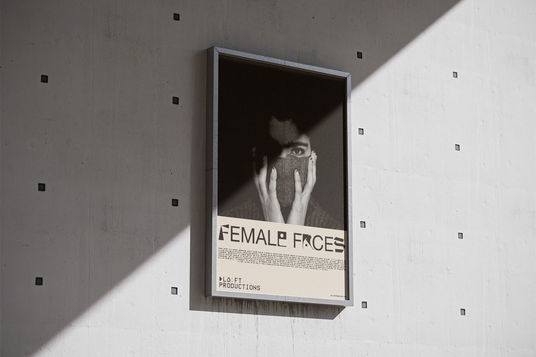
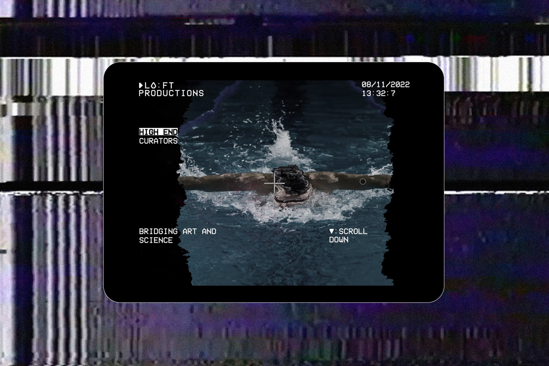
We chose to travel back in time for our design research because the story goes back in time, and we pulled up all these warm analog glitchy vintage VCR and VHS aspects. Inspired by the typography on VCR menu screens, we chose a similar typeface that conveys the ambiance in a very modern way. The initial word, LOFT, receives a double dot in the centre and becomes LO:FT, as a reference to an essential aspect of video production, time. The letter O was then substituted with a digitised water drop as a nod to the previously stated "overseas" feature. The last touch was a cross in the centre of each application, referring to the well-known frame centre point.
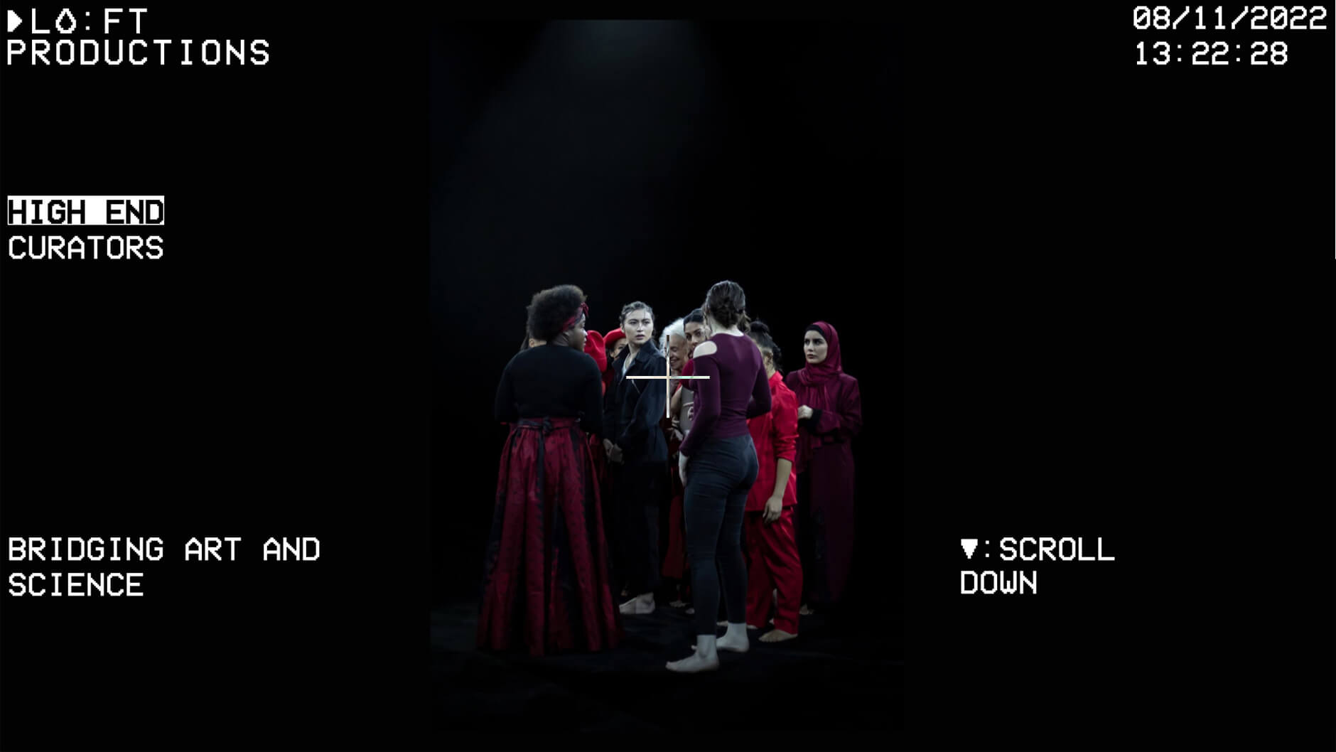
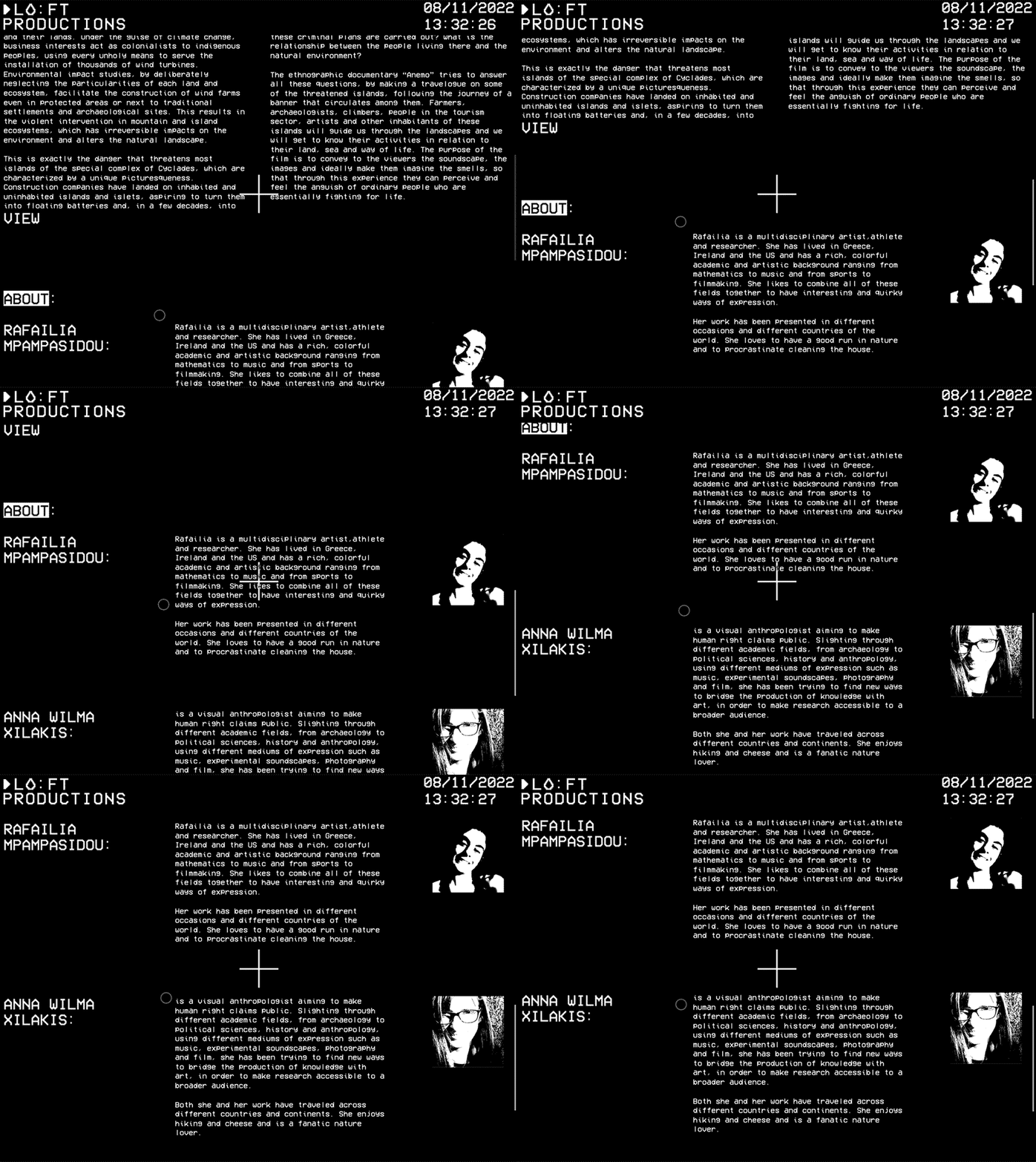
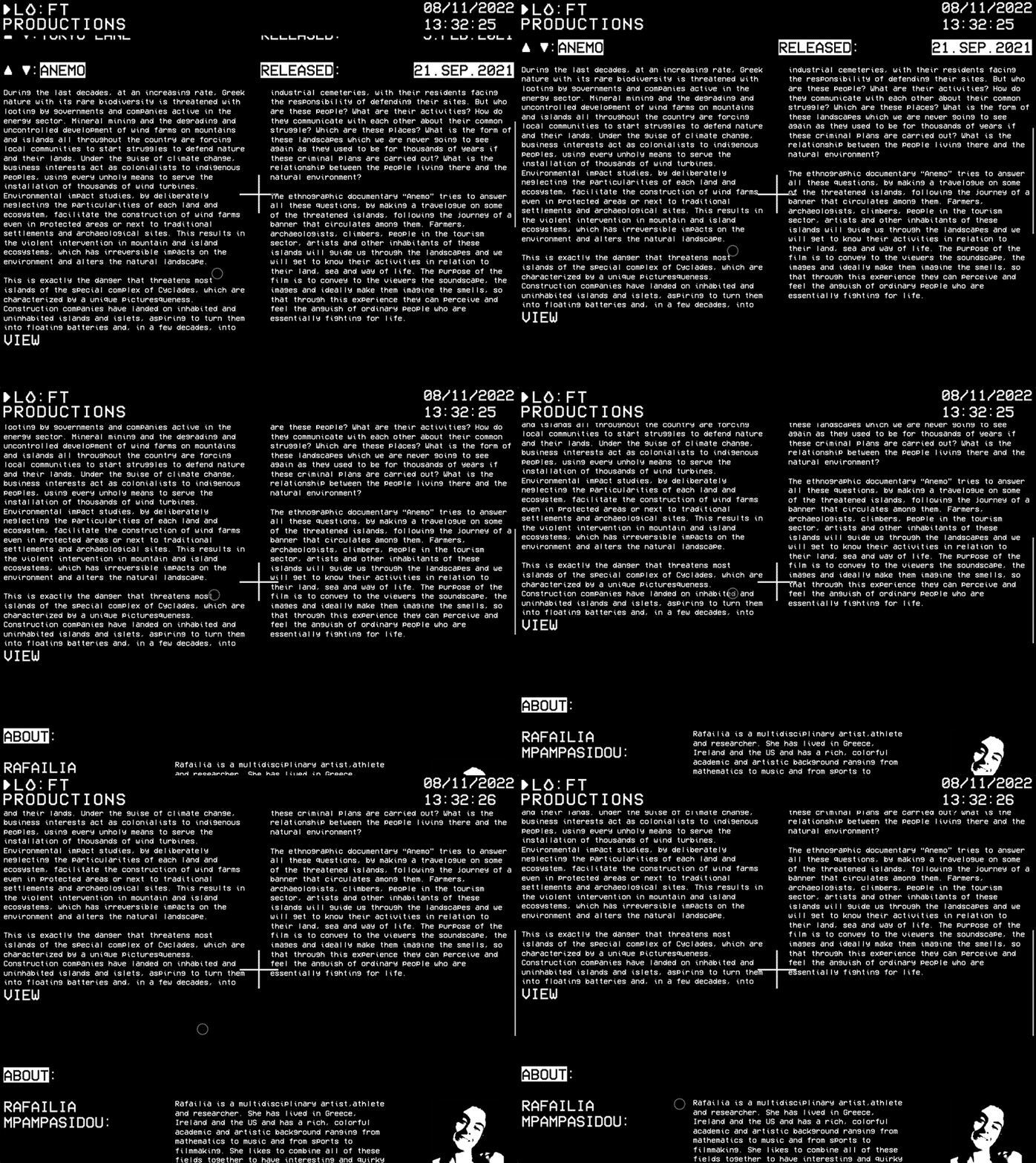
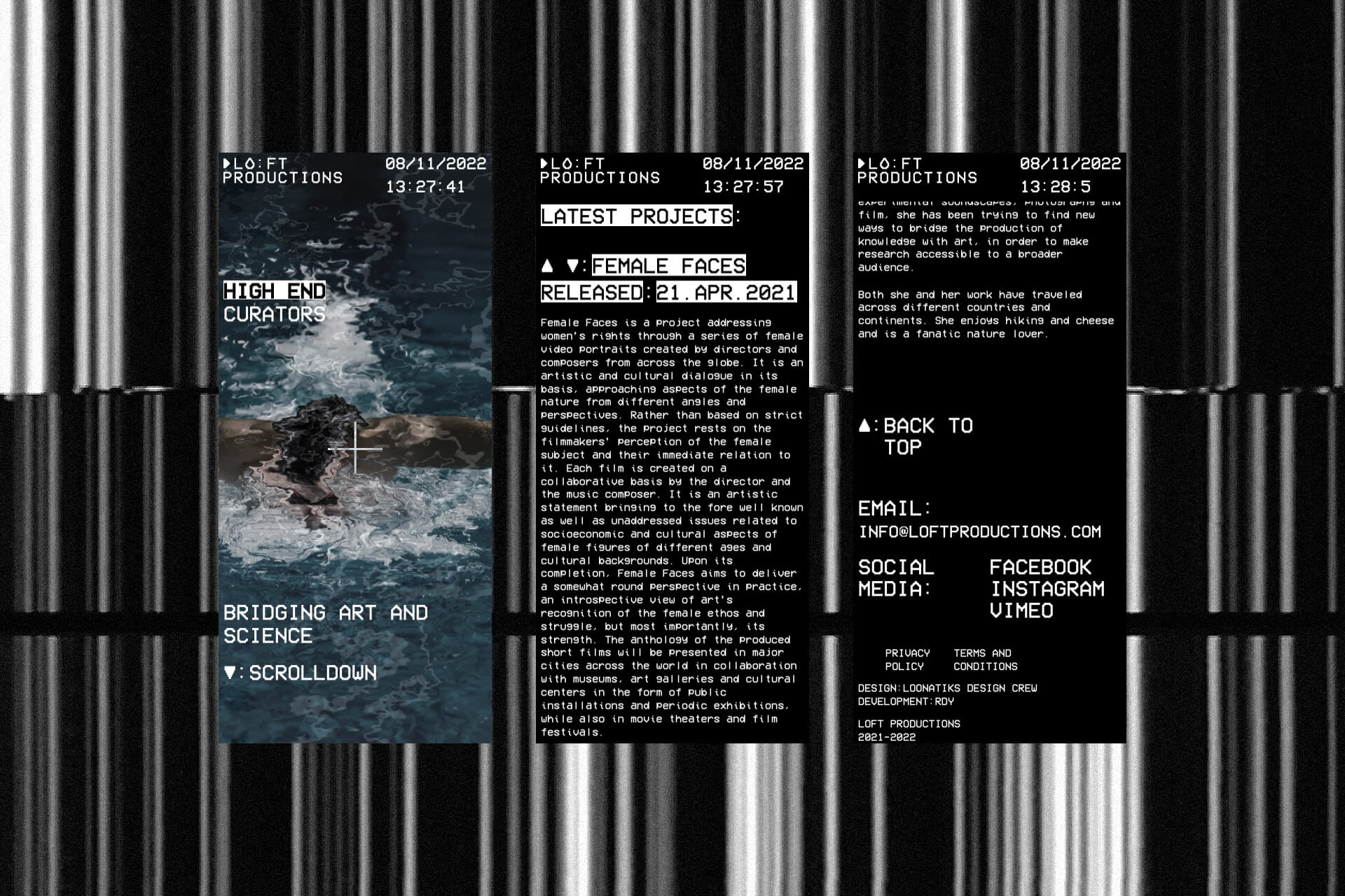
Their web site is a single page catalogue where they can upload all the projects they make including a short description and link to the actual project. The first section of the website is a direct reference to an old VCR screen with the projects’ images changing with a displacement map like a glitchy video tape would do between movies.
Visit website here
Web development by RDY Studio
