Ikon Living – Branding
Info
The identity for Ikon Living is rooted in the craft and precision of furniture making, with a particular focus on custom constructions.
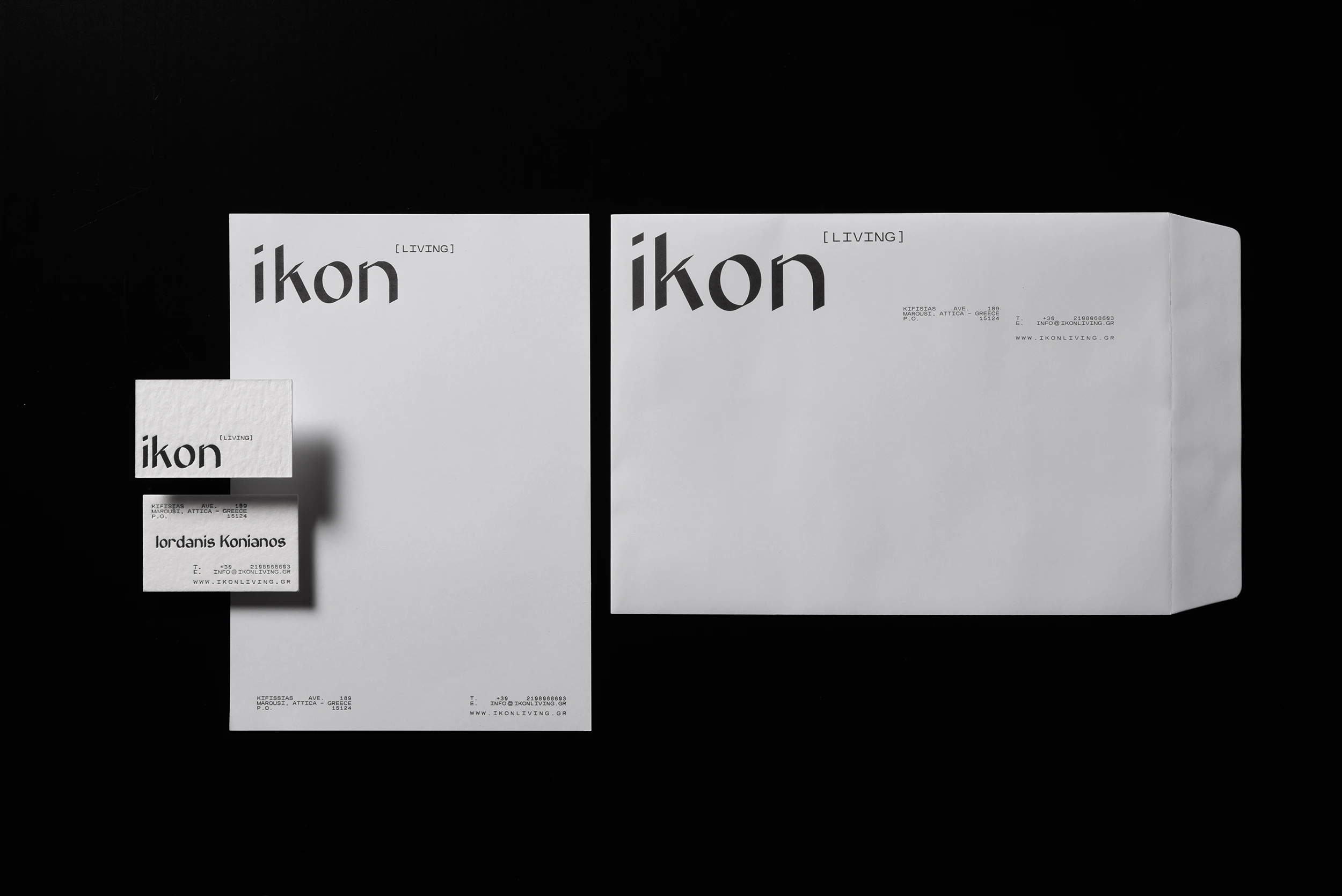
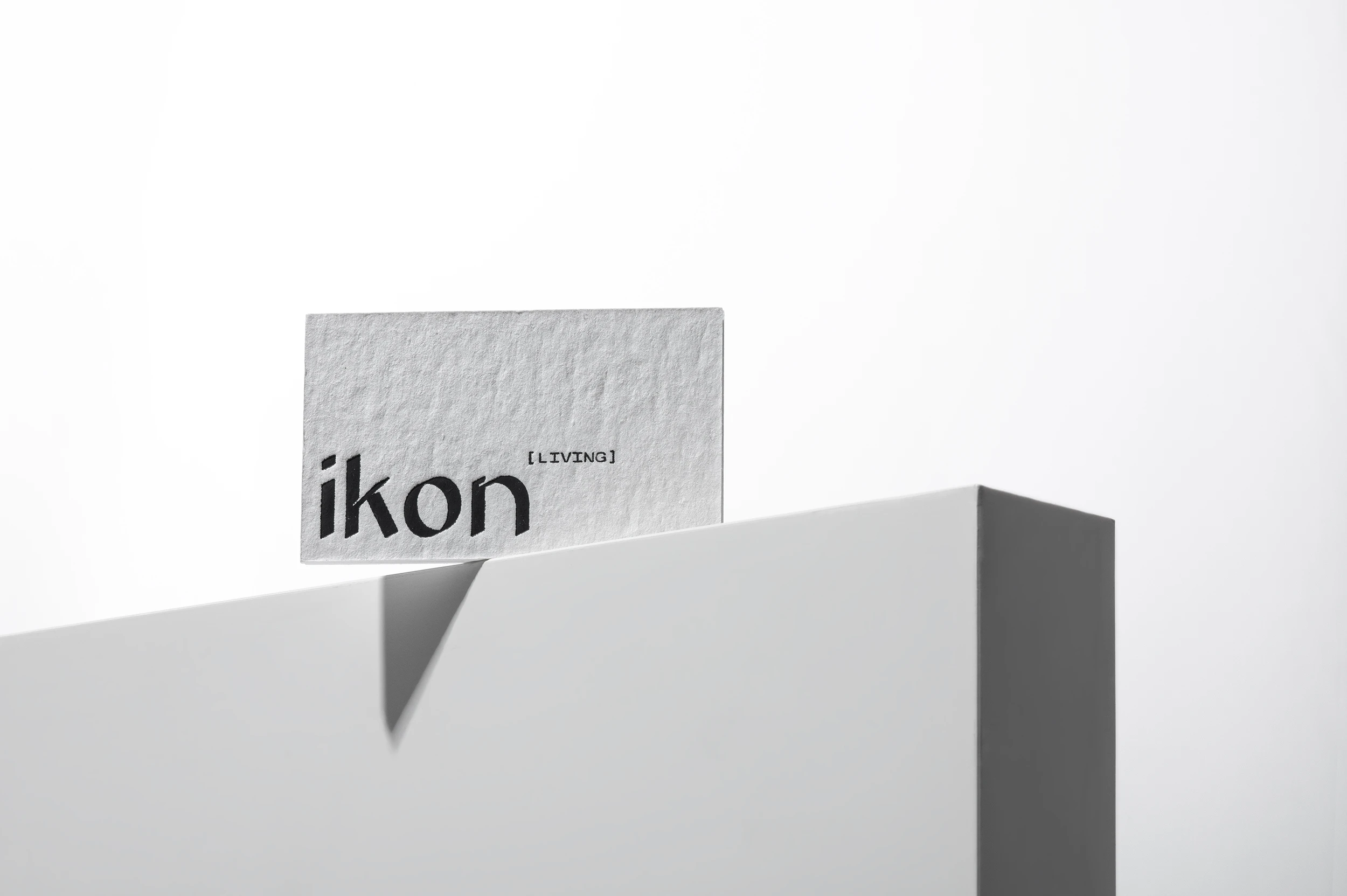
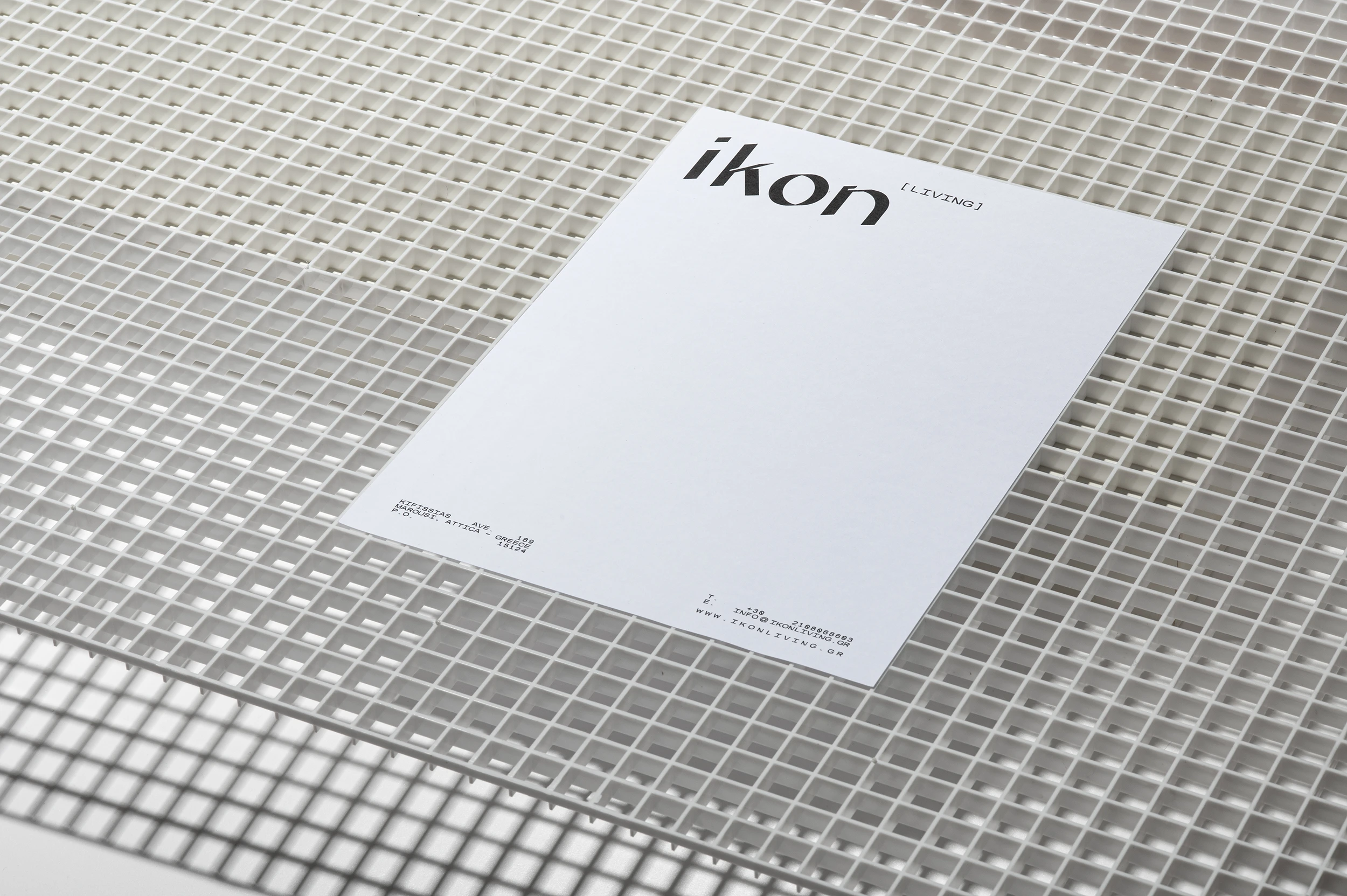
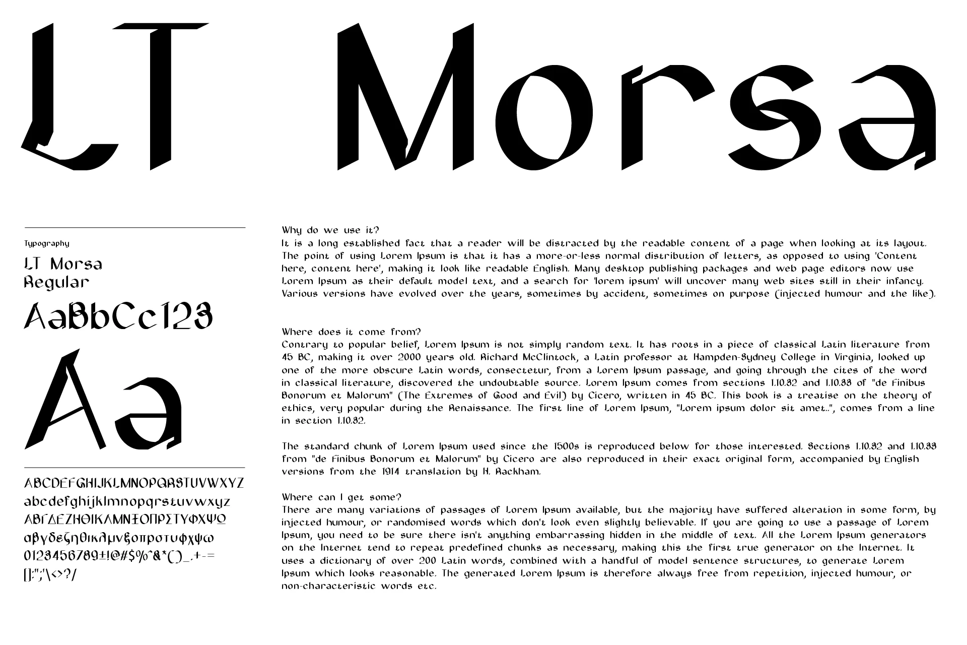
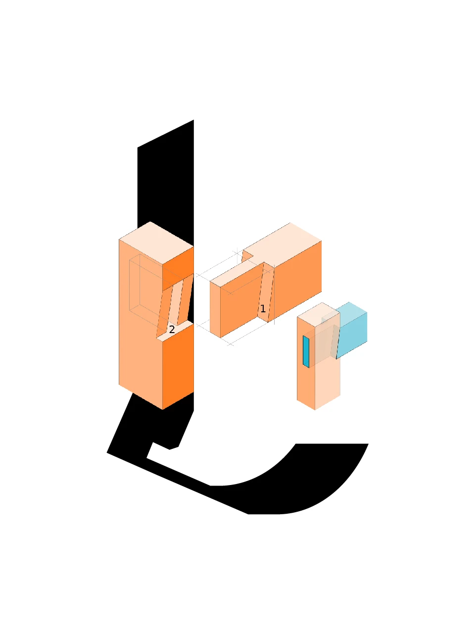
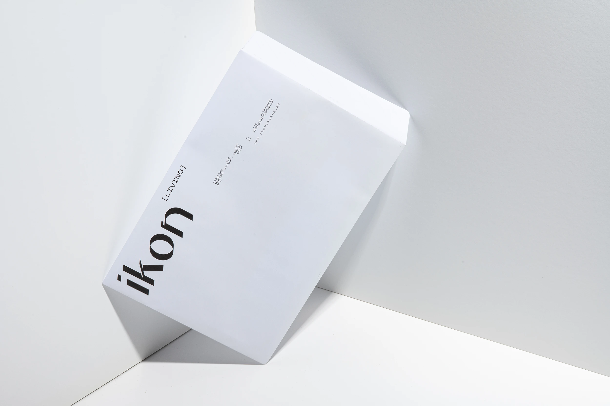
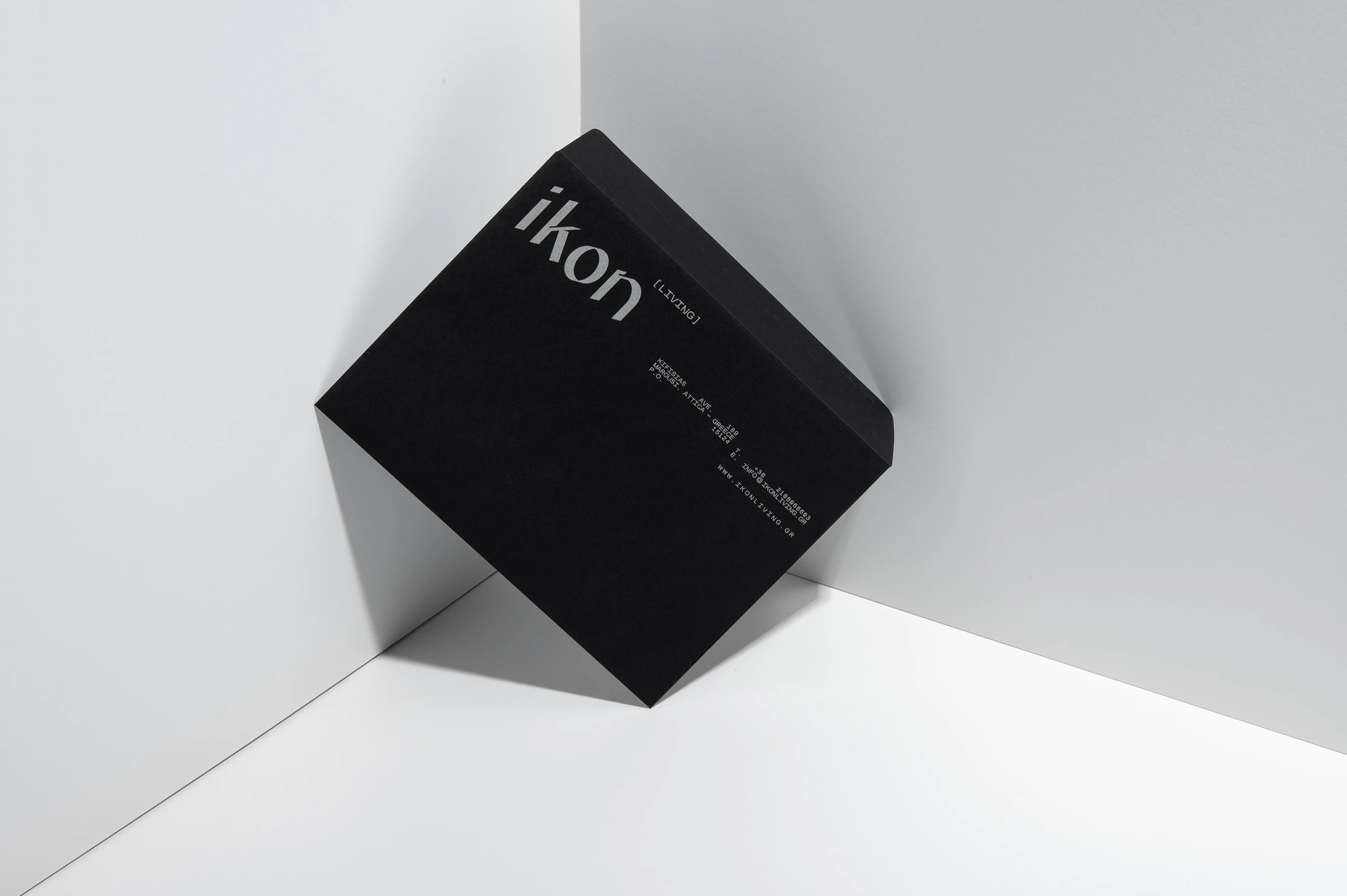
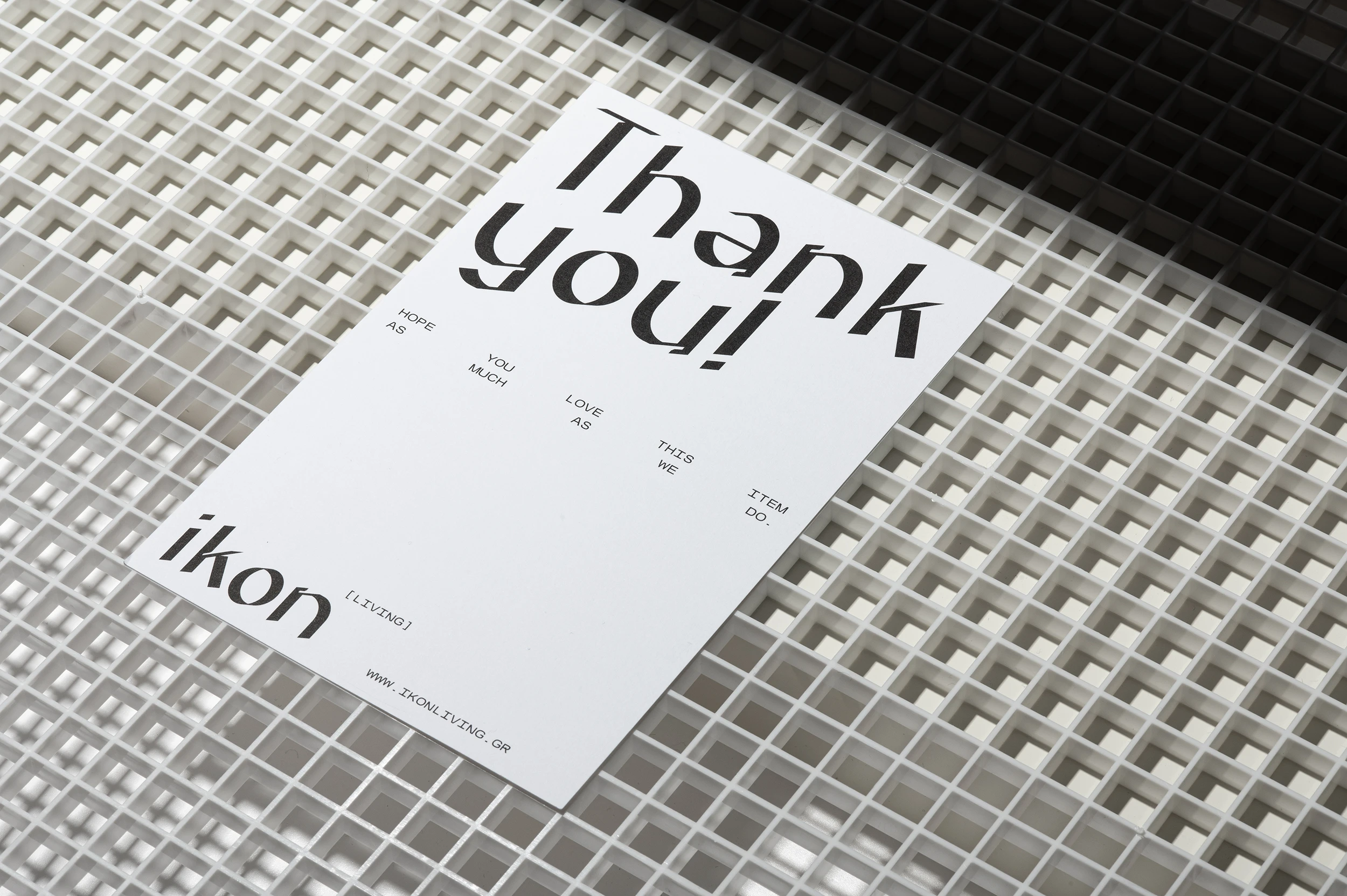
At the centre of the visual language is a bespoke typeface, designed specifically for the brand in two languages. Its forms draw inspiration from the traditional mortise-and-tenon joints (morsa), a woodworking technique in which individual elements interlock to create a strong and durable structure.
Translating this principle into typography, the letterforms bring together the characteristics of handcrafted forms, three-dimensional construction and typographic precision. The result is a distinctive visual language that moves between the refined and the raw, the classical and the contemporary.
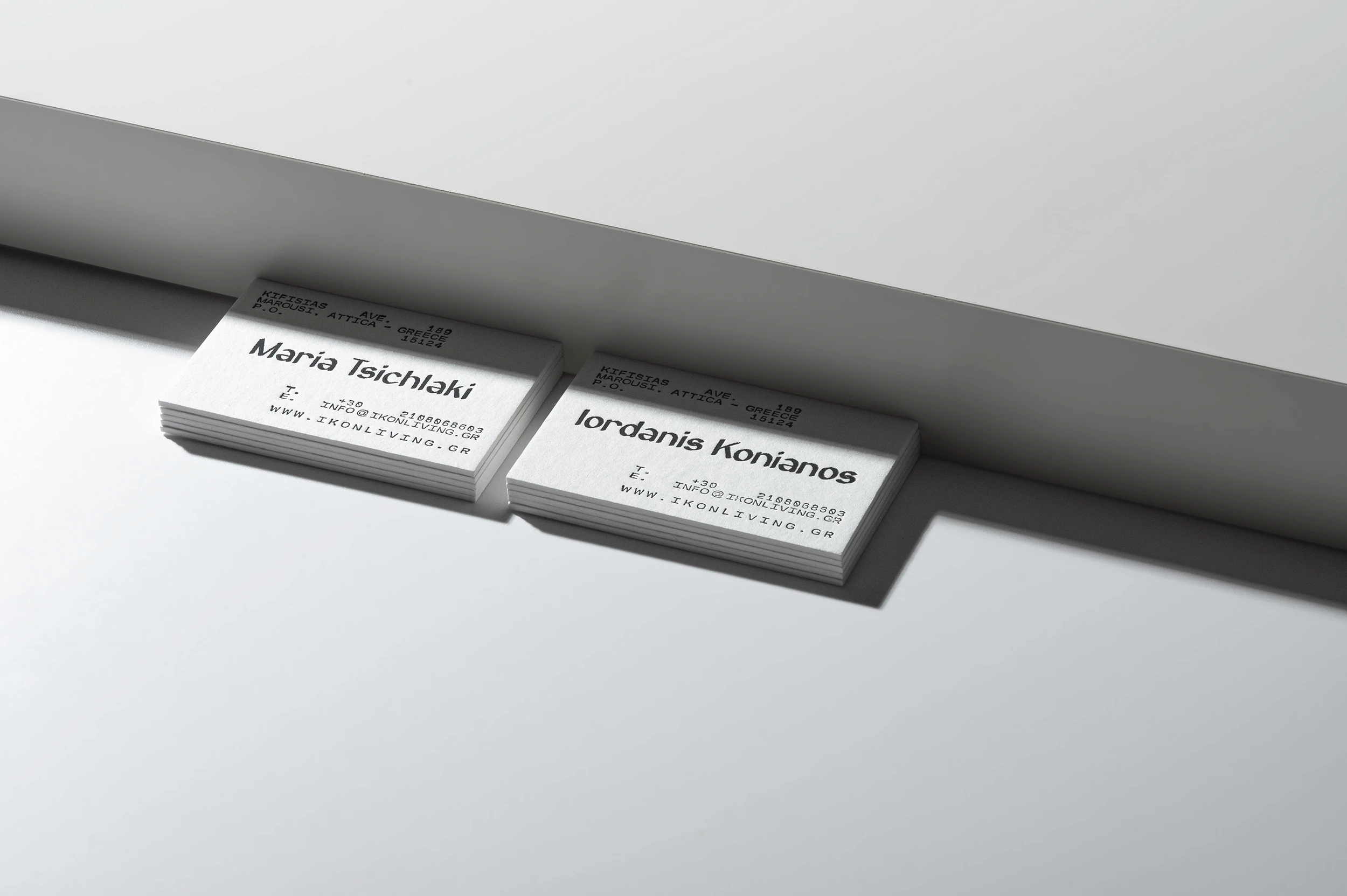
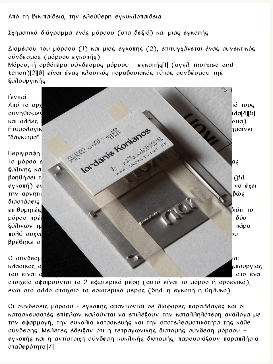
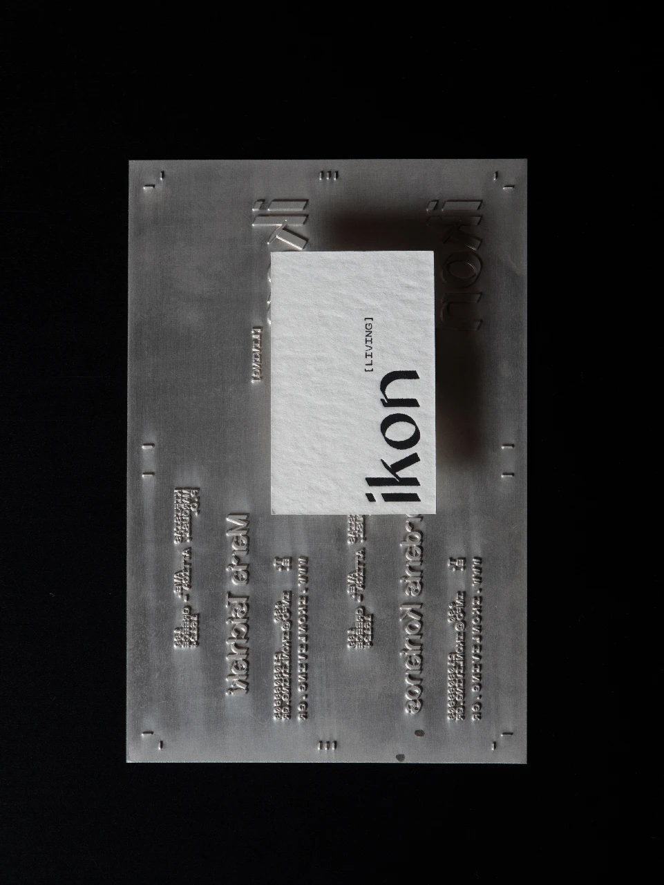
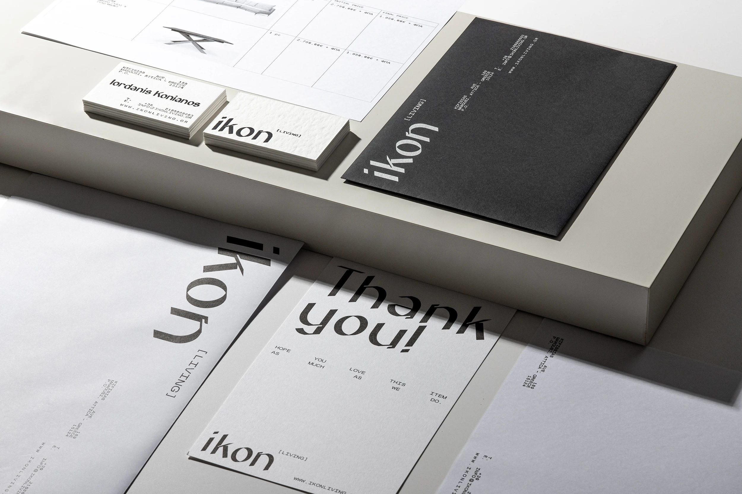
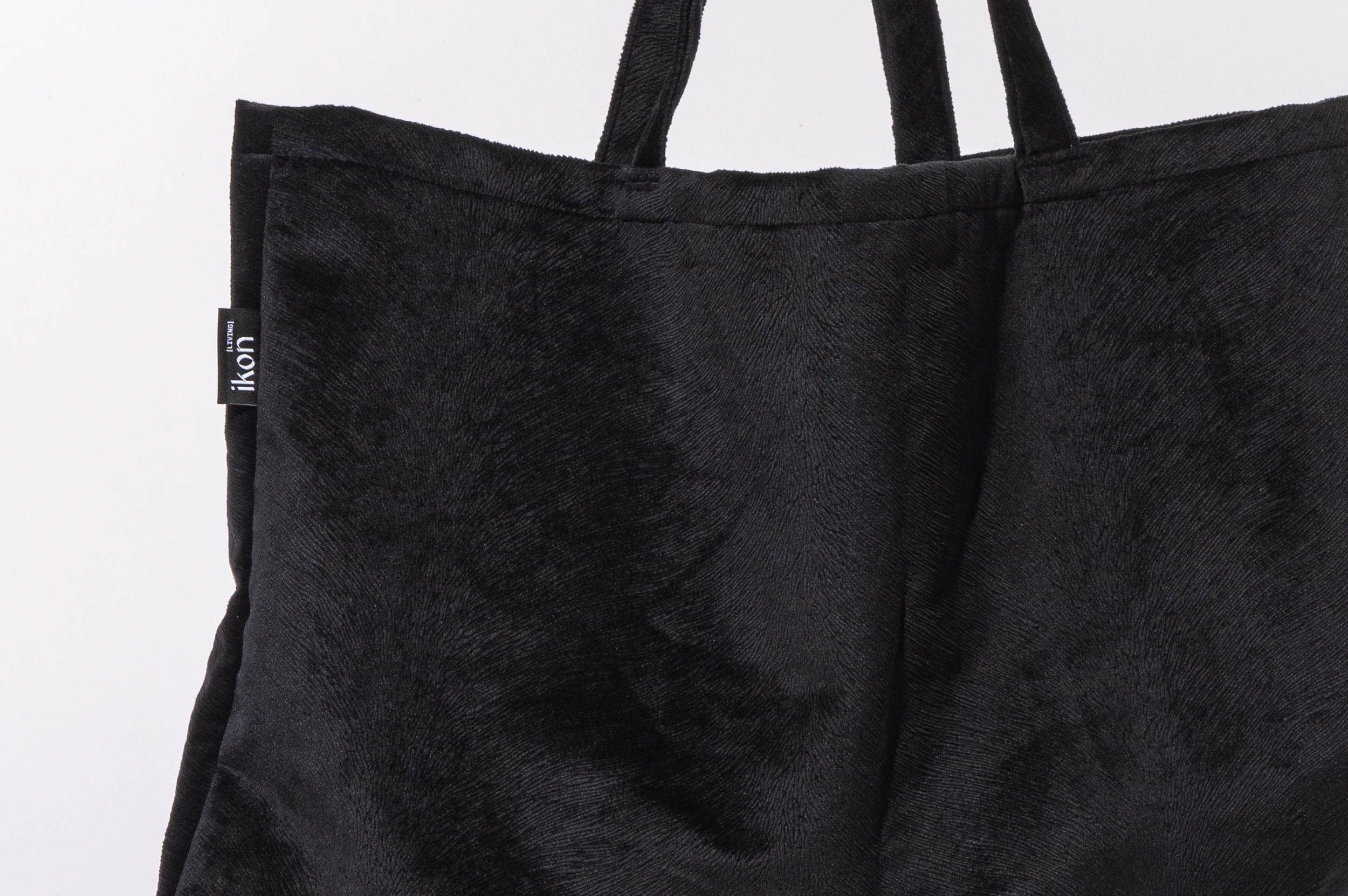
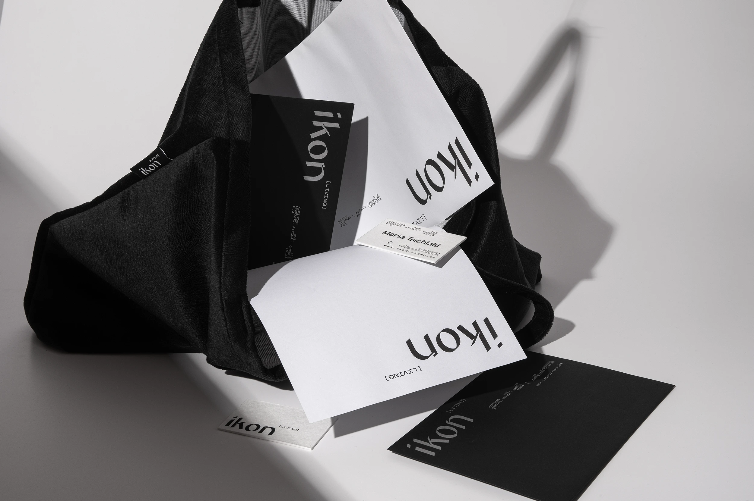
The same attention to materials extends to the brand's physical applications. Business cards are printed on cotton paper and finished with hot foil stamping, creating a tactile connection to the upholstery fabrics used in the furniture. Fabric bags, made from leftover upholstery materials, further extend this approach, turning production remnants into useful objects for the brand's clients.
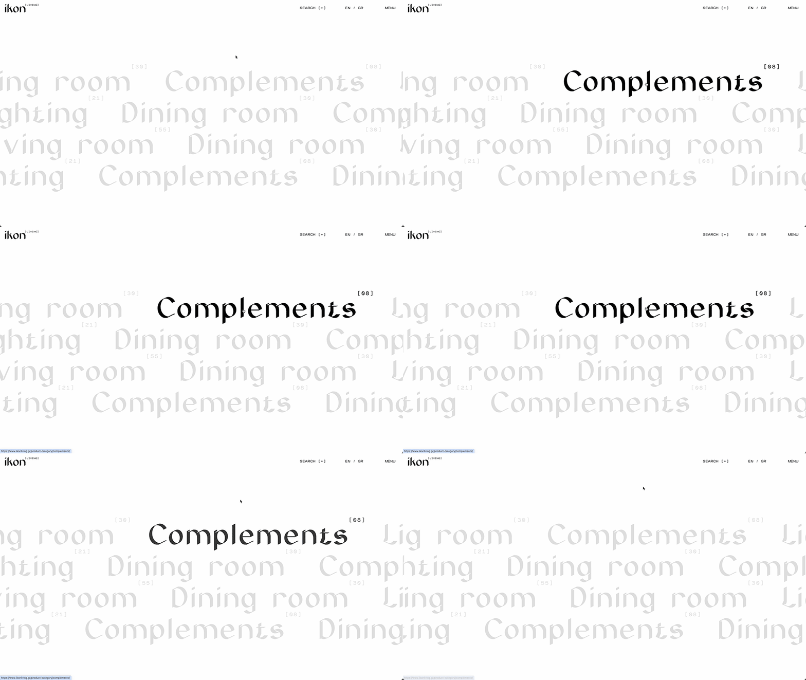
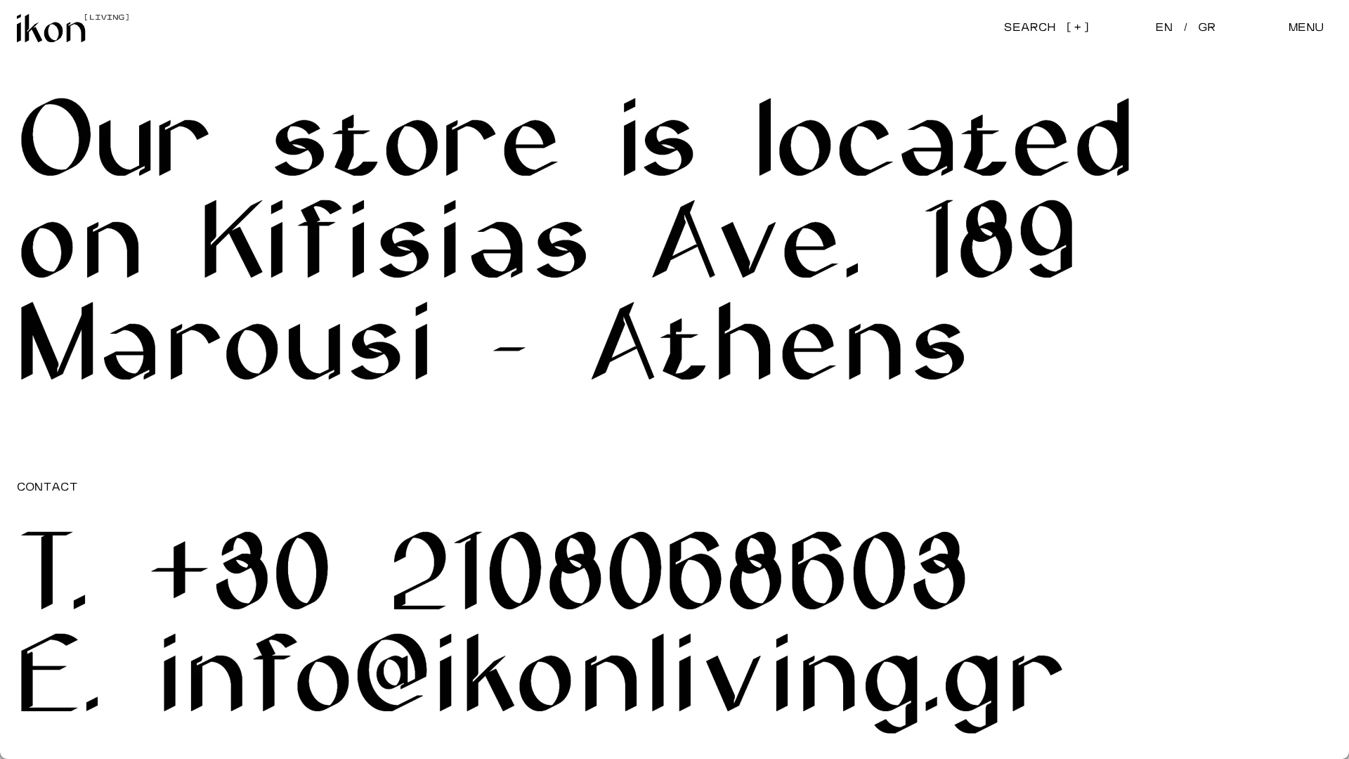
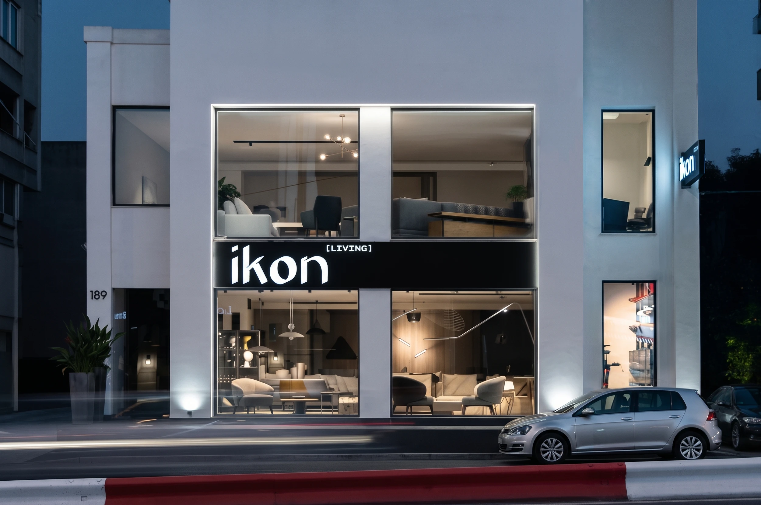
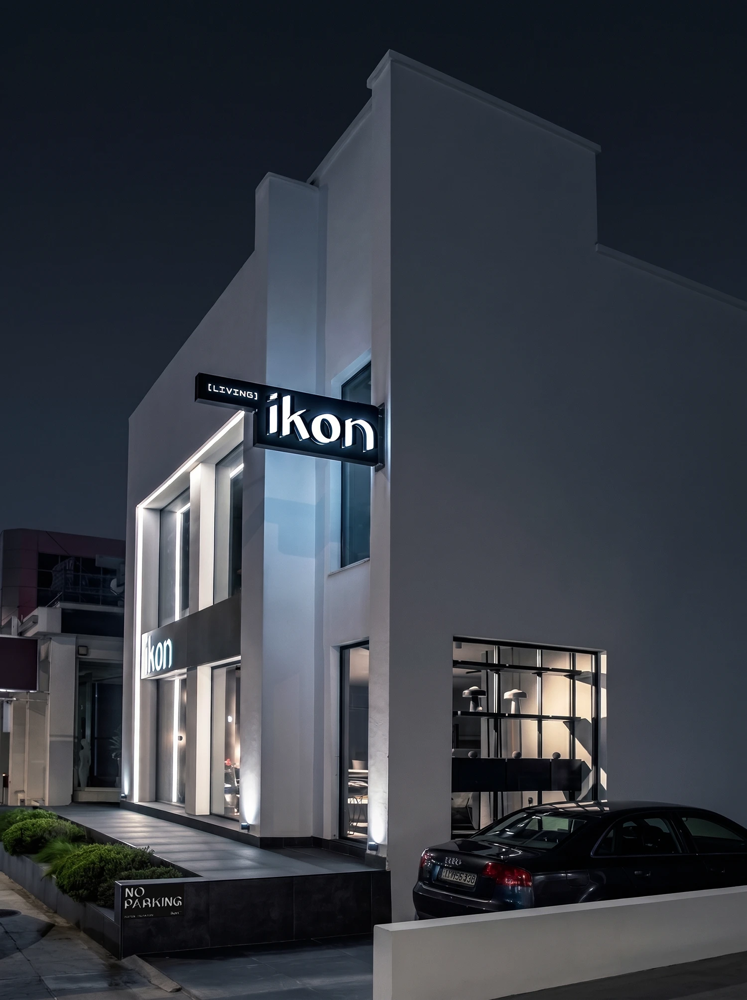
The identity is designed to extend seamlessly across physical and digital applications, establishing a consistent visual language from printed matter and material objects to the brand's digital presence.
Printing: Xenos Printing
Paper Supply: Perrakis Papers
Foil: Foilco
Photography: Konstantinos Gikas