Info
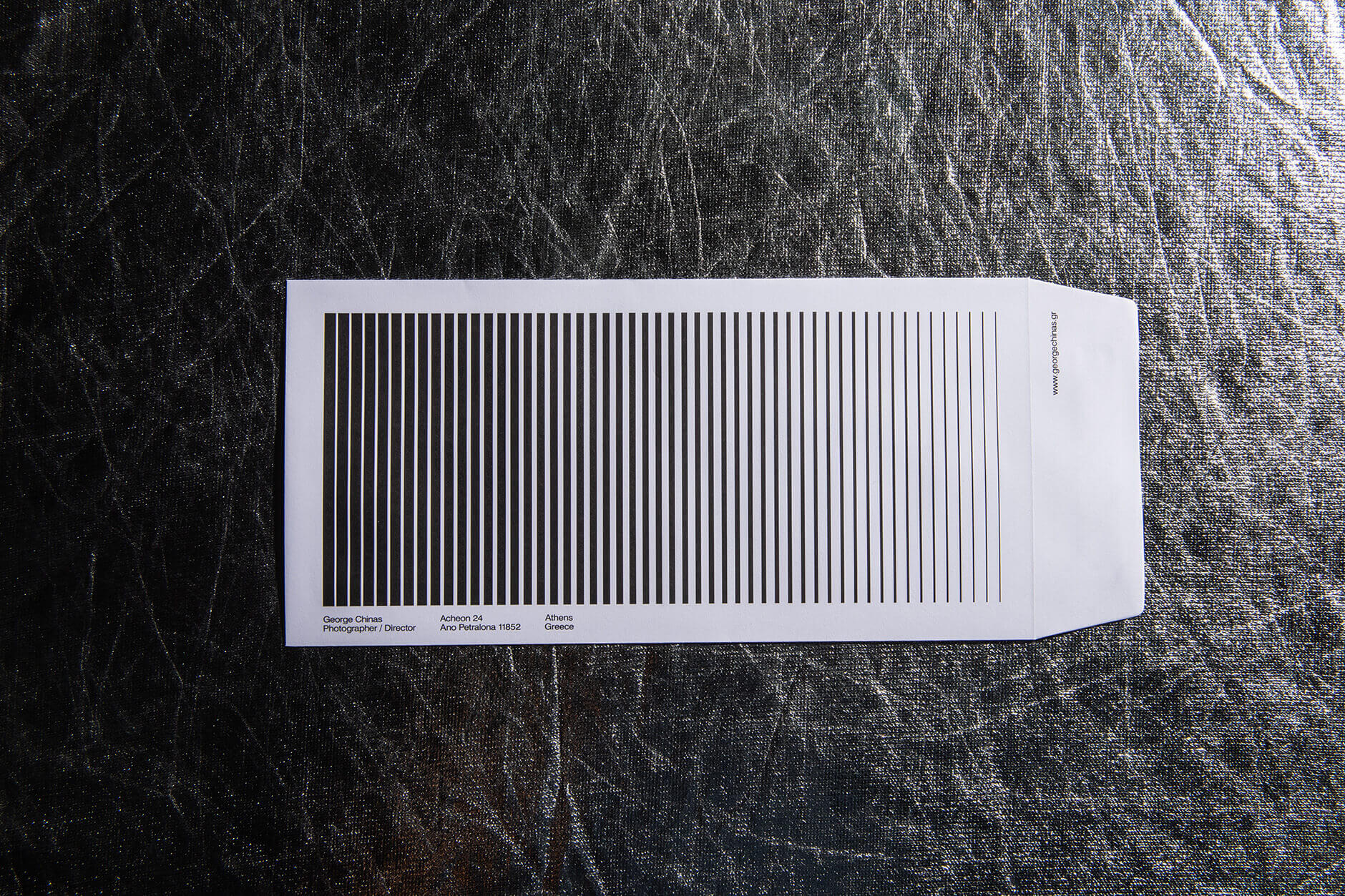
How do you design a corporate identity for a photographer without showing an image? The answer comes from the etymology of the word "photography".
Photography//
the art - science of creating visual images through the capture of light. Etymologically The word "photography" was created from the Greek roots (photos), genitive of phos, "light" and graphe "representation by means of lines" or "drawing", together meaning "drawing with light".
So with the proper layout of black lines on a white background one can create the illusion of tonality, that is, the shades of grey produced by the different qualities of the lines.
In the corporate identity of photographer George Chinas we attributed the intensity of light to progressively thinner lines, this visual effect remains a prime substitute for the image but at the same time gives a vibrant sense of motion.
Another element we adopted from the photography process was the “grey card”, a basic tool for photographers to measure tonality in the frame. We kept the grey colour on the corporate card paper, giving them a dual nature.


