Awards
Adobe Behance
Graphic Design Gallery
Info
Forever Young is a newly established company in the nutritional supplements industry, focused on exporting high-quality products made from Greek ingredients such as olives and grapes.
When commissioned to design the first three packages, we approached the project through the three pillars behind the products: Greek origin, quality and scientific research.
We decided on an exclusively typographic approach to the packaging design, using typography, materials and print finishes to communicate these three principles without relying on illustrative elements.
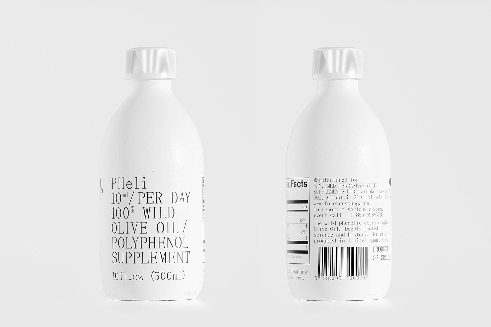
To express the scientific aspect of the products, we selected a serif typeface inspired by classic pharmaceutical labels of the last century. Its restrained character creates a sense of authority and clarity, while presenting the product information and instructions in a direct and accessible way.
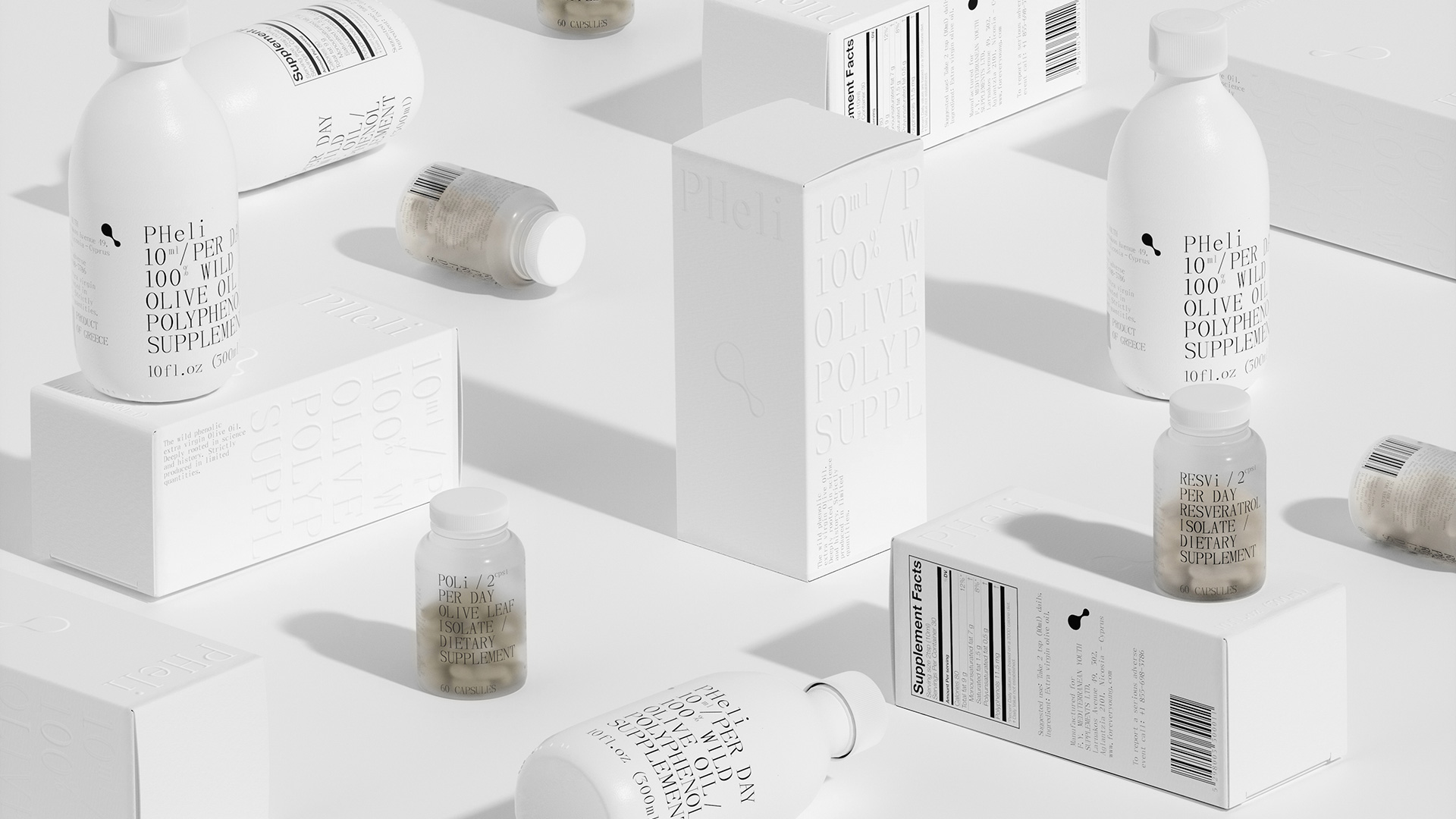
The Greek origin of the products is reflected in the choice of a white 500 ml bottle and a matching white paper box, both recalling the architecture and visual character of the Cycladic islands. Embossed typography on the box creates a subtle interplay of light and shadow, adding depth to the otherwise minimal surface and reinforcing the connection with Greek heritage.
For the two smaller capsule bottles, we developed a more contemporary and minimal aesthetic, reinterpreting references to classical Greece through a modern visual language. The translucent bottles feature a frosted finish that complements the design while giving the packaging a distinct material character.
The three pillars come together through the combination of typography, form, materials and printing techniques. The result is a packaging system designed to communicate quality, scientific research and Greek origin, creating a coherent identity across the product range.
3D Rendering by PStudio