Awards
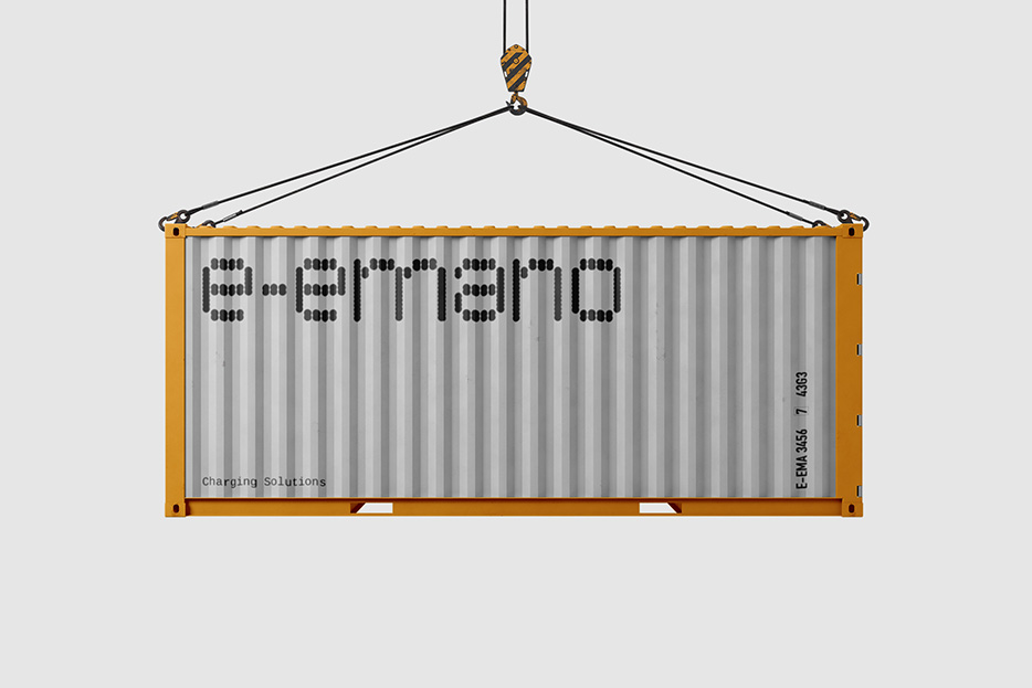
e-emano
Adobe Behance Gallery
Info
e-emano is a brand that believes in sustainable, efficient, and human-friendly electro-mobility solutions.
The firm approached us to develop its logo and brand identity. They had already decided on a name:
emano
: "I flow out; arise or emanate (from)" in Catalan.
Additionally, they added a second "e-" to the beginning to emphasise the product's electro-nature.
Focused on a 30kw DC car charger, it offers fast charging ~100 km of gained range with a 30 minute charge and battery longevity with the lowest noise levels in its class "A", operating below 50 dB, fulfilling the strictest noise emission requirements for urban areas.
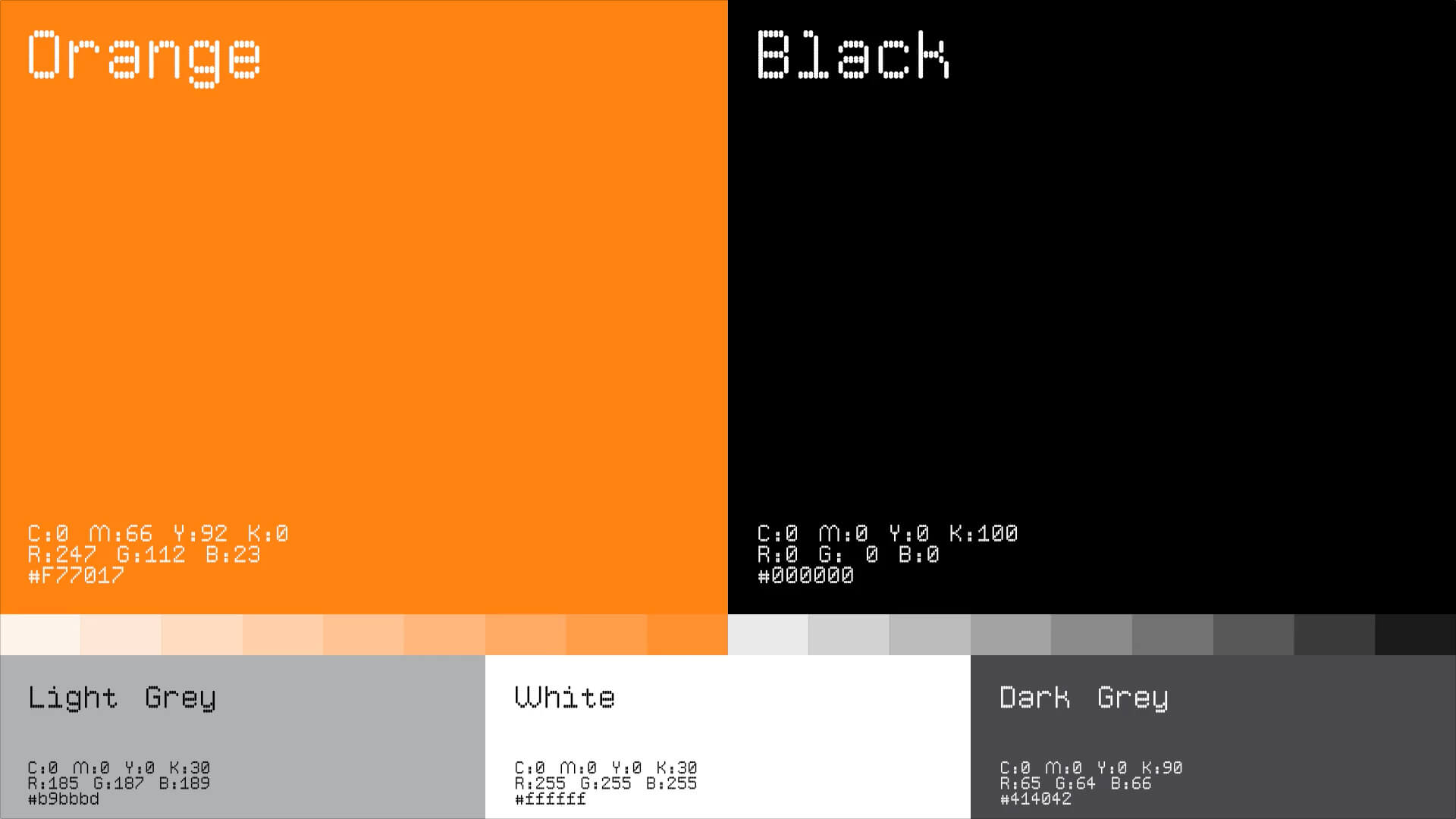
During our research prior to the design process, we were fascinated by the dot matrix fonts and their defects used on many aspects of the charger, such as microchips, cables, motherboards, and so on. These flaws added a very humanistic touch to an otherwise systematic and rigid font.
A dot matrix is a 2-dimensional patterned array, used to represent characters, symbols, and images. Most types of modern technology use dot matrices for the display of information, including mobile phones, televisions, and printers.
We chose to create our own dot matrix typeface as their brand logotype since it is a design feature that flows from the interior to the exterior of the product. We also duplicated it to match with the repeated letter "e" in the name e-emano and give it the imperfect, humanistic feeling we were going for.


