Info
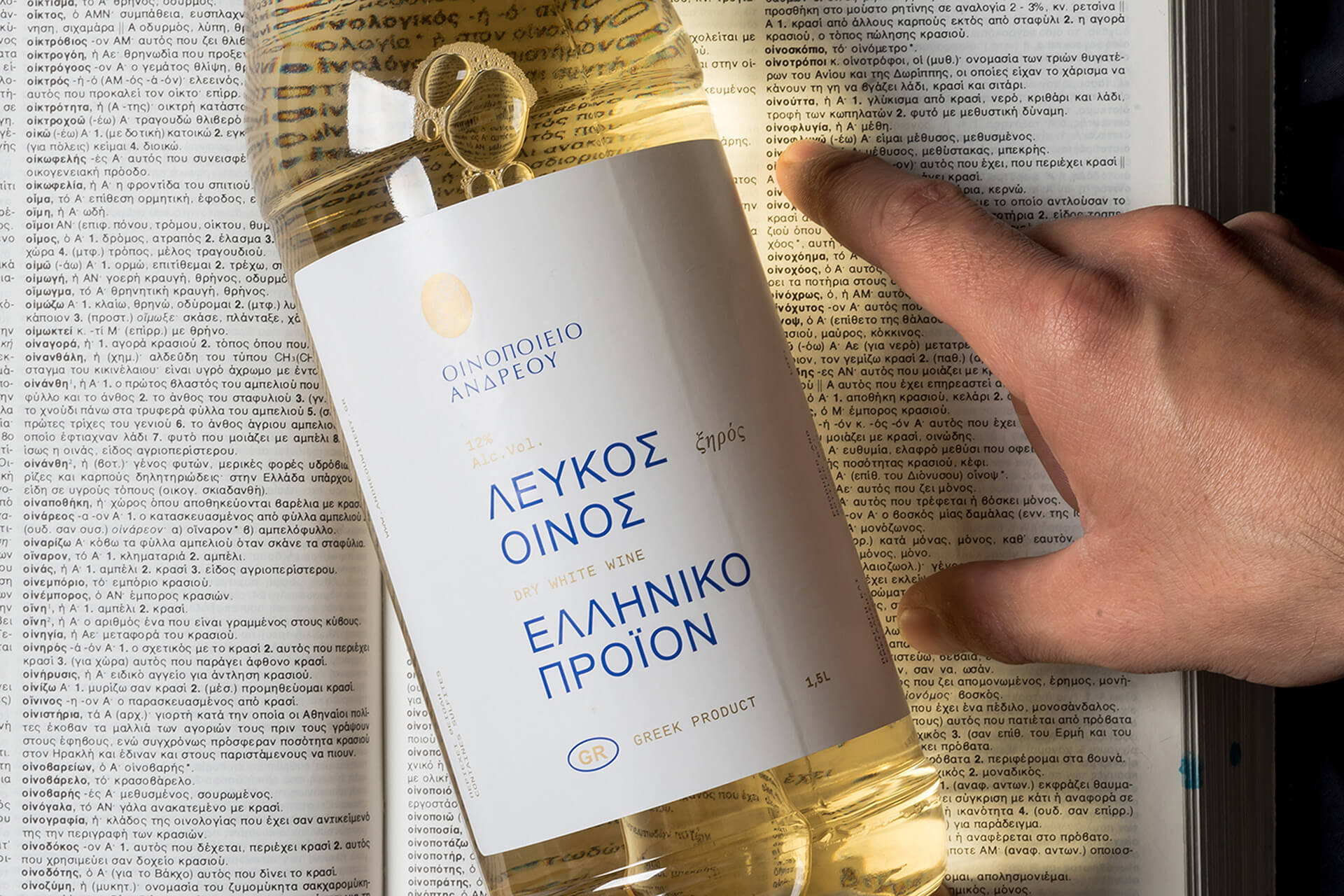
Andreou winery commissioned us to design their very first product, an entry level wine which includes a red and white wine variety that will be sold in local taverns. Their request was very clear, “We want a simple label for our entry level wine, no fancy stuff.” “AMEN”, we said, and design.
Our design approach here was based on the concept of a “dictionary”. We wanted to communicate the basic info and values this wine has, like a dictionary informs you about a word. No fancy printing techniques or sophisticated wine papers. Straightforward typography that serves its purpose with some of the most democratic, simple and easy to find fonts out there, Arial, Times New Roman and Cousine, something like their wines, simple, affordable and easy to find.
The outcome of course comes in contrast with the folk - traditional and sometimes overwhelming decoration these taverns have and it was something we wanted to highlight through are photoshoot.


