Info
ARCHON, as its members are proud, is the first Pansexual Radical Group in Greece.The aim of the group is to create a community free from taboos and prejudices, but full of understanding, acceptance and a mood for fun. Wanting the team of ARCHON, to show to the public all the above but also to raise awareness regarding the environment or society, to inform about public benefit actions that they carry out such as reforestation, blood donation, etc. and to show the world to cultural events and parties they organise, they decided they needed a website.
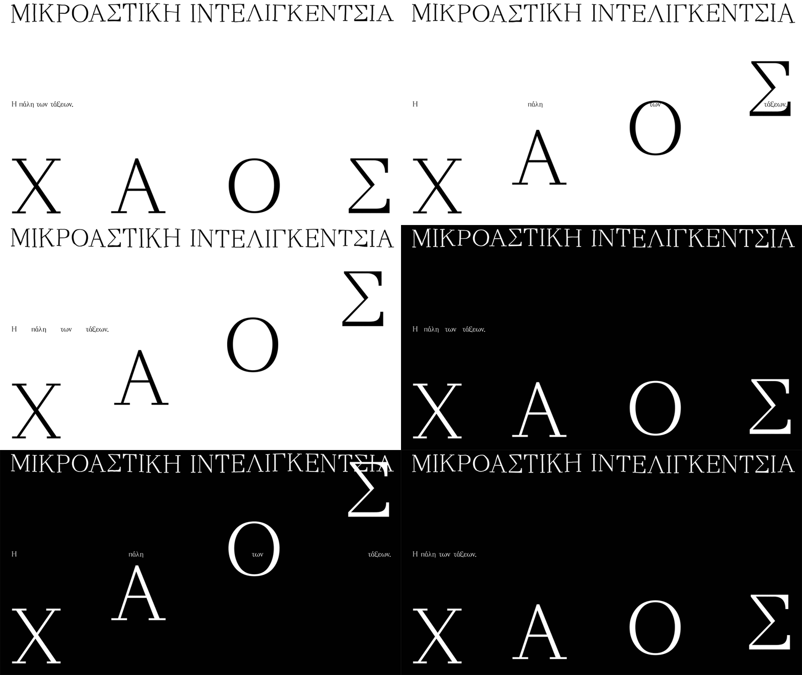
The two issues raised by our first meeting were, first, how the group`s pan-sexual identity would be reflected in a corporate identity, and second, the group structure is inspired by that of the ships, for example the captain is the leader, they follow. Captain No2, the crew, etc., so this naval element had to be seen without becoming descriptive and cult. We found the solution and the balance in terms of design through many small details. Researching the typography in the names of the ships, we noticed that we could categorise them typically according to the type of each vessel. For example, on cruise ships we have more often encountered fonts with serifs, in tankers bold fonts without serifs, on warships stencil fonts, on fishing boats more handmade and so on.
So, we took graphic characters from each category and put them together in an unrelated way, yet the big picture looks complete. For the same reason, in the design of the website, we used two different fonts that both refer to those found on ships. In fact, one of the two is the Sanskrit Ume, which we Hellenised for the sake of the website. Additional water elements are the filters in the images, reminiscent of the calm waters when ships cross them and leave behind water.
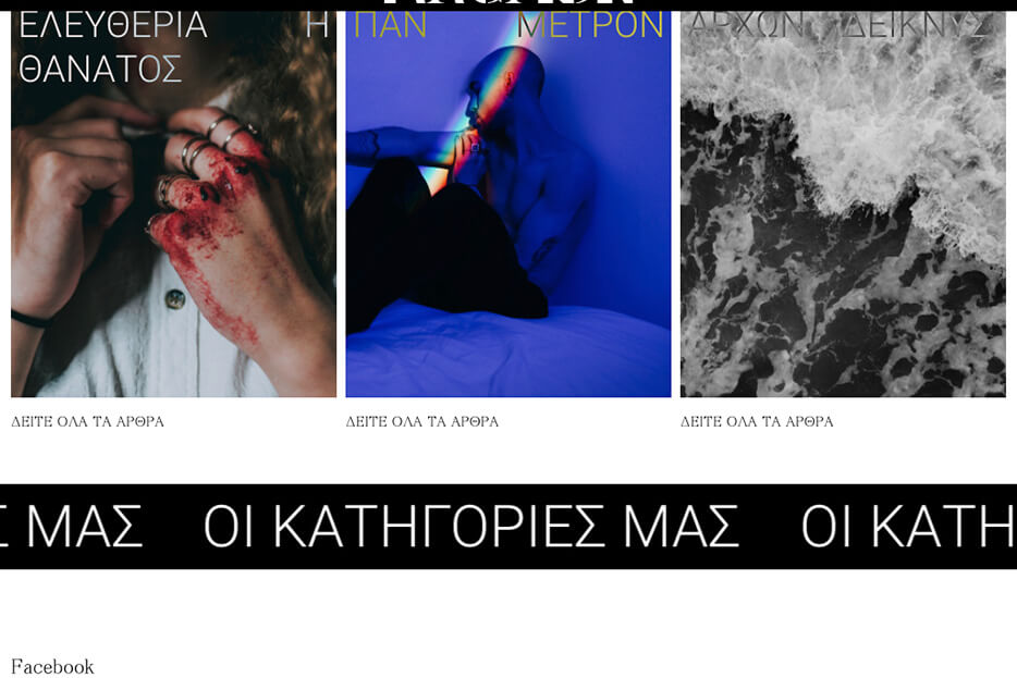
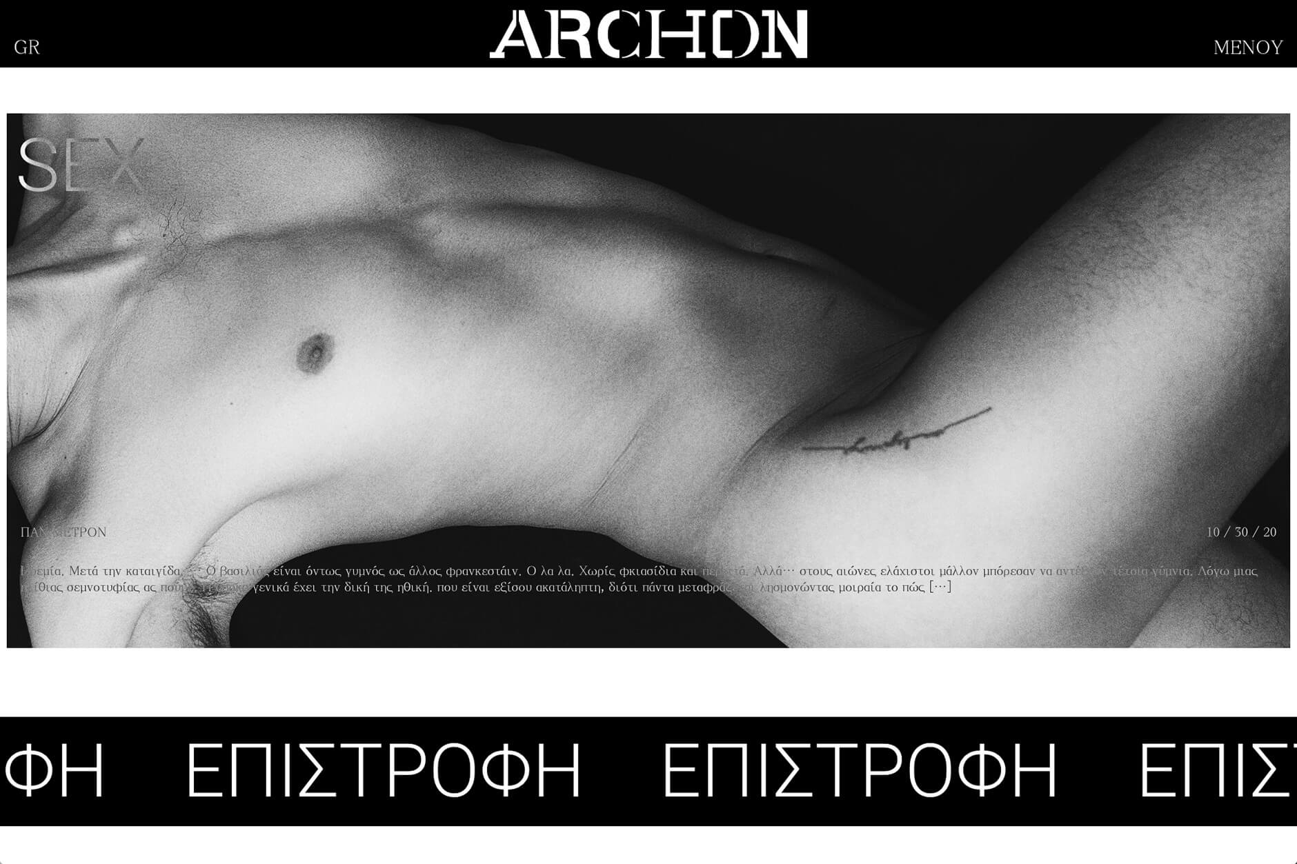
The structure of the website was based on the logic of daily information, where the newest article is met by the reader first and with a big picture, while the older are smaller.
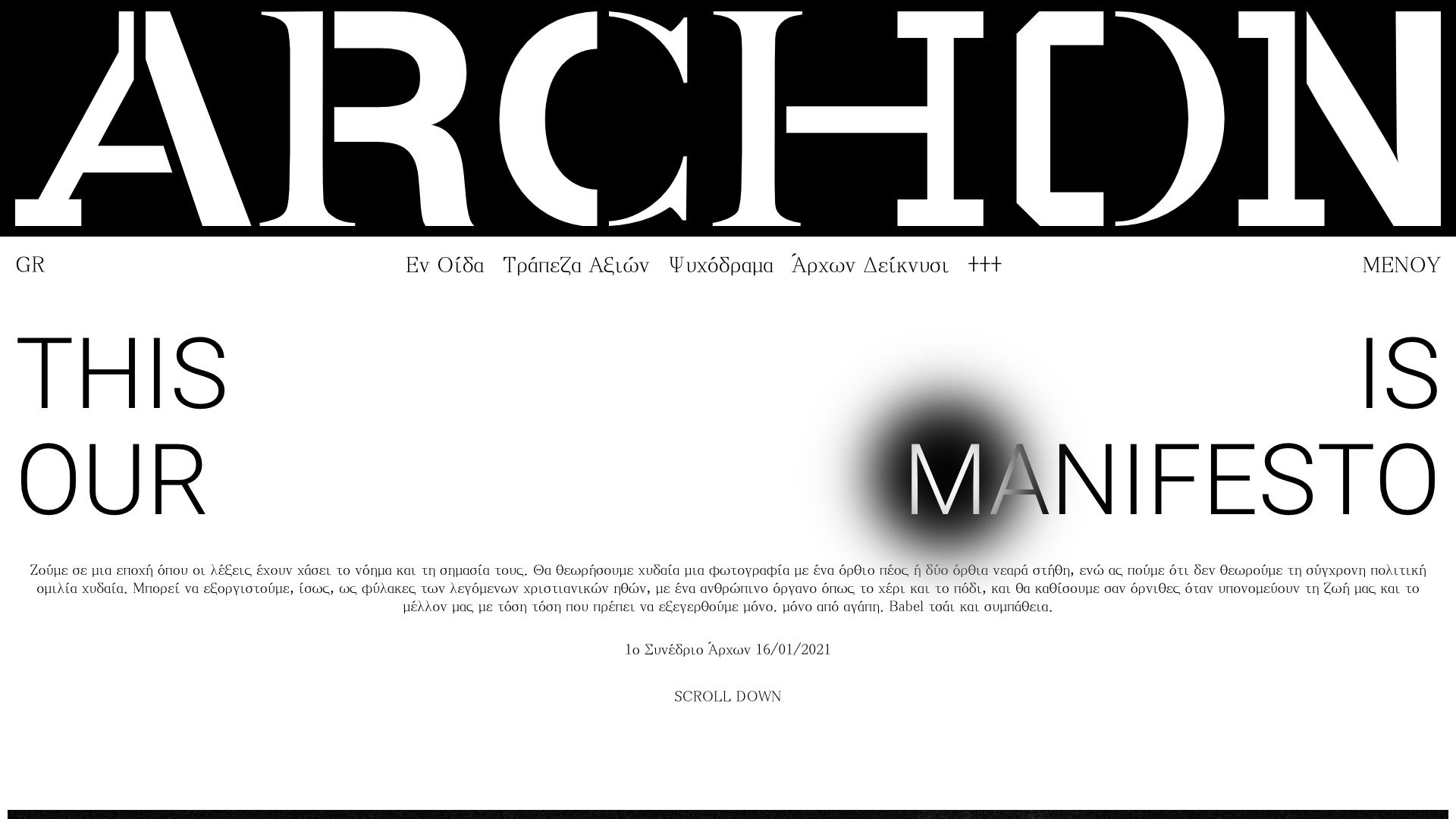
On the home page, the visitor is shocked by the large logo of ARCHON which occupies the top of the page from one side to the other, in this way we highlighted the strong character of the group, bellow follows their manifesto, in which the title is in full alignment to emphasise that the community is made up of people from the full range of legitimate sexual preferences, with respect for each other and we continued this logic in the other titles of the website.Finally, we set the cursor to be followed by a burn on the screen, such as the warm imprint that leaves a touch on an other body.


