Info
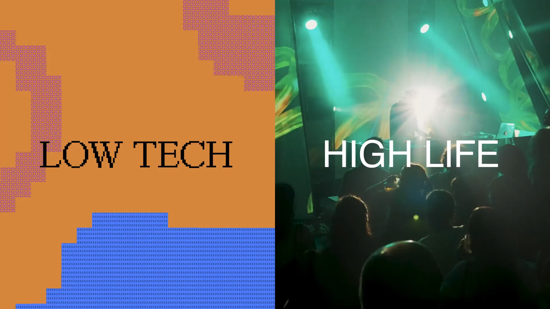
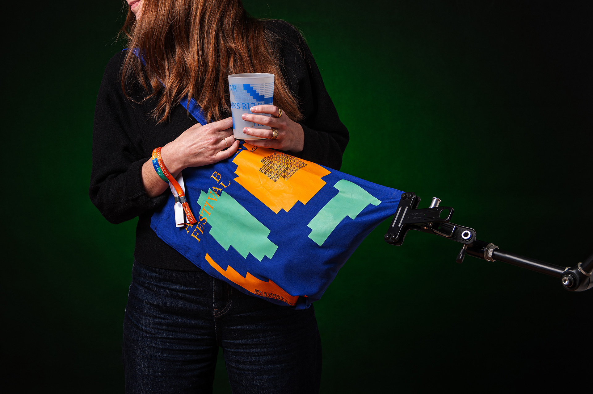
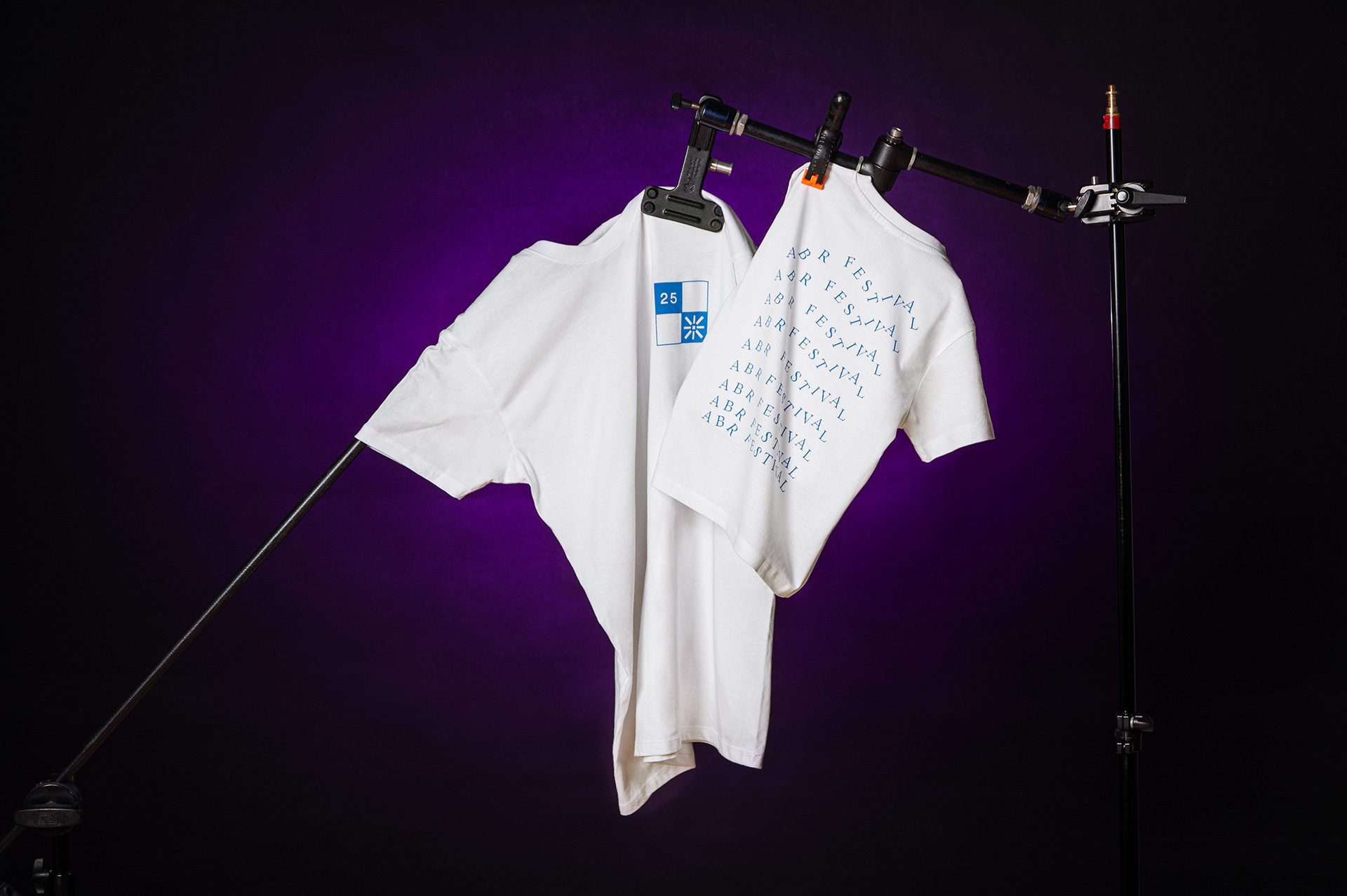
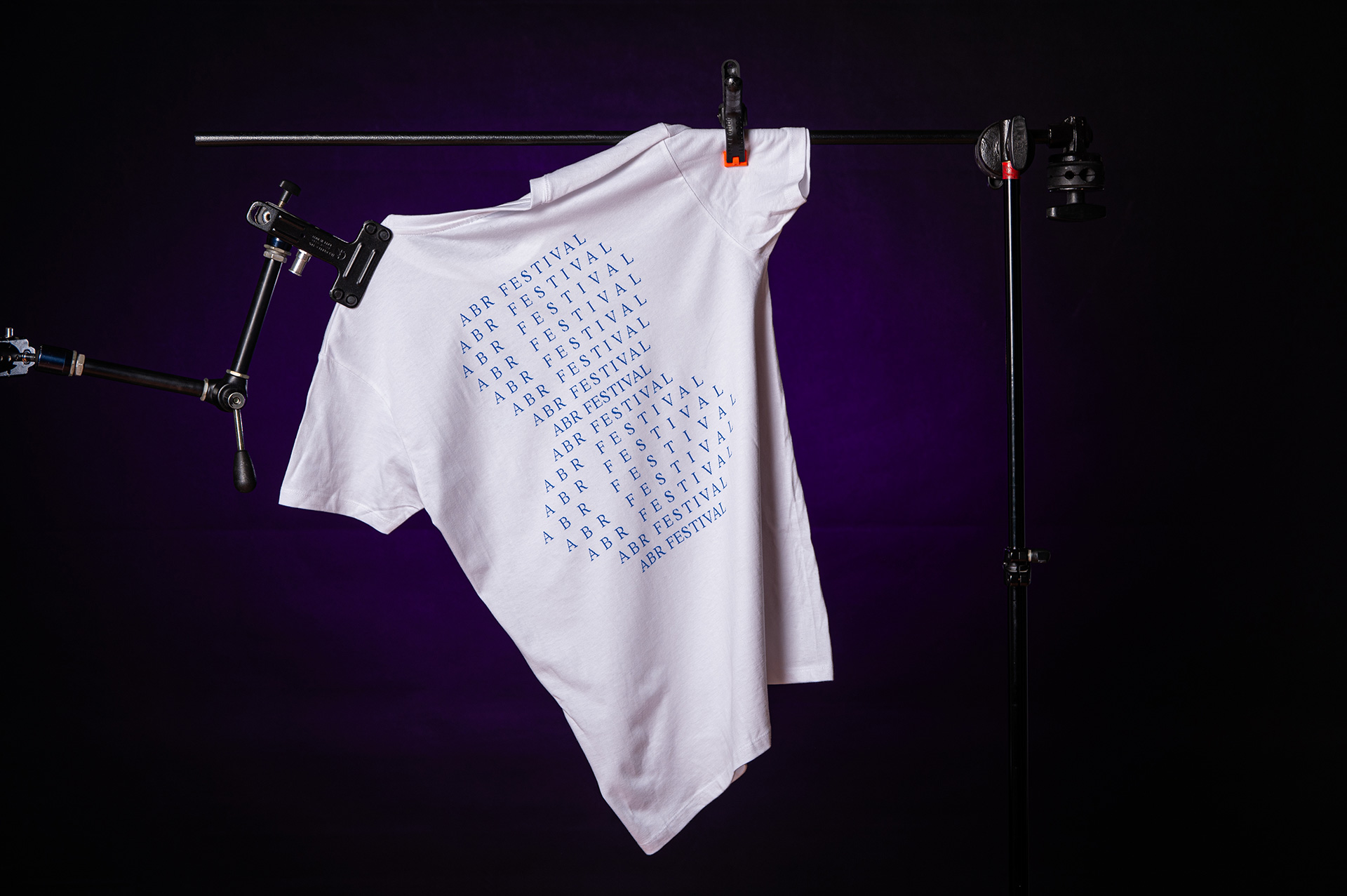
ABR Festival is built around a modular, motion-first identity that explores the contrast between Low Tech and High Life. Through a system that combines a custom pixelated typeface with the clarity of Helvetica, and a dynamic visual language generated through code, the project creates a flexible yet distinctive experience across print and digital. The result is a cohesive identity that reflects the festival’s multicultural character and the coexistence of different sounds, rhythms, and audiences.
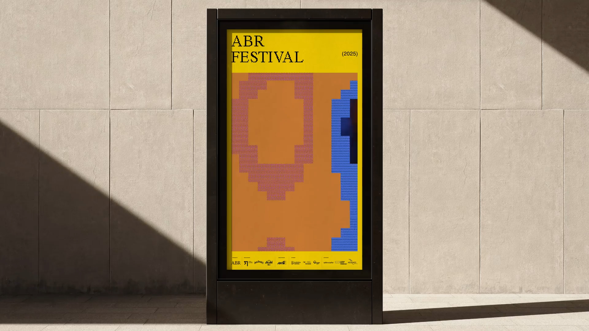
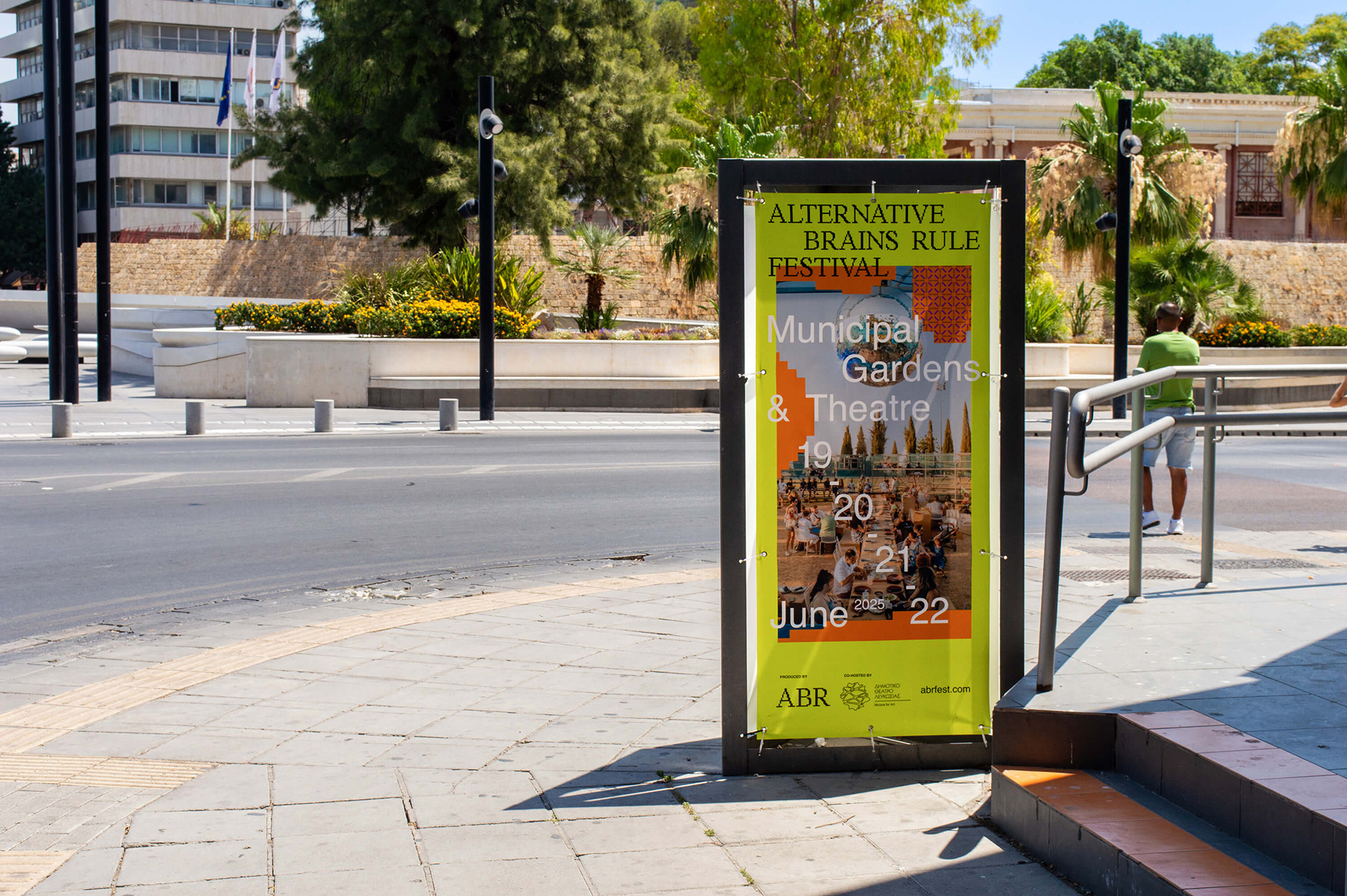
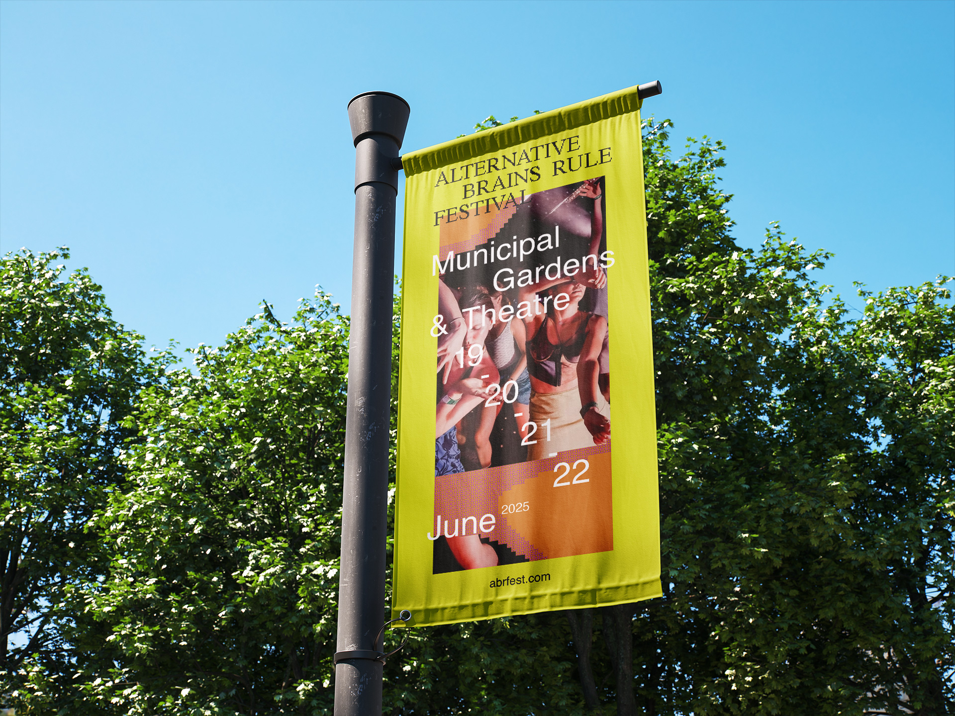
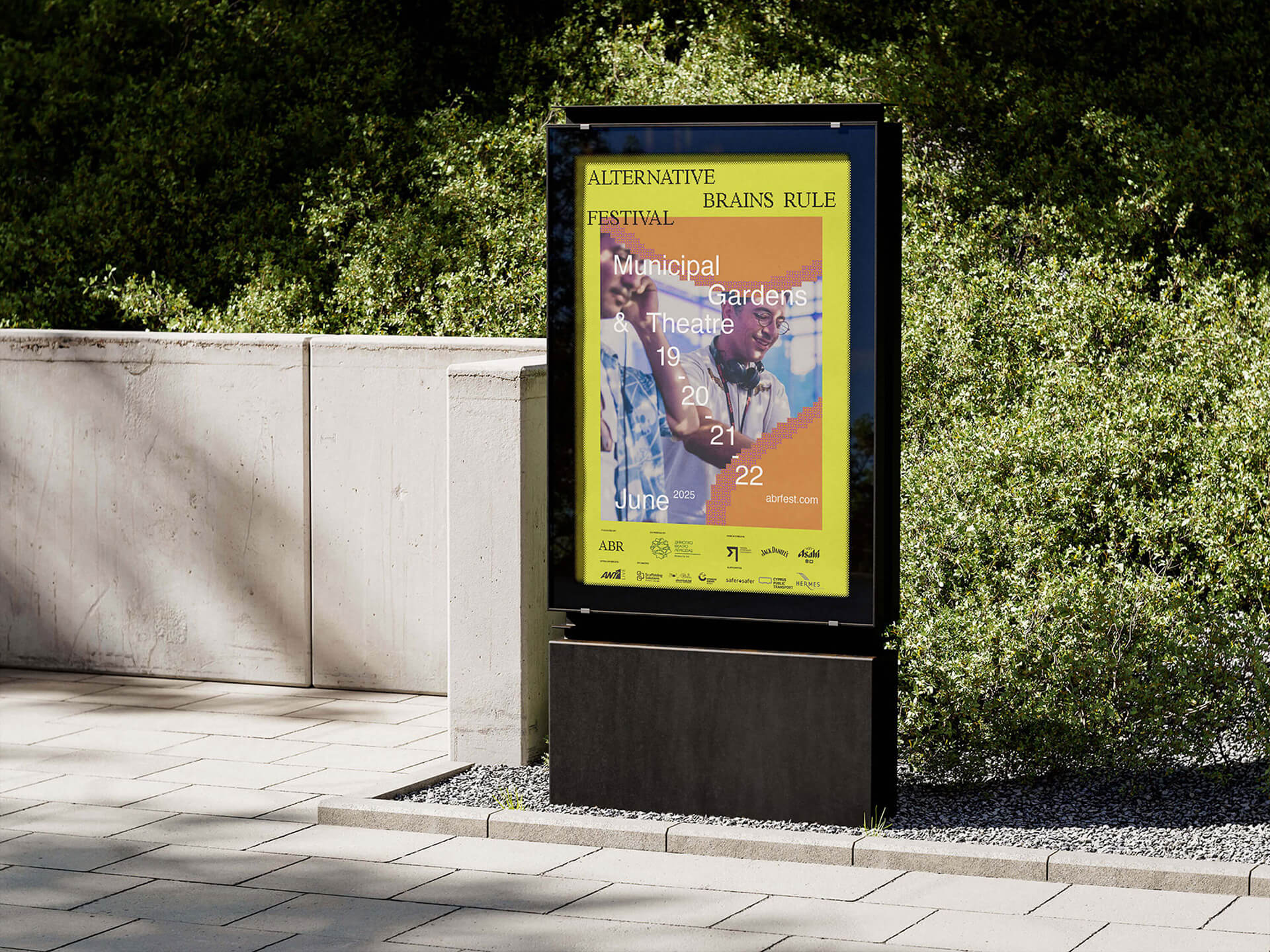
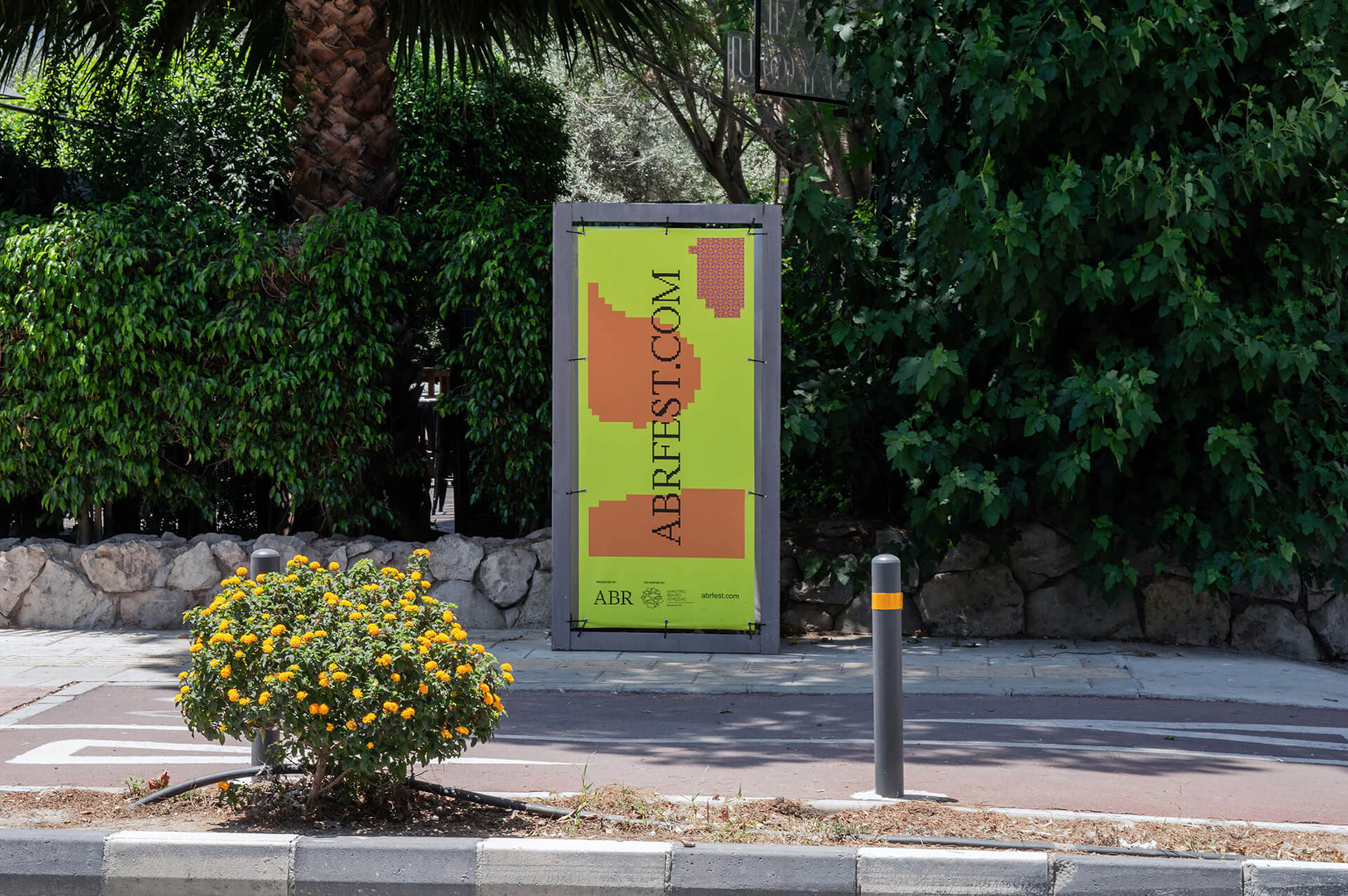
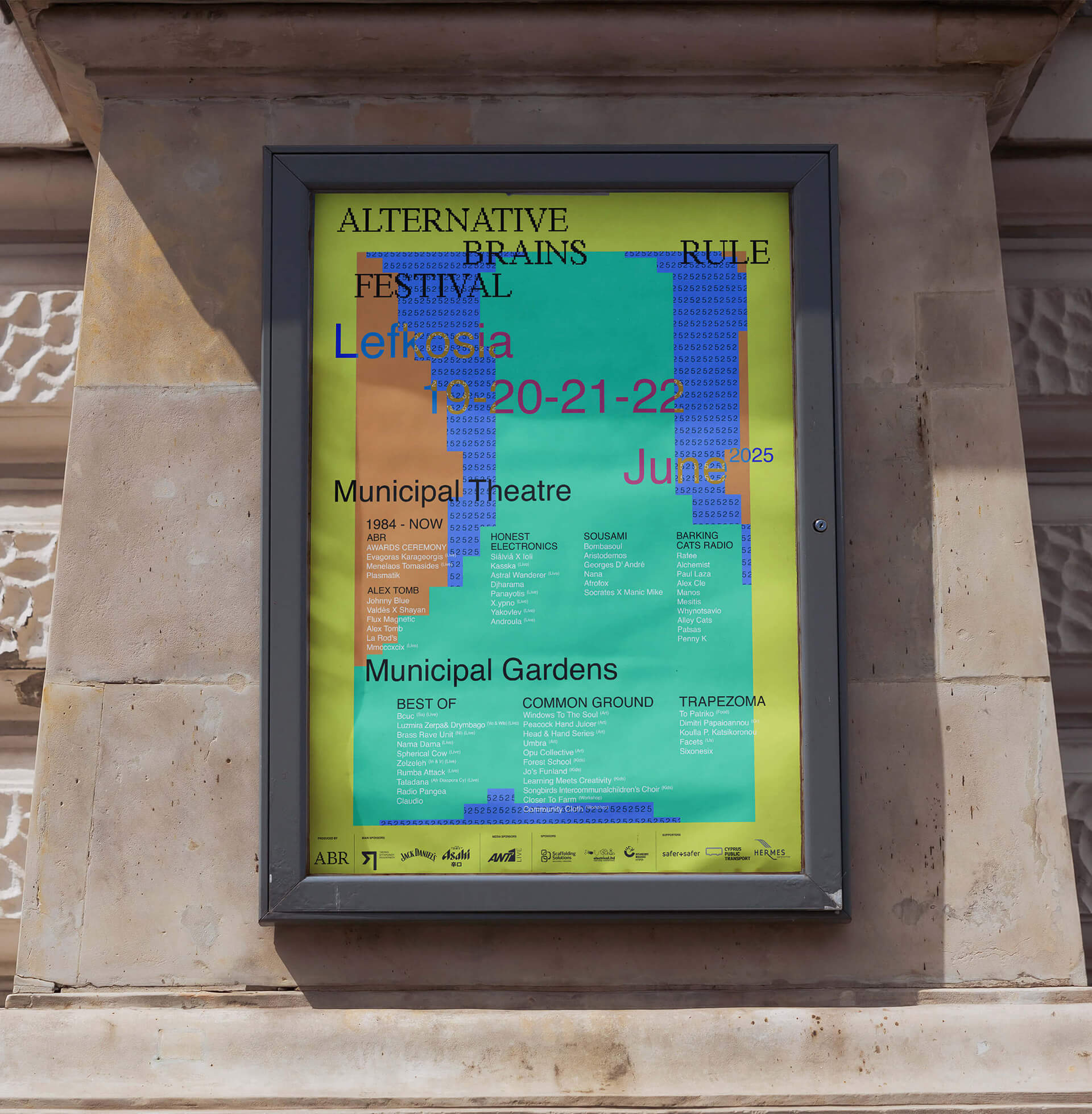
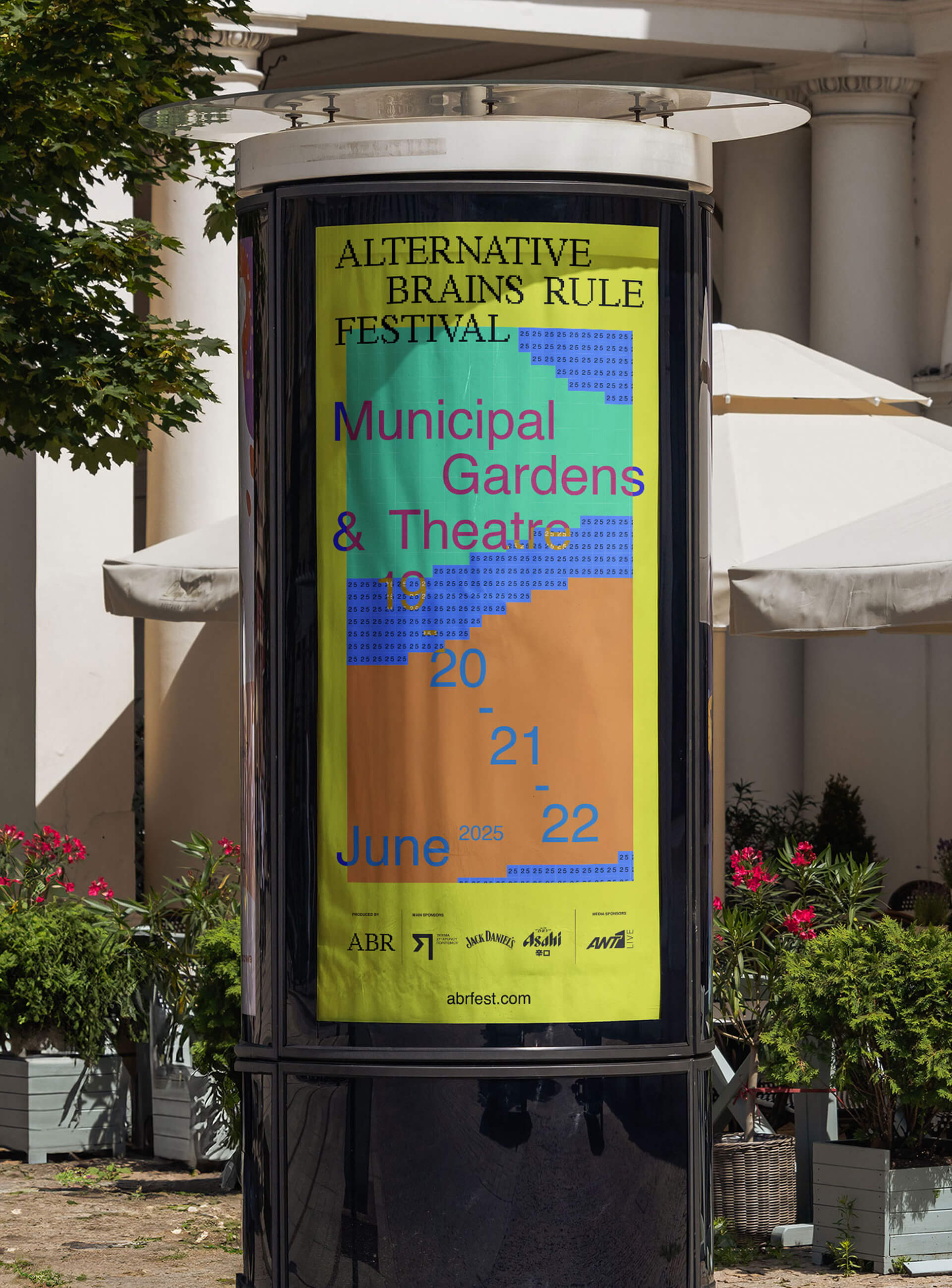
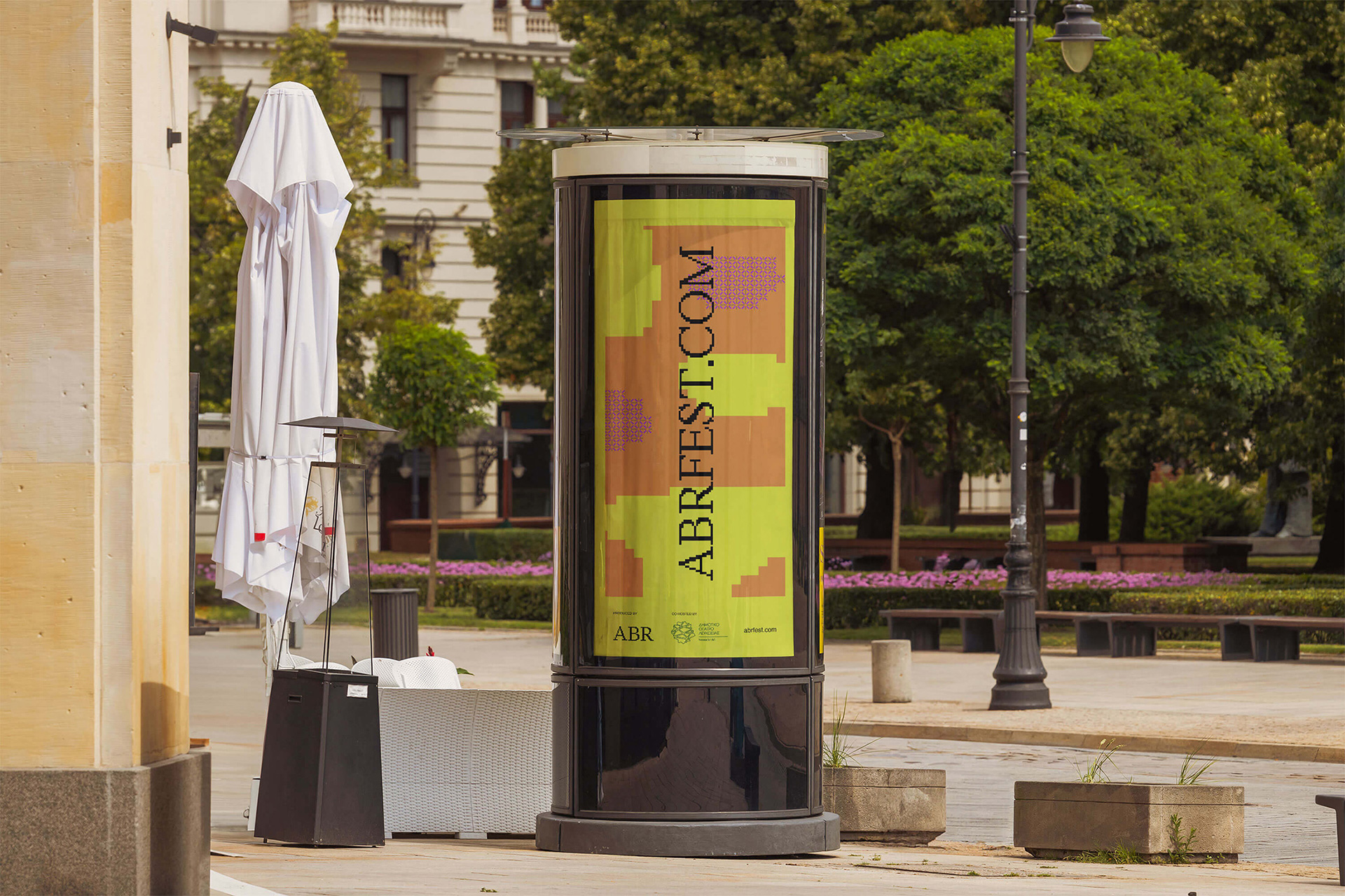
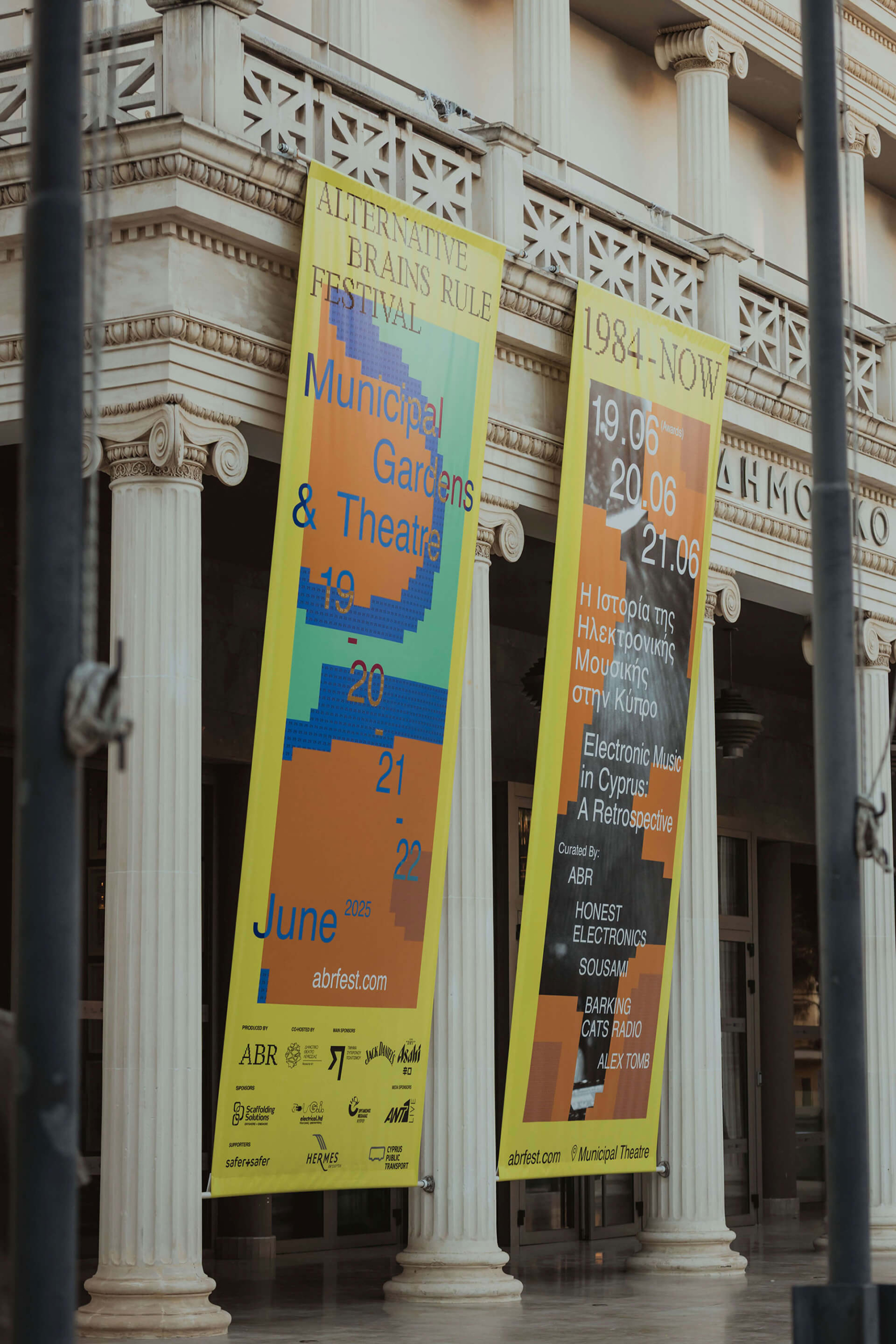
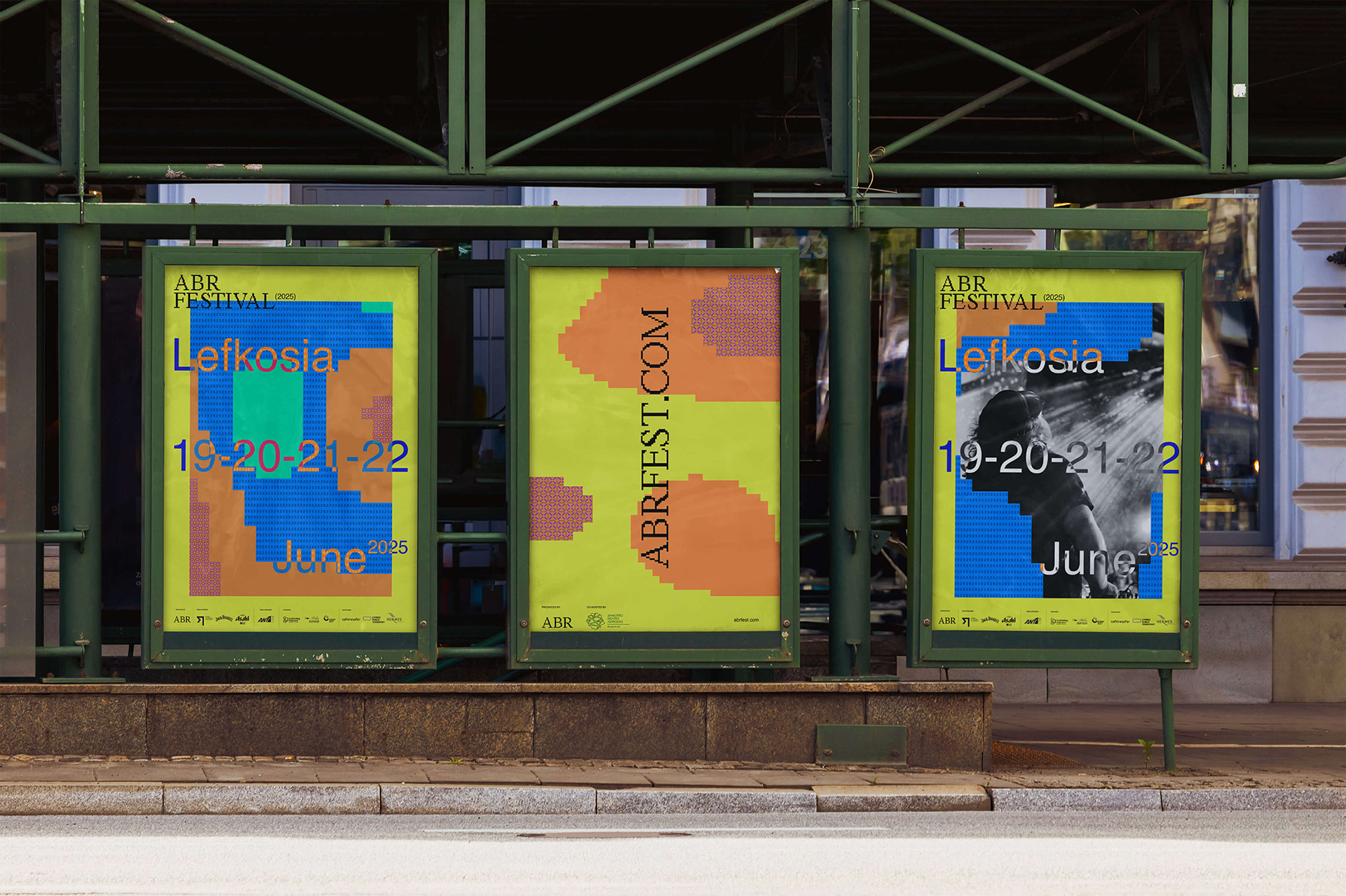
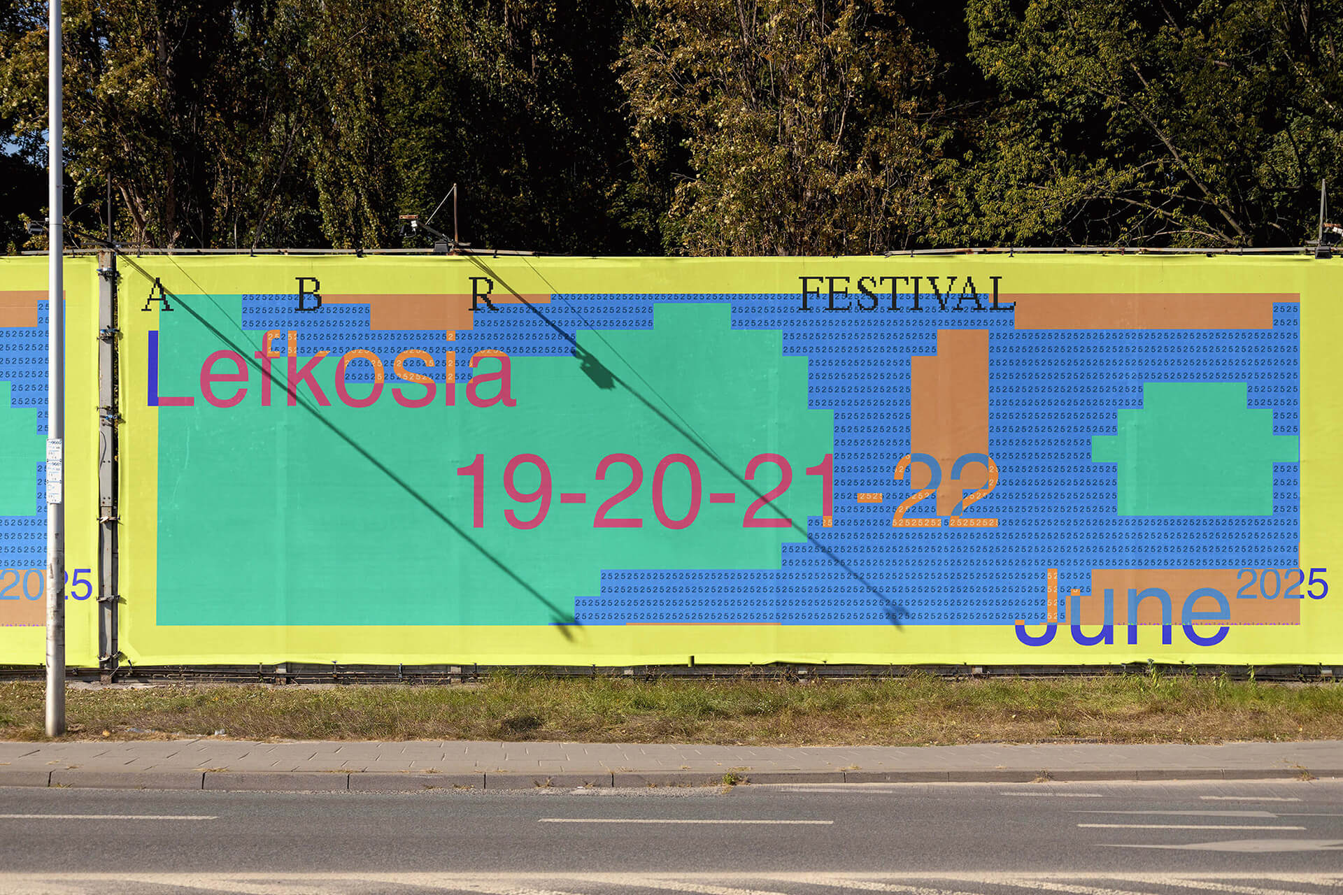
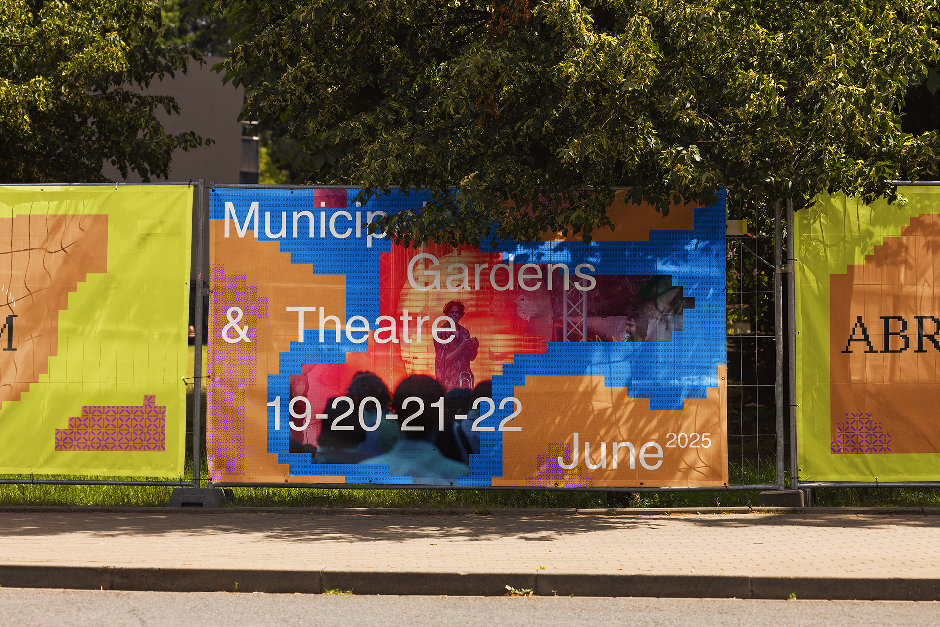
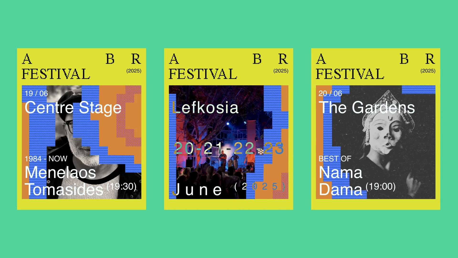
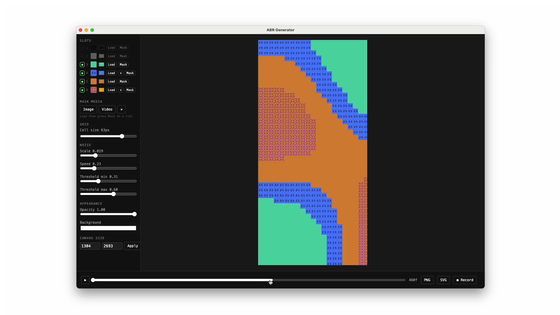
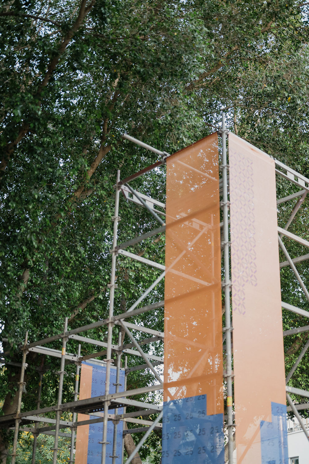
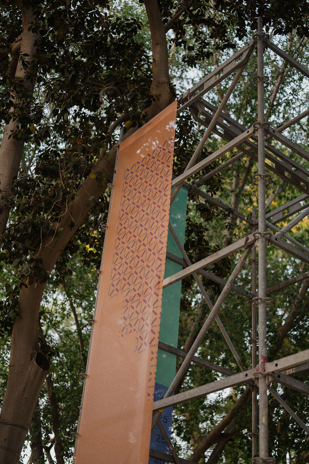
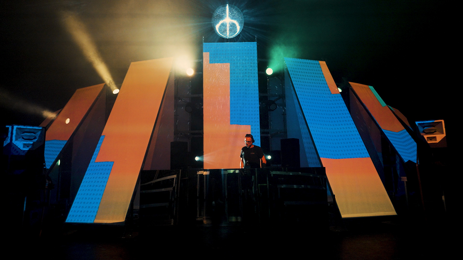
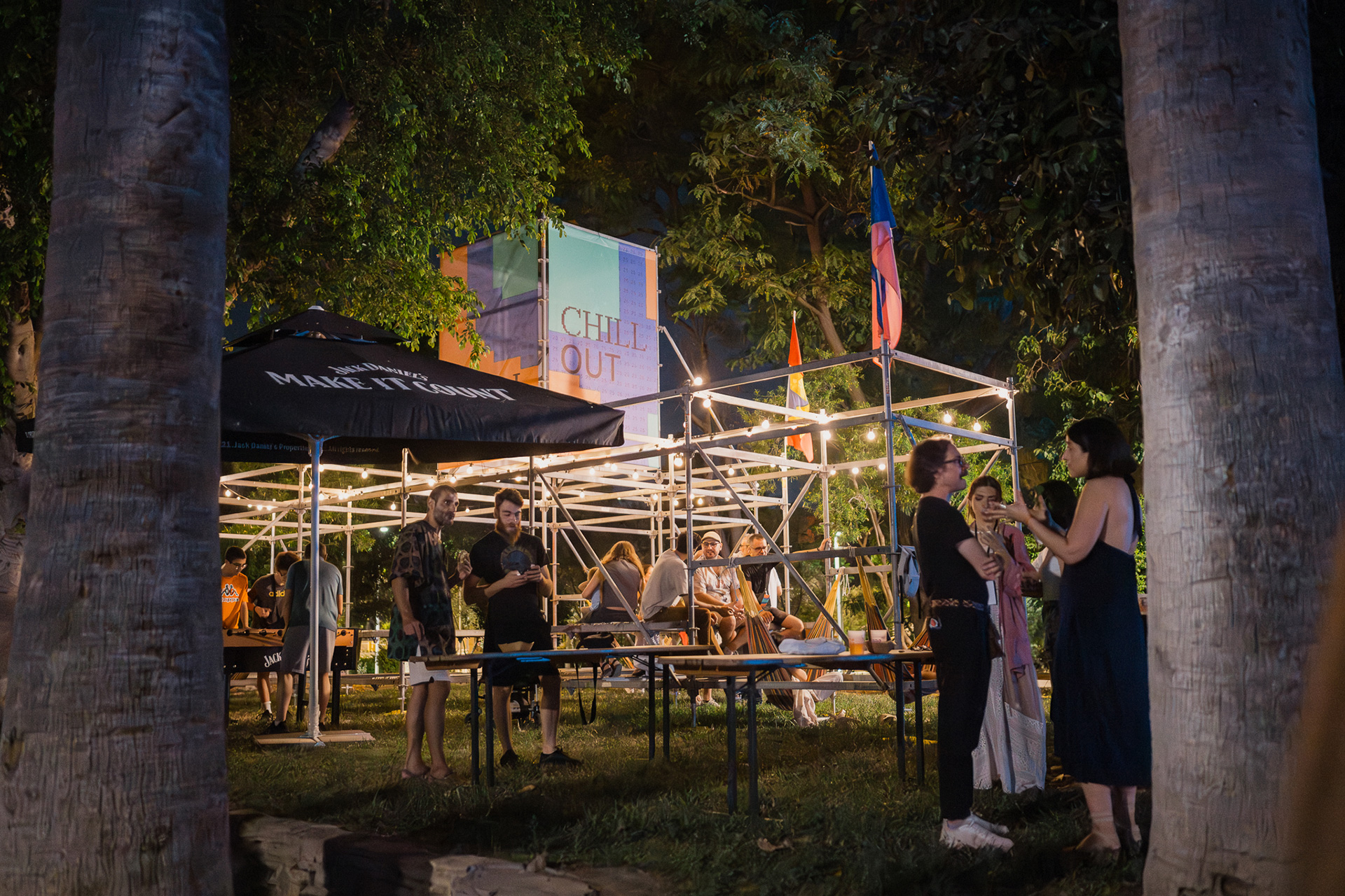
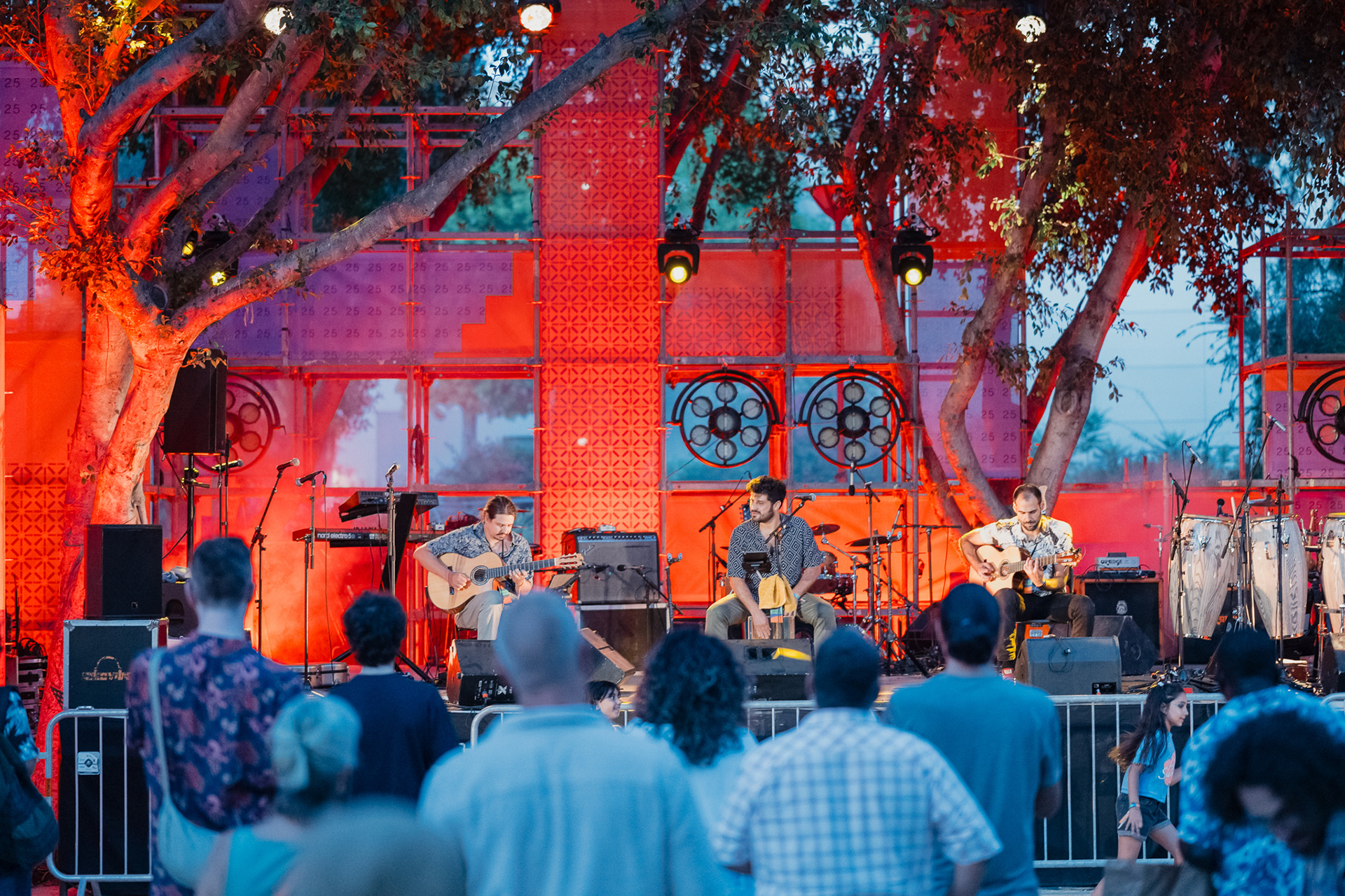
The ABR Festival posters extend the festival’s modular, motion-first identity into the print space. Each background is generated through Processing (Java), producing unique snapshots from the animated pattern originally designed for the digital identity. Typography is limited to Helvetica, while the logo remains in the custom pixelated typeface. This contrast reinforces the “Low Tech – High Life” concept. Each poster is not merely a communication tool, but a unique moment within the visual system—a static outcome of the festival’s kinetic, dynamic identity. It can expand across social media, merchandise, and stage elements, maintaining strong recognizability and the intensity of the modular pattern.
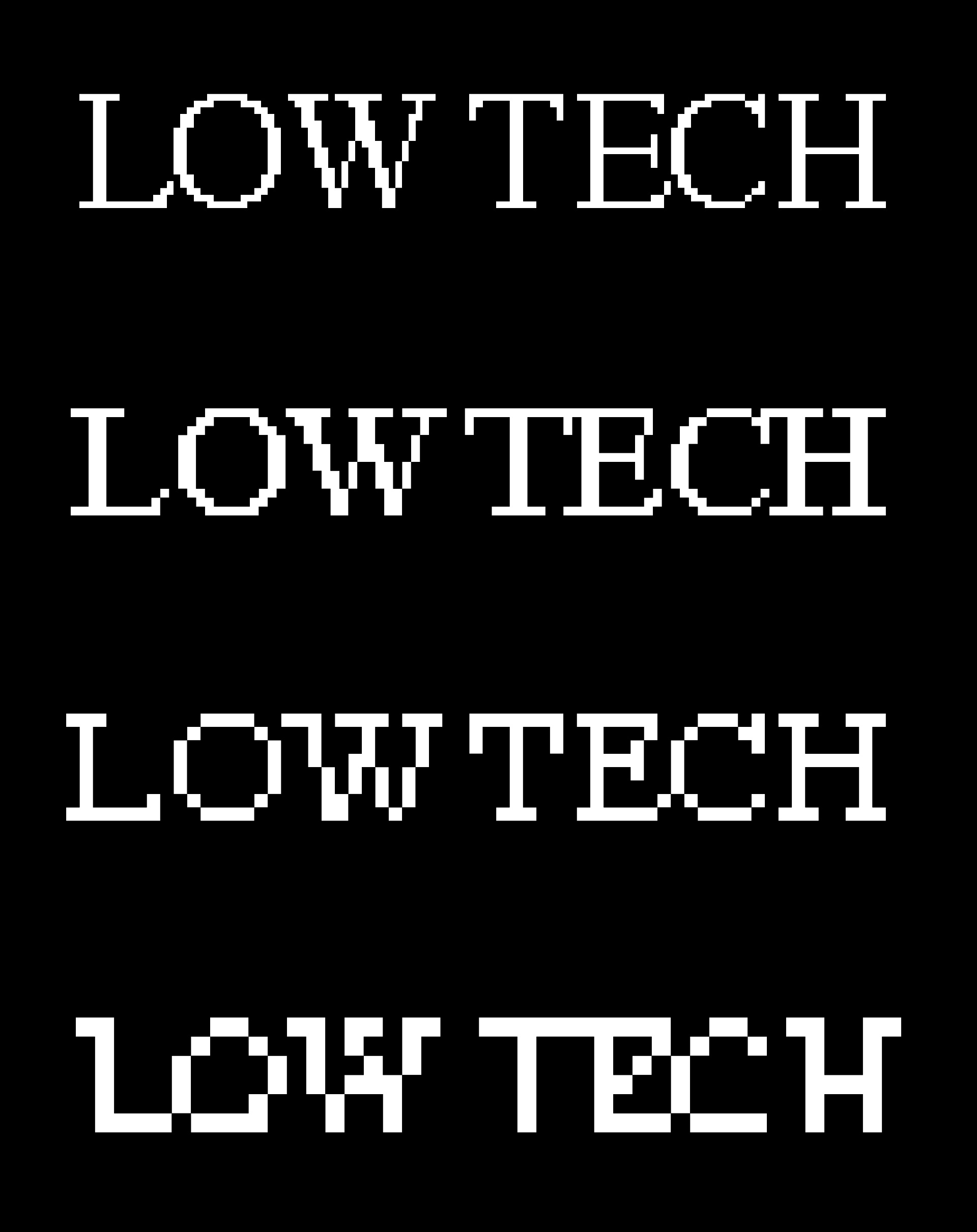
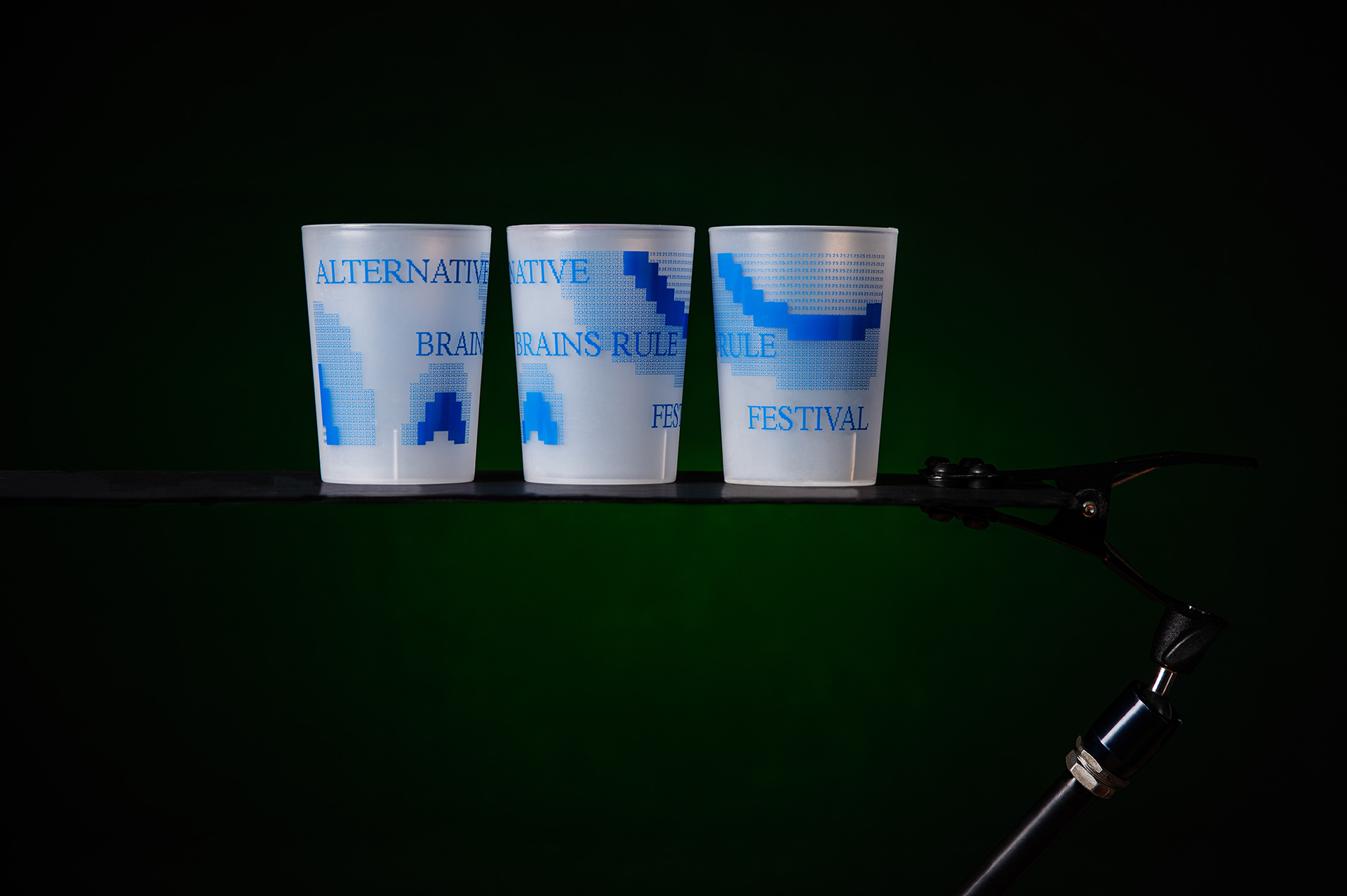
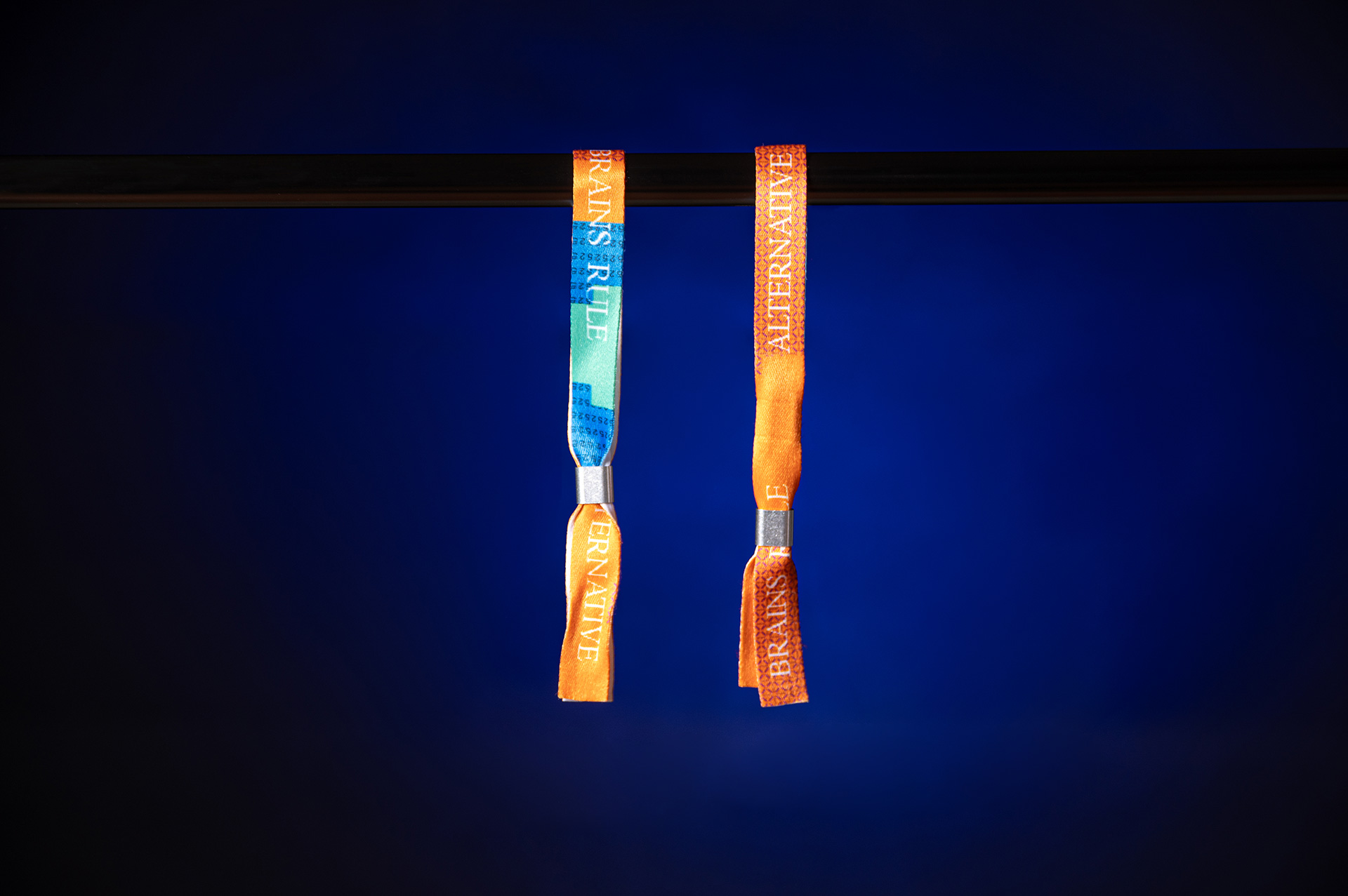
Low Tech is expressed through a custom pixelated typeface, where typography itself becomes a tool for deconstruction and reconstruction, reflecting the need to disconnect from the fast pace of modern life.
High Life is represented by Helvetica, carrying the clarity, precision, and timeless character of Swiss Design. The coexistence of these two worlds creates a creative tension, just as different music genres, cultures, and people coexist within the festival.
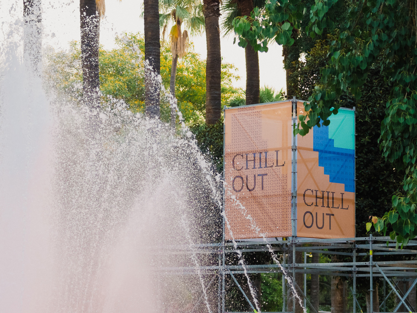
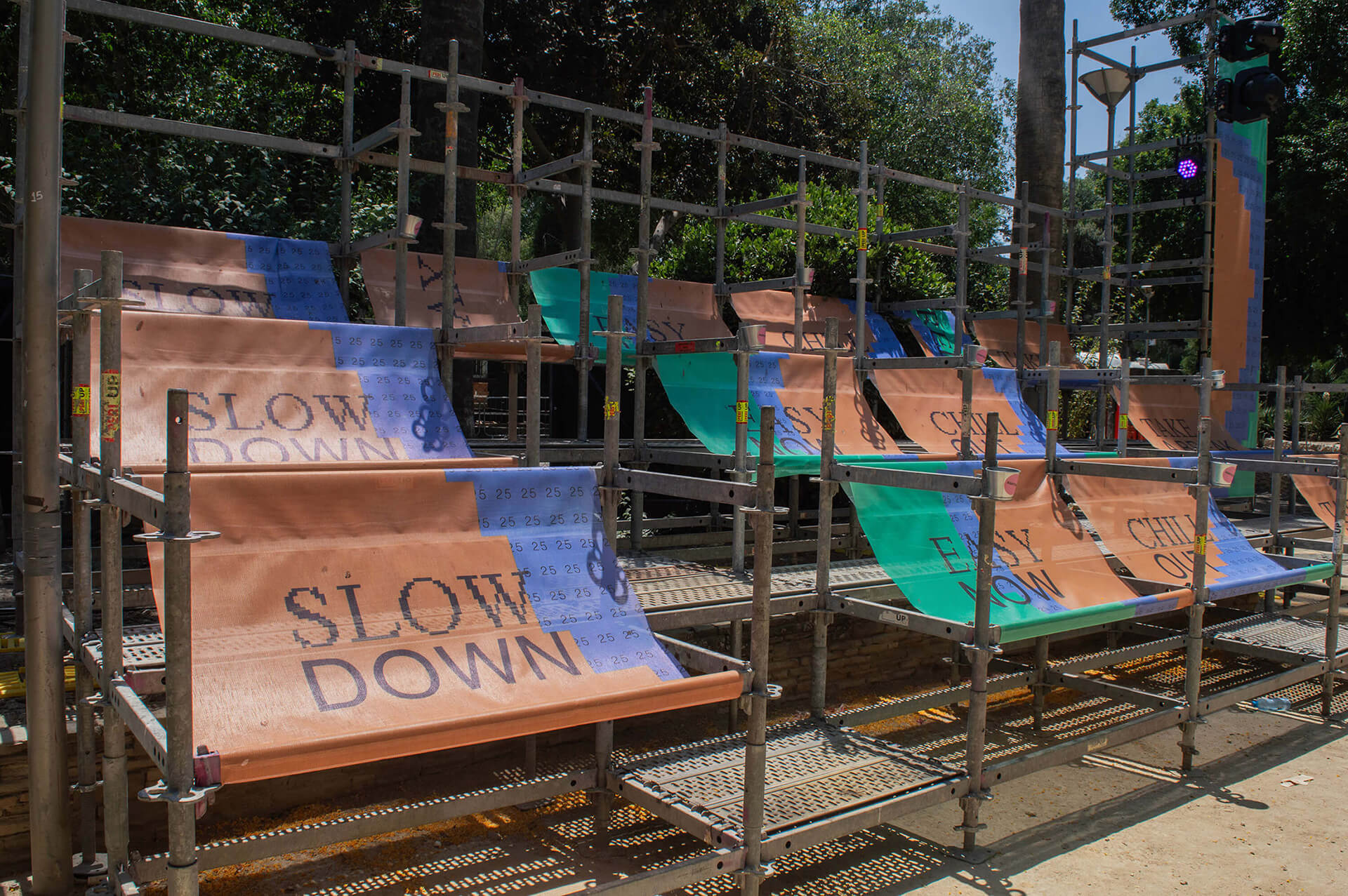
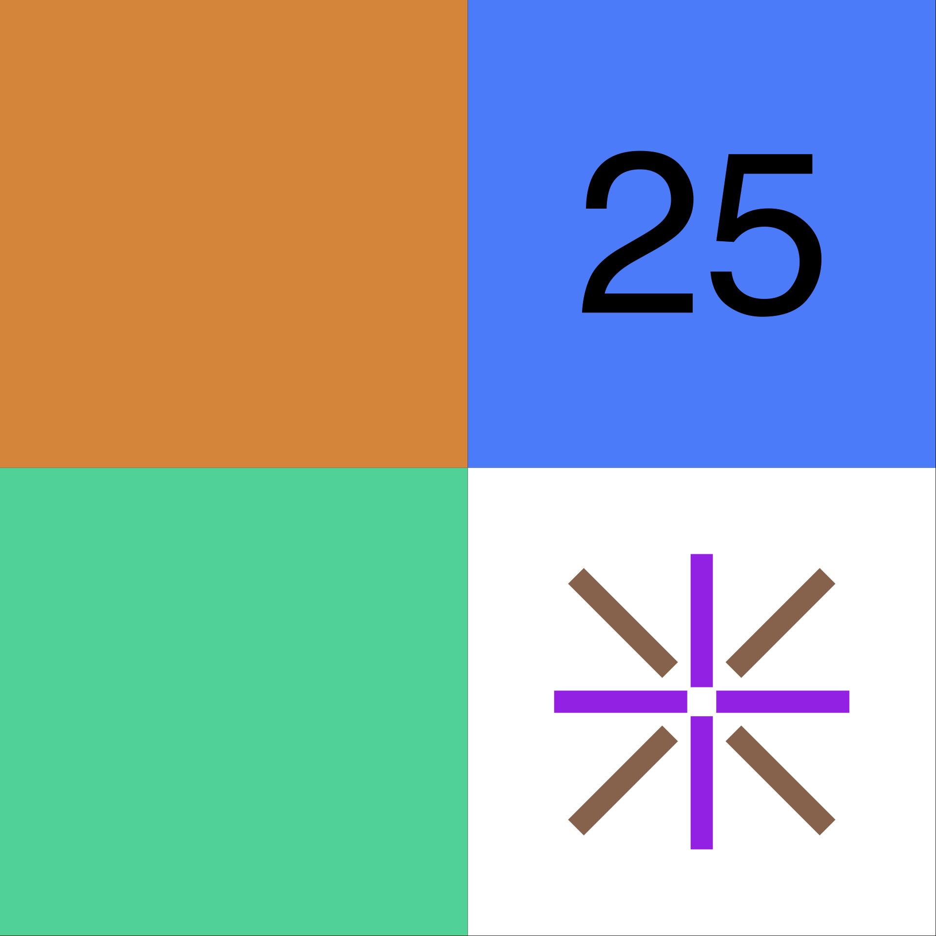
The visual system is modular and motion-first, built around four tiles:
• #50D399, a bright mint green, conveying freshness and energy.
• #D6863A, a warm orange, referencing light and natural elements.
• The “25” in black on a vivid blue #4C7BFA, acting as a digital motif that bridges the physical and technological realms.
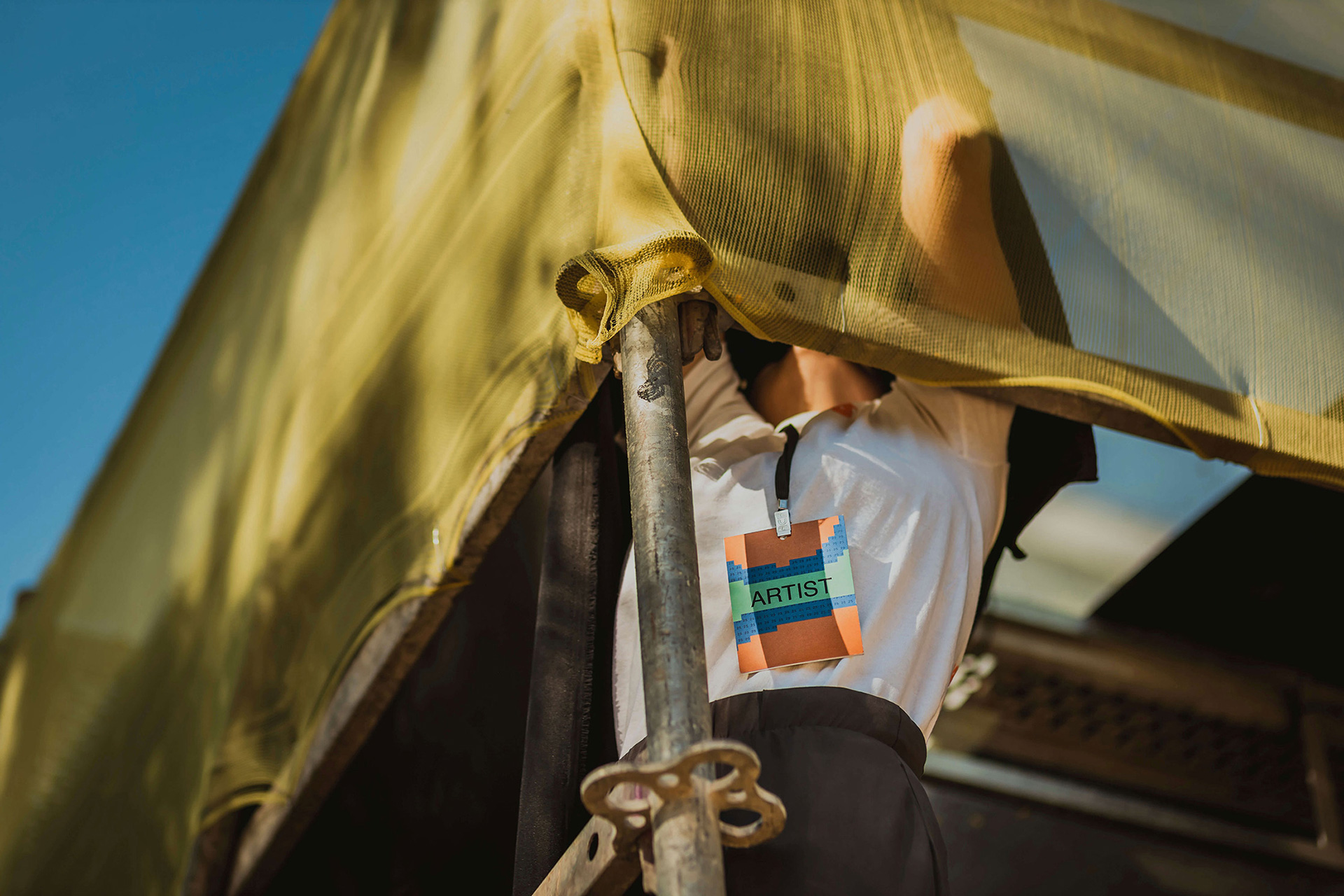
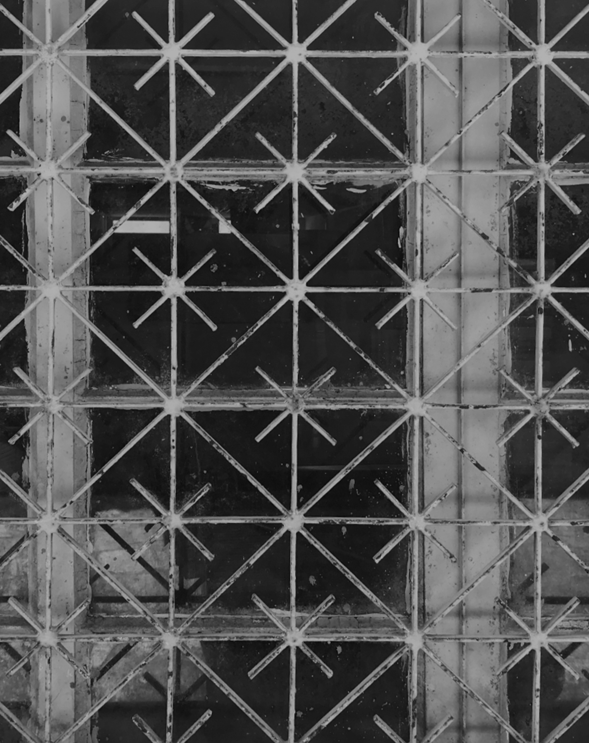
• An asteroid-like shape, inspired by metallic window patterns from Nicosia, embedding a sense of locality.
The alternation of tiles forms a visual mosaic, reflecting the coexistence of different cultures and experiences. The pixel structure is not merely decorative but a carrier of meaning, applied across posters, social media, motion graphics, and stage design, with a strong presence and clear recognizability.
Credits
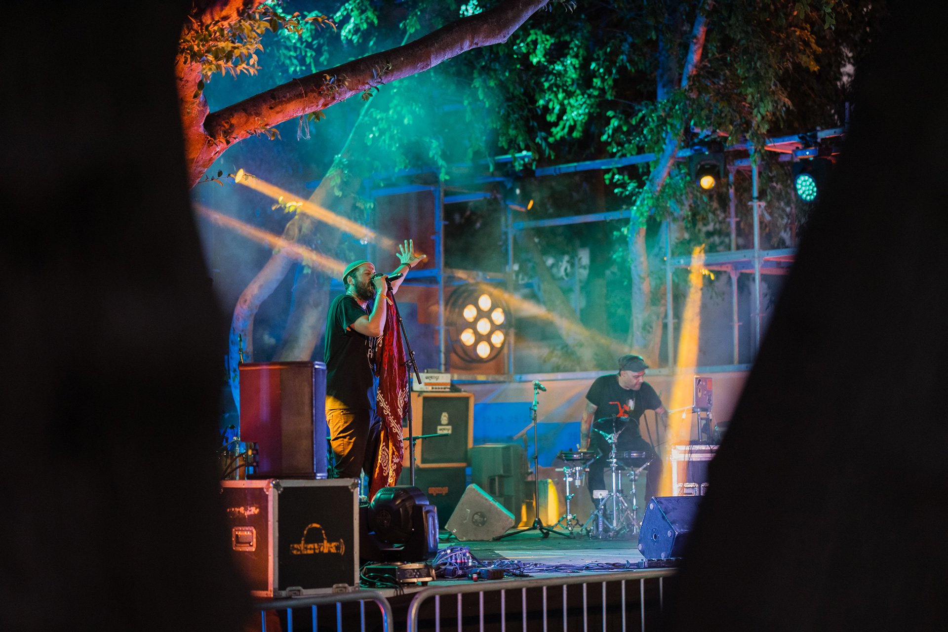
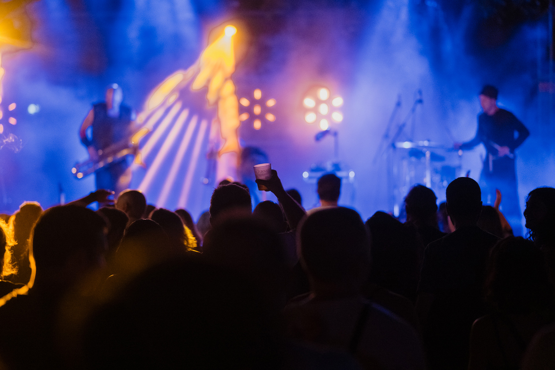
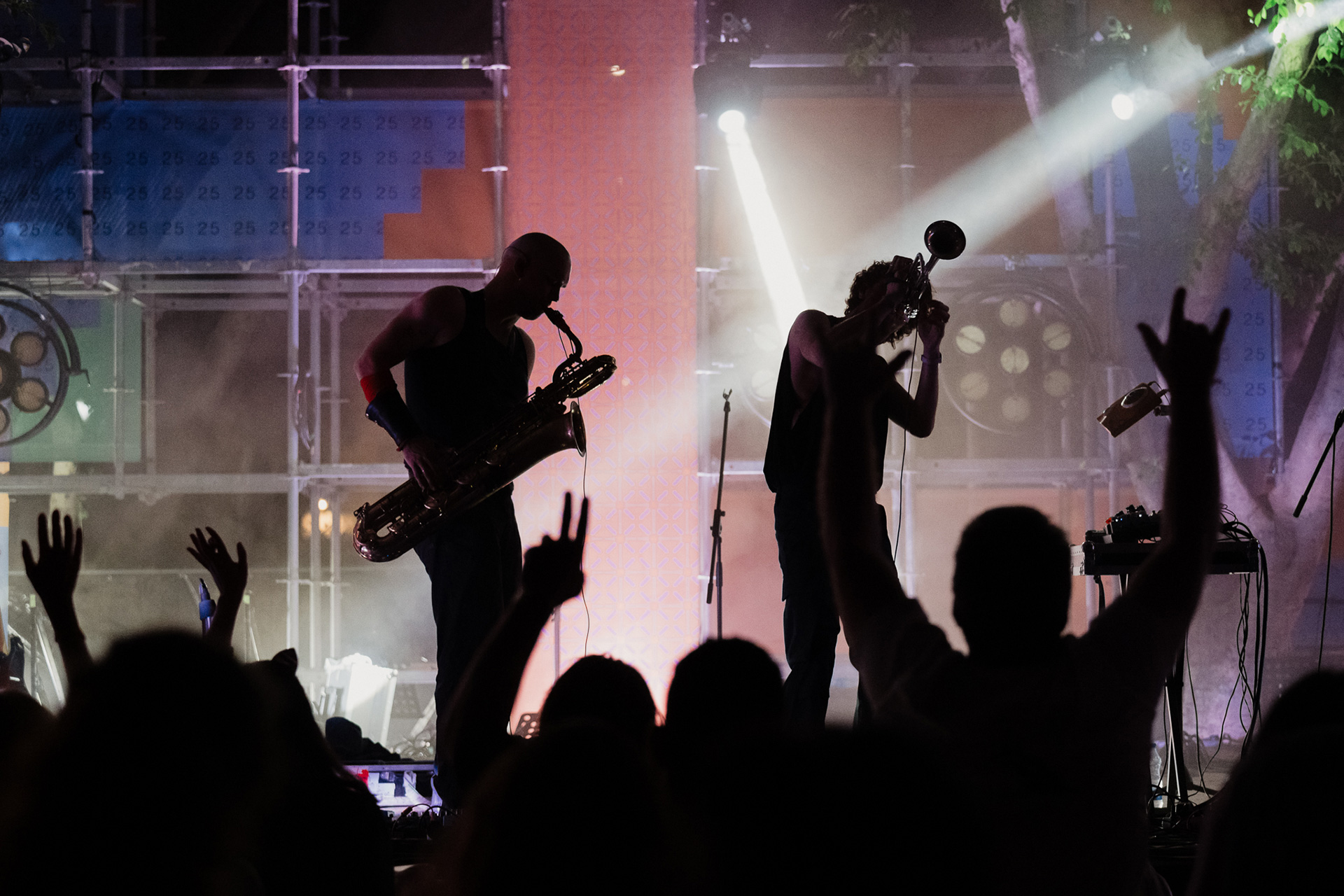
Festival - Exterior Photography by Michalis Demetriades (CY).
Studio Photography by Konstantinos Gikas (GR).

)